In the previous articles of the HTML Email Develoment Tools series we gave some pieces of advice and showed some tricks for development productivity, like Sublime features and layout-generator scripts. By having read those posts, you can write code more efficiently.
Now it's time to see the tools that can define if the output is quality or rubbish. We consider the topic really important for email coders.
In this article, we are going to discuss visual testing, and we'll use the built-in tools of the browser first. The browsers' Developer Tools will enable quick iteration over design. It'll help us identify common mistakes that most email clients won't tolerate. Following that we'll walk through an example of some support problems that can only be identified via email testing services or email tests on physical devices.
Some of the tools throughout the post may be old friends from your professional experience or our previous tutorial series on HTML email coding. In the Modern HTML Email Tutorial Series, we revisited HTML email development principles based on the new era of modern emails as per the Gmail update.
In each topic, we had theories about how client-support may have changed in the past. We kept on continuously justifying these theories with visual email tests. With these tools, we could tell how code changes affected the rendered views in numerous email clients at the same time.
However, that was the time when we realized how time consuming it is to run tests through these services. We also noticed that we can save time if we do the initial testing of our concepts by the aid of web-browsers.
This article started off as a comprehensive introduction about testing tools for email coders. But soon enough we found out that there was so much to mention, that we decided to only discuss the built-in browser Developer Tools and visual testing in this post. We'll show other tools and extensions in the next article.
Introduction to Email Rendering and the DOM
Varied rendering is a worn out topic in email development. Every email client has its own implementation of supported HTML and CSS; to be a successful email developer you have to know about all of them. For this reason, we're looking under the hood inside our web browser to see the possible causes why our templates might break.
Next time you encounter odd behavior from some properties, you'll be able to identify the problem by yourself. In this section, we're going to discuss the theory first, then cover the topic through an example and sample images.
From HTML & CSS Code to Rendered View
Let's go over the process an email goes through until the recipient receives it. We cover this section based on our readings from Litmus' article.
Every fancy email starts with an HTML document, which has CSS inlined, like this:
<!DOCTYPE html>
<html lang="en">
<head>
<meta http-equiv="Content-Type" content="text/html; charset=utf-8">
<meta charset="UTF-8">
<title>Document</title>
<style>

	</style>
</head>
<body>

	<table width="100%" cellpadding="0" cellspacing="0" style="min-width: 100%; background-color: yellow; border: 1px solid #000;">TABLE,
		<tr>TR element
			<td style="background-color: orange;">
        TD element
			</td>
		</tr>
</table>
</body>
</html>
Pretty straightforward, right? (Although if you think about it, we'll see some email-client differences already, as some clients support external stylesheets... But let's just forget about that and use email best practices!) The document is sent to mailboxes by some sort of server. As we talk about emails, it is the mail server. Usually, there's no change in the HTML at this step, a lot of additional data for the mail client.
Here is an example excerpt from Gmail about the previous HTML code:

Inside the recipient's email client there's a pre-processor which interprets the document. It eliminates all elements that are unknown or dangerous, like scripts from the attributes. If clients don't do this, the users are exposed to the security vulnerability of cross-site scripting XSS. Cross-site scripting enables attackers to inject client-side scripts into the emails. Source: Wikipedia
At this point, custom classes and additional markup may also be added. At this point, huge implementation differences arise. You can access this data directly in every webmail client, using the Developer Tools:
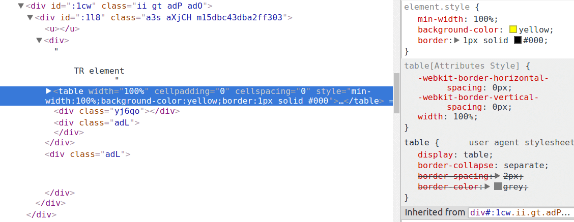
In the subsequent article, continuing the topic of email quality inspection, we'll show you how to exploit this behavior.
Following these steps, the rendering engine receives the modified HTML and parses it to create the Document Object Model (DOM). The DOM is an object, representing the HTML document and the applied CSS properties. This representation is visible in the browser or in the mail clients. The email clients often use the operating system's browser engine to show the DOM.
The main reason behind the DOM is that HTML elements and attributes can be accessed by scripting languages, like JavaScript. As it provides an interface for programmatic use it's called the DOM API. However, scripts are removed in the vast majority of email clients, so we don't need to worry about this at all.
The Developer Tools as a Testing Solution
As mentioned before, email clients often use web browsers present on your operating system to render views. Webmails use the browser in which you open them. Desktop email clients can default to specific browsers installed on your system. One example is Internet Explorer based Outlooks, they will use Internet Explorer or Edge on Windows-running machines.
By the above mentioned details, we have 3 + 1 reasons to test first in the browser:
- Quick iteration over your design
Support to write properties on the fly
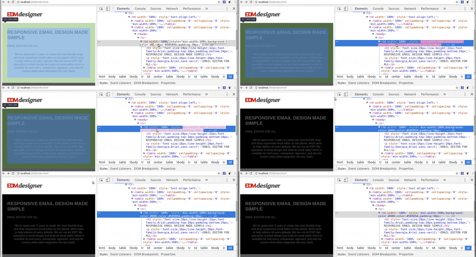
Easy way to debug with tools like the option to turn properties on/off
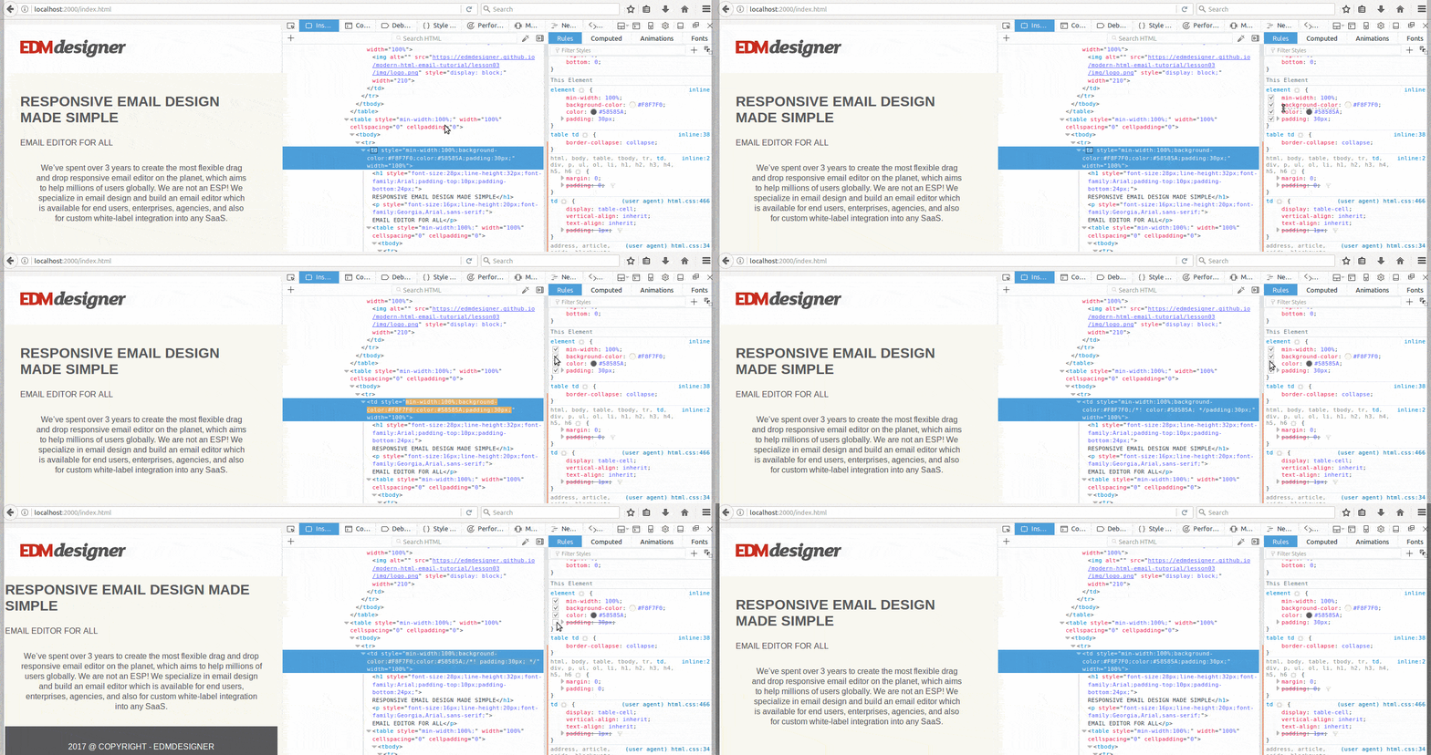
Almost immediate feedback about the payload and download speed
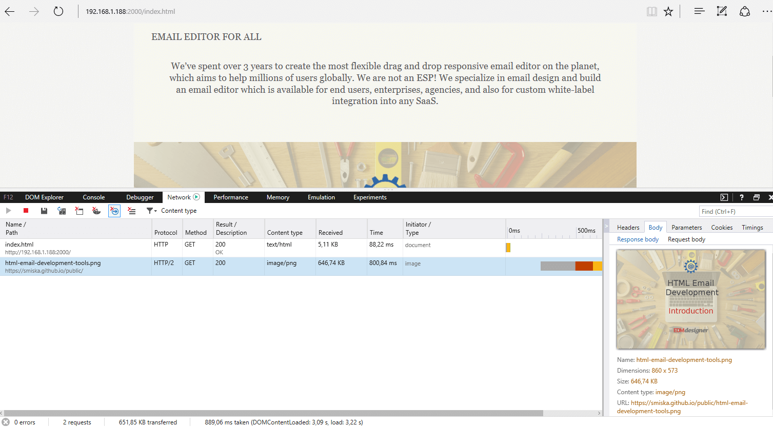
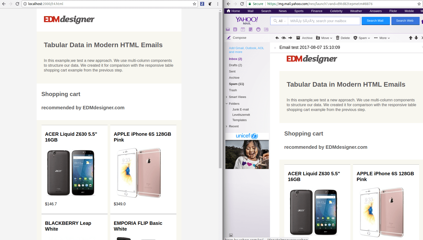
- Webmail view is usually very similar to browser view with the same browser
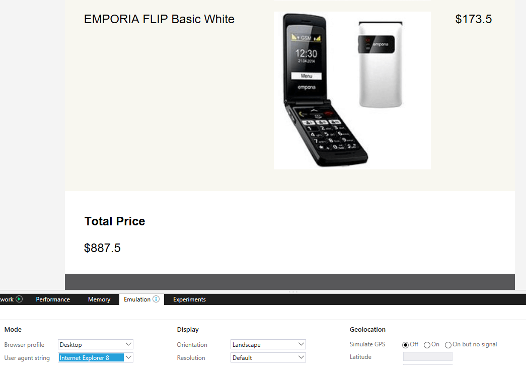
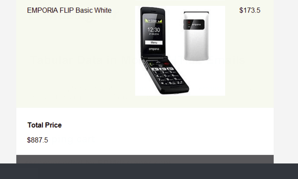
- Specific desktop client's views can be anticipated from the browser view
| Internet Explorer 8 Emulated in Edge | Outlook 2002 |
|---|---|
|
|
- (Mobile views can be emulated in major browsers)
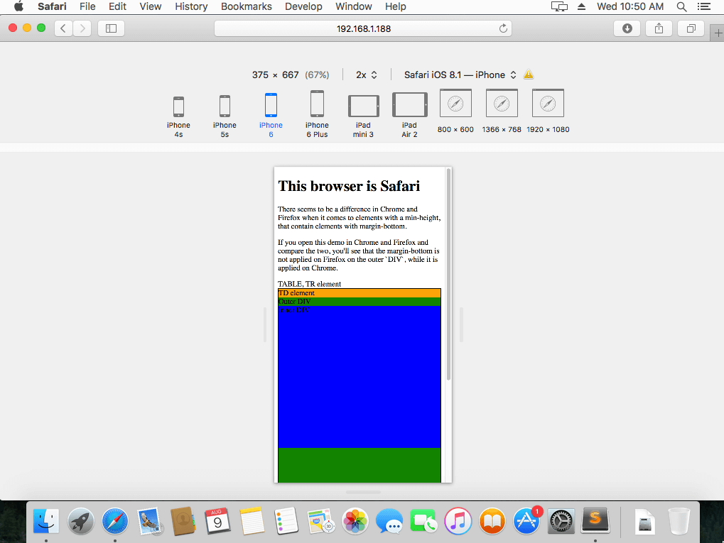
There's a plus one among the bullet-points because you always need to test emulated views as they are not 100% reliable.
There are a few conclusions to keep in mind here:
- We suggest browser testing only as a preliminary step to help you decide on the main design principles. It's always advised to confirm with visual testing services and physical devices.
- Just as in web-development, you need to consider other browsers. It's best if your workflow supports the most frequently used browsers (like Chrome, Firefox, Edge, Safari). See our recommendation for multi-browser testing through an example in the next section.
Browser Testing Example
Working with the browser can give an almost instant feedback on the design and we've seen quite a handful other reasons to do it. In this section, we'll see that we can also use it to catch rendering differences across browsers before we would use a testing service. First we'll work on our testing workflow, then we'll inspect what we've built through an example highlighting a rendering difference between Chrome and Firefox.
Getting Started - Testing Environment Setup
To be able to run consistent, well-orchestrated tests in multiple browsers, these are the tools you'll need:
- A text-editor, possibly with LiveReload enabled
- Major browsers installed
- A server for serving your HTML documents. You can download one here running on Node.js
- Virtual Machine with running operating systems for the browsers not supported on your system
In your workflow, you'll open up a text editor, fire up a boilerplate template, or generate some initial HTML&CSS combo first.
Then, you'll have at least the major browsers installed and open. If you still miss out on any, here are the download links for the recommended ones:
Now, there's a problem. Safari is not supported on Windows, while you can't install IE on Linux (there may be other restrictions you encounter; if so, please share it in the comment section). You can eliminate these kind of problems, if you install Windows for IE and Mac for Safari on virtual machines.
For this purpose we use Virtual Box, which you can download here.
Testing in 4 browsers may seem overwhelming and you may decide to skip this part. It's actually okay, if you only test in two of the most important ones for your email client list, when you'll do visual tests by testing services later. Nonetheless if you follow our recommendation here, it becomes really easy to test in multiple browsers.
Next, we'll download and extract the server and start it with Node.js, running node server.js.
This gives us the benefit of accessible working files in all web browsers. Even in the guest virtual machine you can open the exact same files. You need to type ipconfig on Windows / ifconfig on Mac on your host, so you'll be able to find the IP address of your host machine:
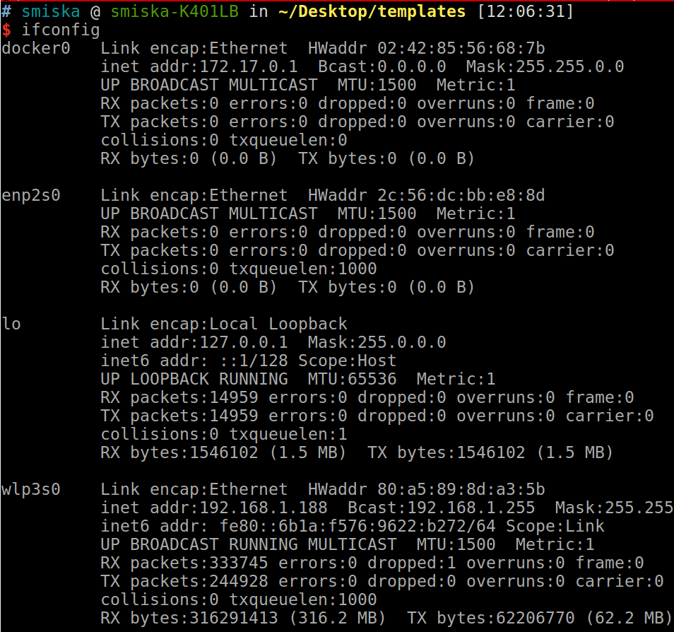
If your servers are running, you can access the served files from the browser. Just type the following pattern in the URL address bar: localhost:<portnumber> on the host machine, or <ip-address-of-host>:<portnumber>/<rest-of-address> on your guest virtual machine.
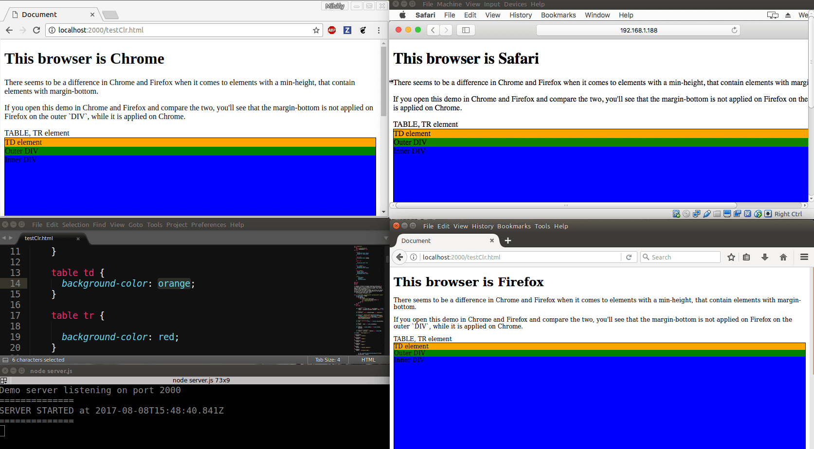
If you've also set up LiveReload, all the updates will show in every web browser on your host machine.
Inspecting the DOM Through the Developer Tools
With our environment ready, we can start actually developing and testing email HTML. In this example there is a very basic layout setup, which serves as a good basis to start inspecting elements.
The idea is that supported email HTML is developing among the various email clients, so maybe we could use DIV elements in our design. We're going to have a wrapper table, conform to email best practices, and have two DIVs inside, nested into each other. Filling it with nice, well-coded content, it could be developed into a beautiful marketing email - that's our goal.
The complete HTML of the document:
	<!DOCTYPE html>
	<html lang="en">
	<head>
		<meta charset="UTF-8">
		<title>Document</title>
		<style>

			table {
			  background-color: yellow;
			  border: 1px solid #000;
			}

			table td {
		  	  background-color: orange;
			}

			table tr {
		  	  background-color: red;
			}

			table .outer {
			  min-height: 400px;
		  	  background-color: green;
			}

			table .inner {
			  height: 300px;
			  margin-bottom: 300px;
			  background-color: blue;
			}
		}

		</style>
	</head>
	<body>

		<table width="100%" cellpadding="0" cellspacing="0" style="min-width:100%;">TABLE,
			<tr>TR element
				<td>TD element
					<div class="outer">Outer DIV
						<div class="inner">Inner DIV</div>
					</div>
				</td>
			</tr>
		</table>

	<script>document.write('<script src="http://localhost:35729/livereload.js"></' + 'script>')</script>

	</body>
	</html>
You can check out the full source code on Github as well.
As you can see in the CSS, we set the inner DIV to 300px with 300px bottom margin. The other dimension we apply is a min-height for the outer DIV. We'll expect the child DIV to stretch the parent DIV and all the table's elements surrounding. As we color each element, a nice layout should show.
These are the results (left - Chorme / right - Firefox):
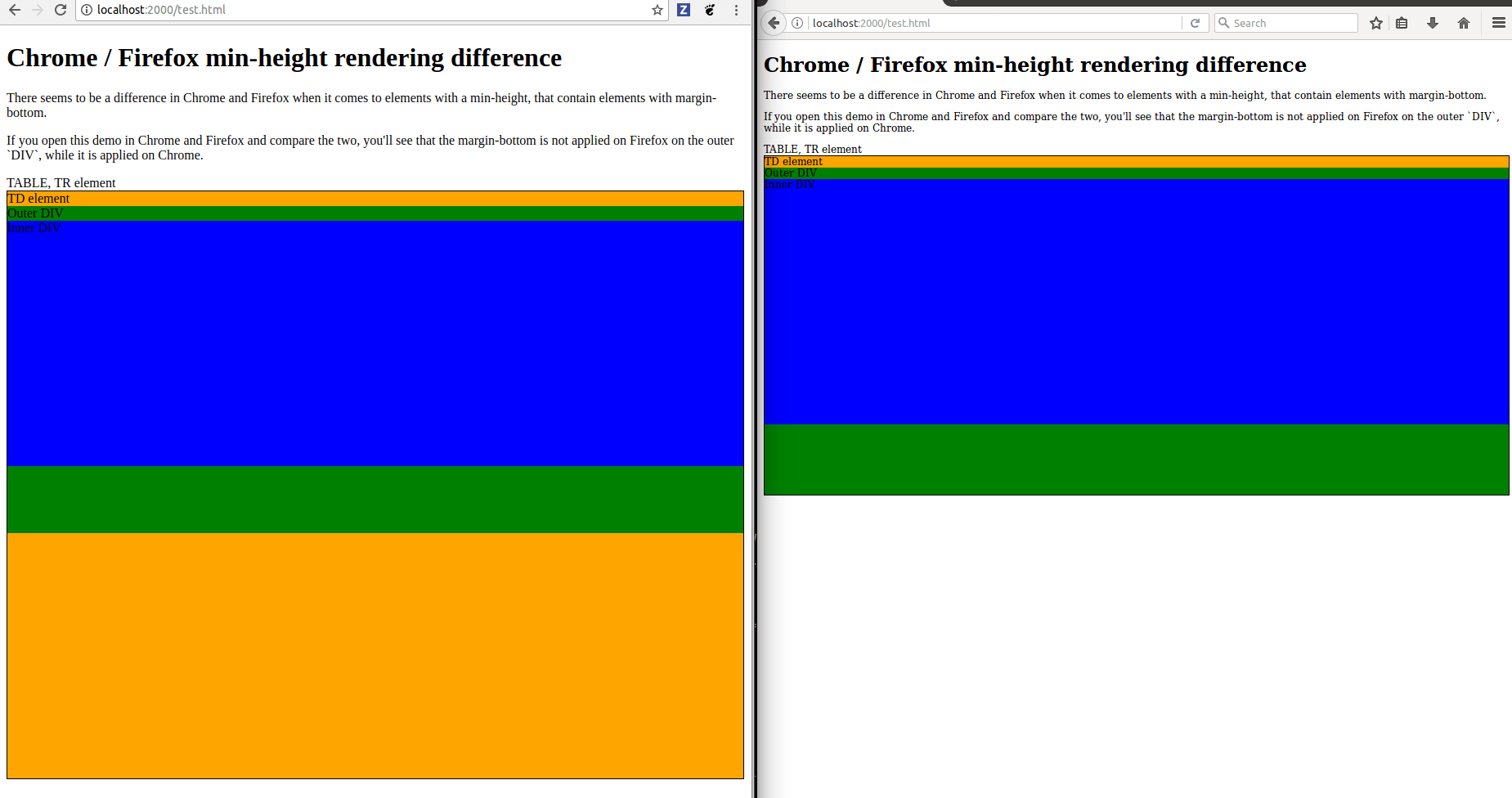
Now the output is quite unexpected. They are radically different in Chrome and Firefox. If we would use testing services, the only thing we could do at this step is to modify the code. The visual feedback may help us to understand the initial cause of the problem.
When we use multiple browsers we can use the DOM inspector in each browser, turning features on and off and looking at how the CSS properties are calculated. In each browser, the Developer Tools are accessible by pressing: F12 / CMD + SHIFT + I.
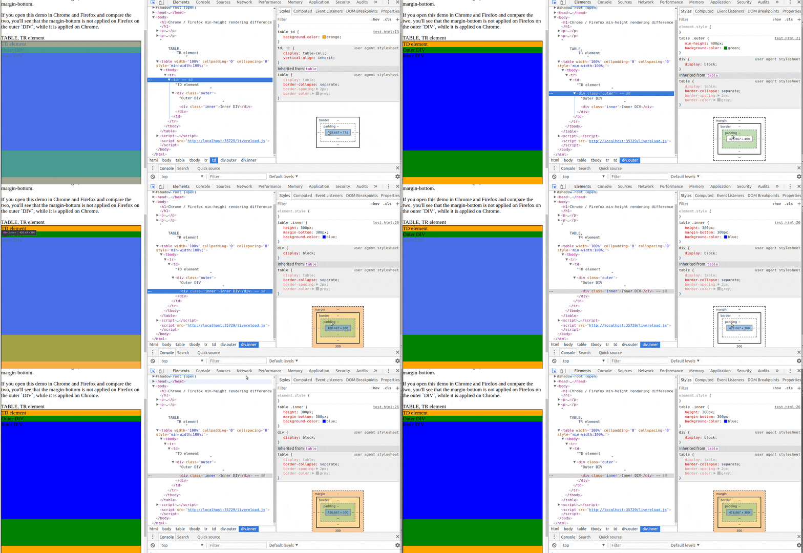
Let's take a look at Chrome's DOM inspector:
And analyze the same in Firefox:
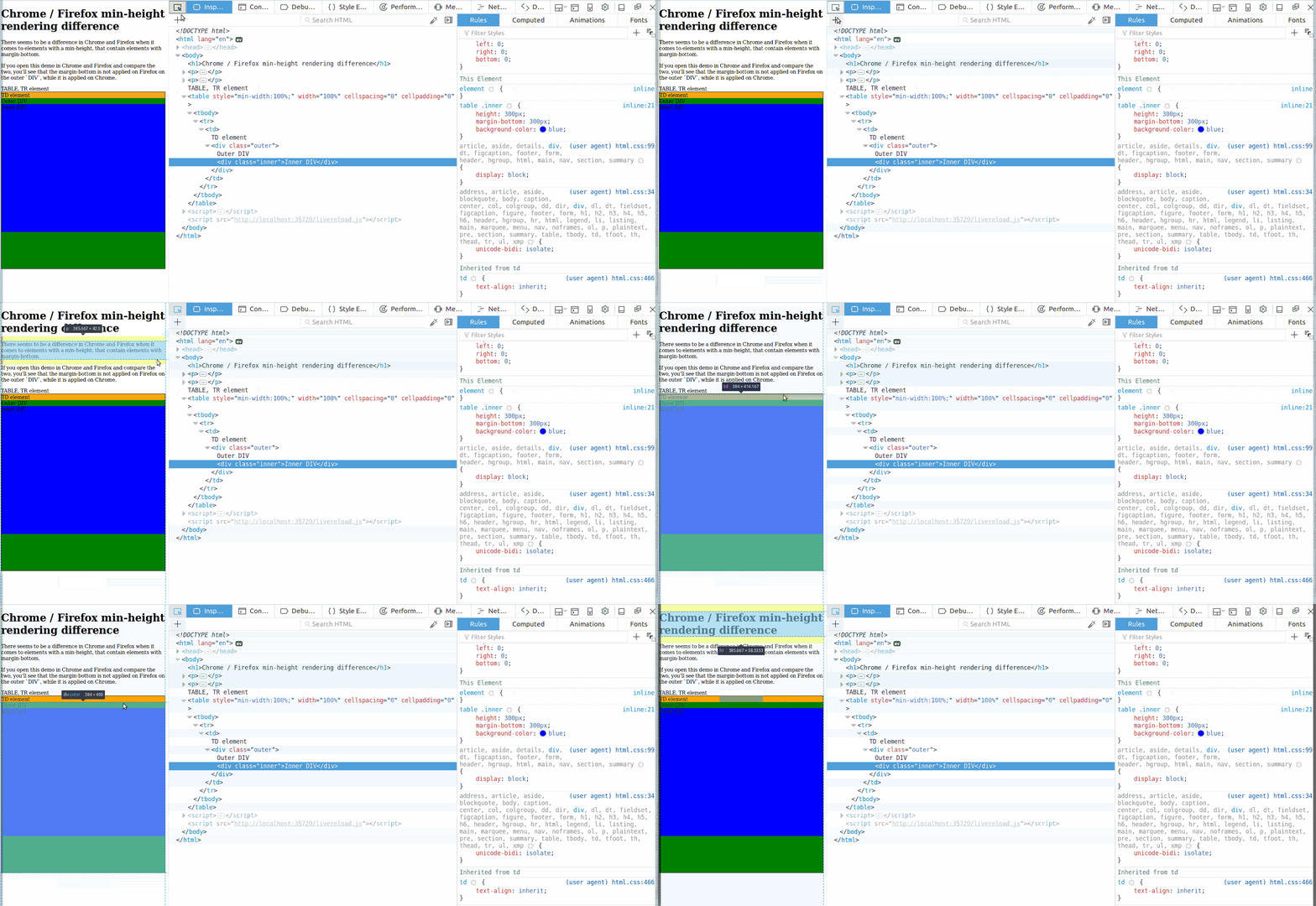
We can conclude what we've seen with the two ways of inspections:
- If you examine carefully, both browsers know that the inner
DIVis
600pxhigh, consideringheight:300pxandmargin-bottom:300px - Firefox applies
min-width:400pxas an absolute value, and cuts off the innerDIVthere, hiding themargin-bottomproperty - Chrome recognizes the
min-width, but also nows that the innerDIVhas a margin, so it counts it as if it were outside of the outerDIV - Firefox counts the
TDelement to400px(+ font size), Chrome counts the sameTDto700px
These differences are present as the two browsers both struggle with deciding the correct height for the elements. We can fix the templates by even adding a zero dimensioned element, which forces the browsers to calculate each element's height.
The fix looks as follows:
...
   <style>
	.clr {
		clear:both;
		height:0;
		overflow:hidden;
	}
   </style>
...
   <body>
...
        <div>
           <div class="outer">Outer DIV
	       <div class="inner">Inner DIV</div>
	       <div class="clr"></div>
	   </div>
...
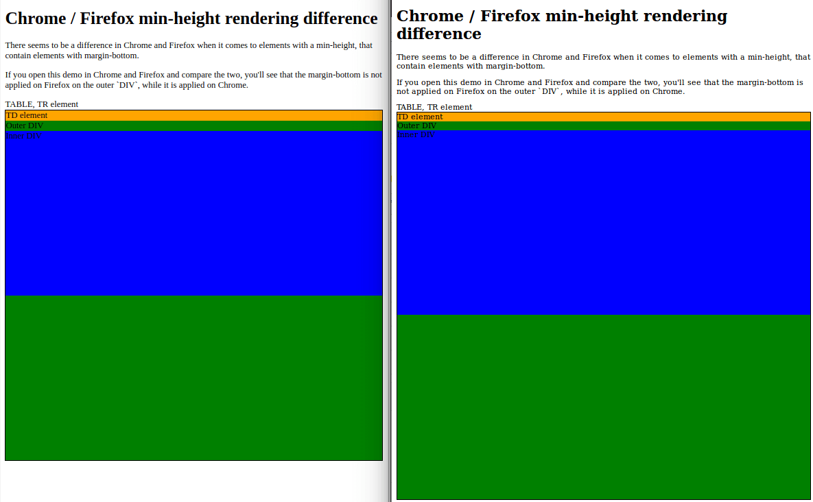
You can check out the full source code here.
Email Quality Testing with Visual Test Suites
We fixed the templates so it looked the same in Chrome and Firefox. We are now confident that webmail clients will render great. To confirm that this is the case or not, we'll use visual test suites, Litmus and Email on Acid. They are the most comprehensive and respected choices available on the market.
Running Tests
Both services provide a great number of features to help developing bulletproof emails. By far the most important service is the visual tests, where you can see live previews of your HTML code in several email clients.
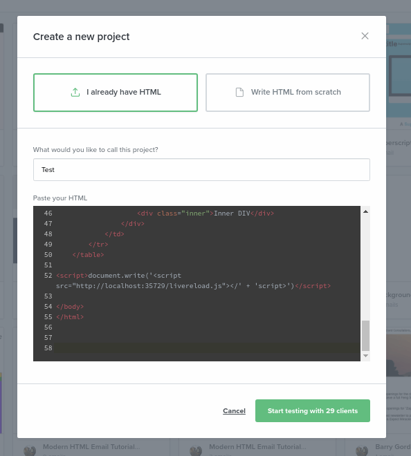
You can also start development from scratch or paste your HTML code to their editors. We have our HTML ready so we can paste it as follows:
Paste in Litmus:
Paste in Email on Acid:

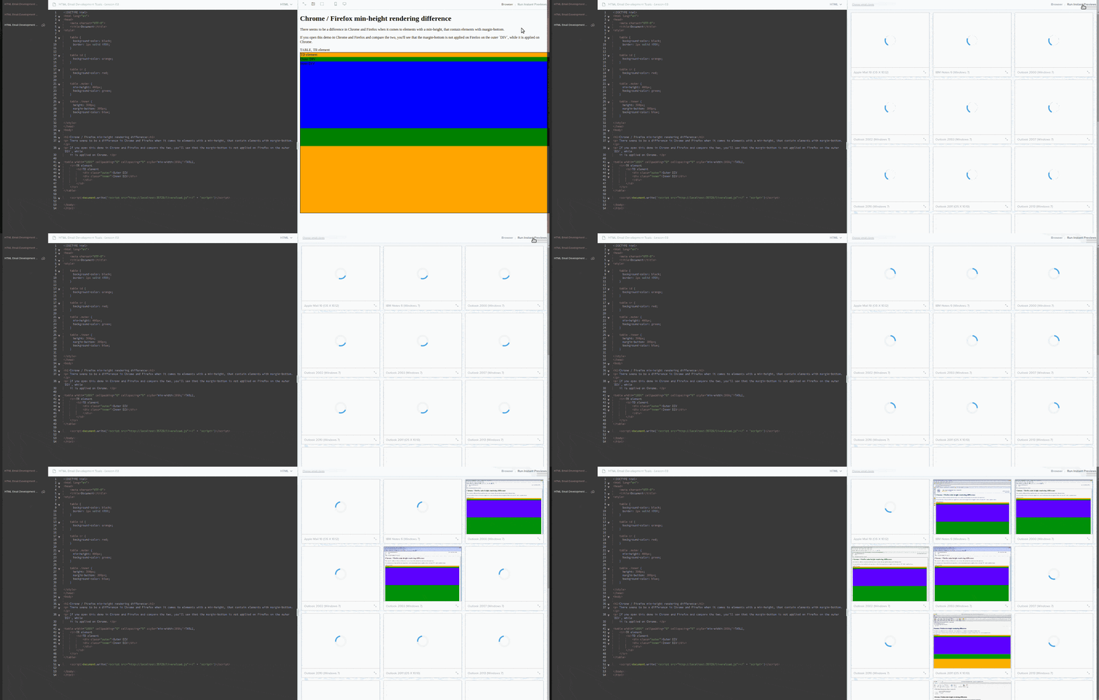
In each service you'll find an editor - specifically prepared to handle email HTML - and a preview pane. In the preview pane you have a browser view by default, which you can toggle to show numerous email client's previews:
In Litmus:
and also in Email on Acid:
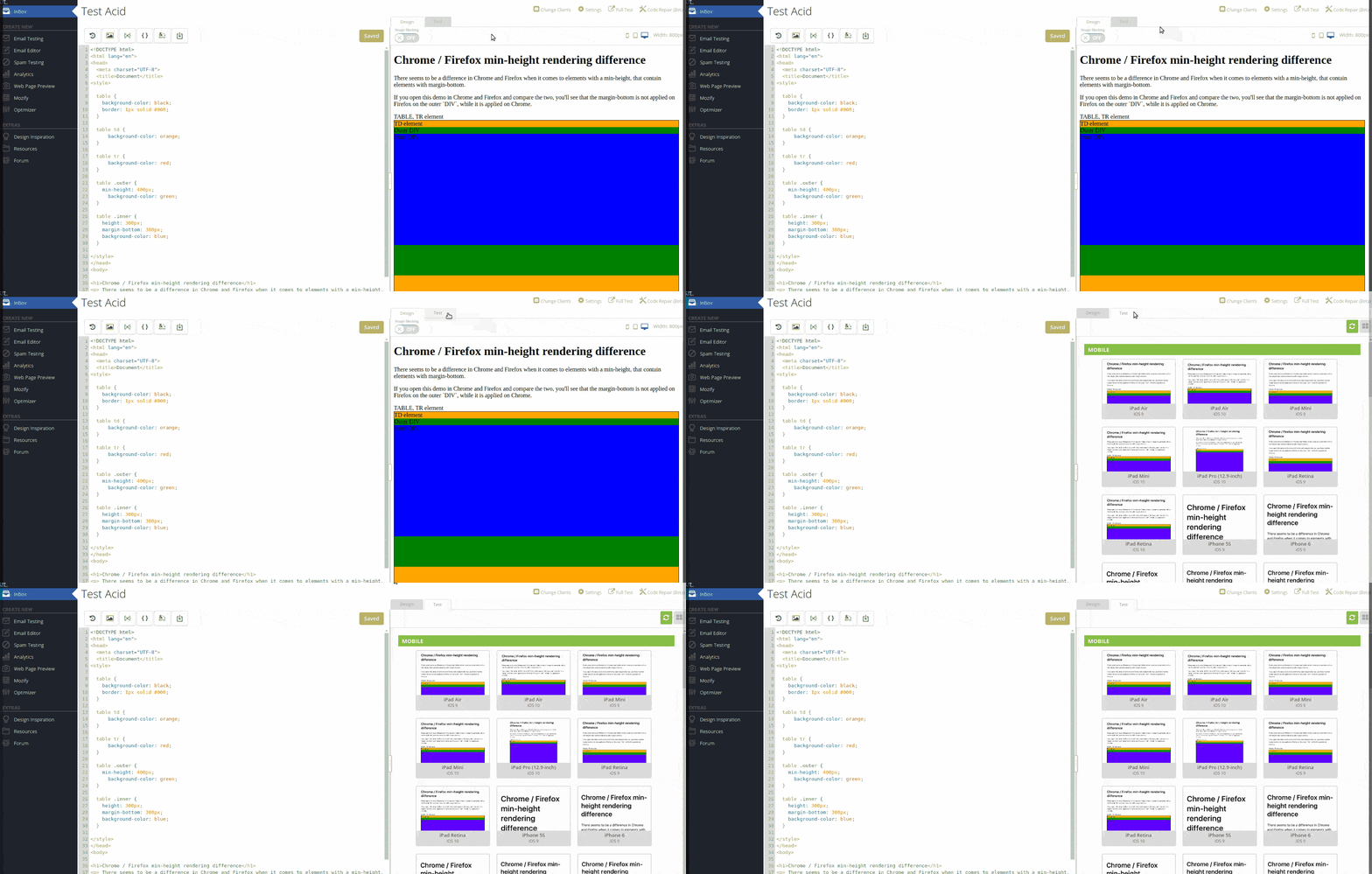
The live previews guarantee the option to test in most of the significant environment setups of browsers, email clients and operating systems. It's also possible in both services to share the outcomes with a sharing link. We can now compare and contrast the results of the two testing service.
You can check Litmus previews before here.
You can check Litmus previews after here.
You can check Email on Acid previews before here.
You can check Email on Acid previews after here
Confirming our results in Litmus and Email on Acid we can see that browser testing was actually a good way to catch design problems, though we have a lot of differences remaining. If you wish to solve those too, our previous article may be useful.
Comparison of Litmus and Email on Acid
As you can see, both services are fundamental tools to make your design bulletproof. The only other option is to test on physical devices, which is costly and far more time-consuming. However there are other good features these platforms provide to help speeding up development process and improving code quality. Definitely our list won't be exhaustive, but let's see the most eye-catching items.
Both services have a number of pre-written templates, which you can modify to your needs. They have preview panes showing a browser view, which is quite similar to the browser testing we were doing before. You can switch it to examine mobile browser view or multi-client previews with a single click.
There's an option in both to follow up on your development history based on the code as well as the project preview. They have additional services like Spam Testing and email Analytics, but let's see more benefits that are related to code quality.
Litmus offers:
- Grid view for easy understanding of your markup structure for the browser preview
- A service available from the Checklist that enables you to verify your subject-line in many clients with live previews
- Multiple email templates in a project and you can run tests for them separately.
Email on Acid offers:
- A built-in inliner tool shipped - your embedded CSS become inline styles by a click
- An very easy to understand code quality checker warning about problems with your code and also an Optimizer tool, which will correct them instantly
- The ability convert your special characters to HTML code in an instant.
And last but not least, two very intriguing features: Litmus has Sync to ESP, Email on Acid has Mozify.
Summary
In this article we learned about the browser's Developer Tools and email testing services.
In the first part of the tutorial, we summed up the steps which an email goes through:
- HTML document is created with inlined CSS
- Mail server sends the information usually untouched
- Pre-processor modifies the document, strips away dangerous content
- Rendering engine creates the Document Object Model (DOM) for representation
Next, we inspected the DOM in Chrome and Firefox through a simple example, which was rendered very differently in the two browsers.
In the second part of the post, we discussed the two best email testing services, Litmus and Email on Acid. We analyzed the email previews and made some comparisons on their available features.
We hope that you found this article interesting. We're going to continue in the next one with some tricks and extensions in the browser and see some online services that will improve code quality. Join us next time as well!

