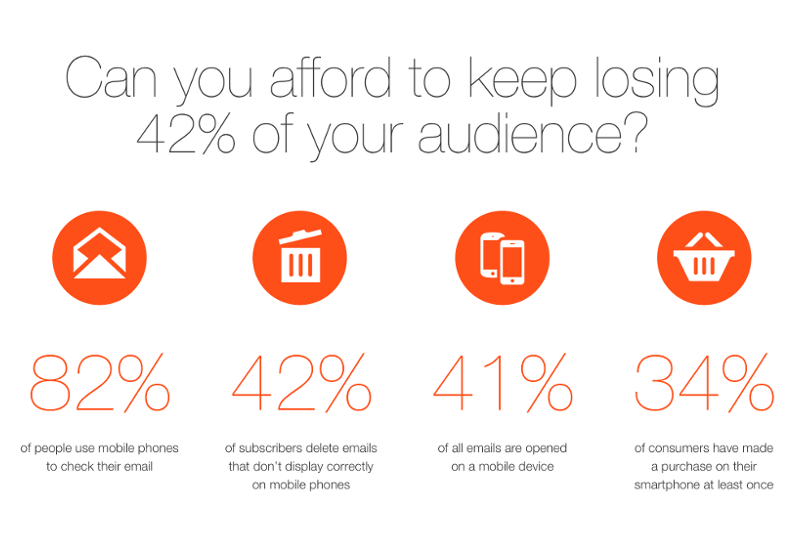
In this article you will find out must have element of cart abandonment email design and copy.
According to Baymard Institute, the average cart abandonment rate is somewhere around 68% while SalesCycle states it is around 74% worldwide.
This number sounds awful, but there is nothing bad in it. It is just another opportunity to convert more.
The good news is that you can take proactive measures to reduce this rate. If you reach a drop even by a couple of percents, it will bring quite a noticeable increase in revenue.
In this post, we will cover the elements of a winning cart abandonment email, one of the most popular tactics used by e-commerce marketers to remind visitors about the full shopping carts they abandoned.
Why does a cart abandonment email work so well?
There are a number of reasons for that:
- Cart abandonment emails have a 40.3% open rate, which is twice the open rate of a usual marketing email
- Their click through rate is close to 27%
- A third of these clicks result in conversions
Why do people abandon their shopping carts on your website?
Customers have been browsing your website and putting all the items they like in the cart. And then they simply leave it without purchasing anything.
Awful.
Actually, the reason why this happens requires a proper investigation from your side. This information will help you a lot in crafting your cart abandonment emails.
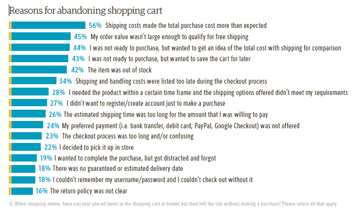
But here we will list some of the most popular reasons:
- Shipping costs are more than expected
- Use of shopping cart as a wishlist
- The order value does not qualify for free shipping
- Shipping costs are not listed prior to checkout process
- You have to create account prior to purchase
- Not enough payment options available
- Too long shipping time
- Item is out of stock
- Technical issues during checkout process
What are the elements of a winning cart abandonment email?
Design
First of all, your cart abandonment email should contain a reminder of what your visitors have abandoned.
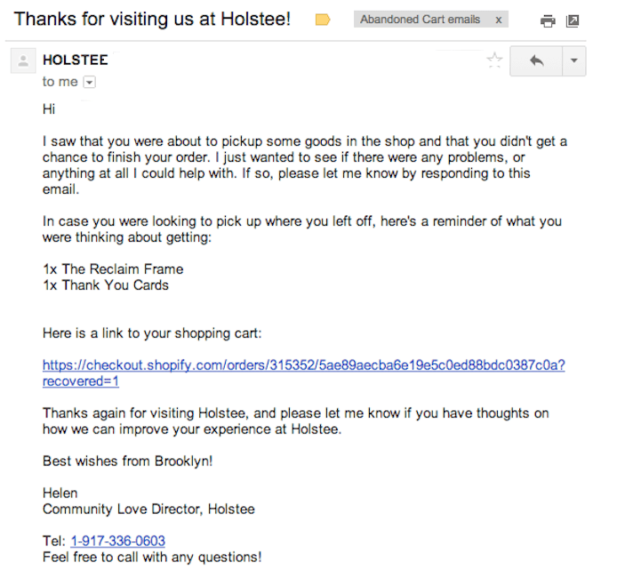
It could be a simple text email with a list like here:
*Source: *Mageworks
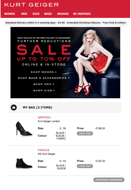
Or a more ornamental one featuring images of the items:
Then, your cart abandonment email should offer a direct link that will allow your customers to continue shopping without prior registration. You want to make your customers’ shopping path as smooth as possible.
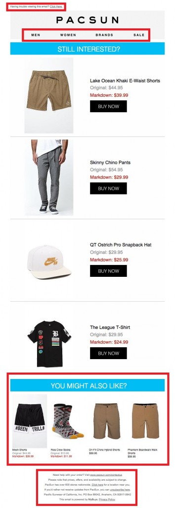
If you want to enhance your customers’ experience to the ultimate height, consider including the following elements in your email design:
- Reduced website navigation. Excessively detailed navigation menu will both ruin your email design and your user experience.
- “You may also like” section containing similar or compatible items.
- Contact details of customer support
- Link to store locator
- Link to purchase policy
- Browser view, if you are sending an image-rich email
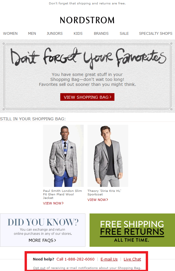
A Marketing Sherpa study showed that 38% of people are actually annoyed by the cart abandonment emails and 16% percent of respondents found cart abandonment emails extremely annoying.
Thus in order not to annoy your customers even more, your should include in your emails a simple opt-out like in Nordstrom email:
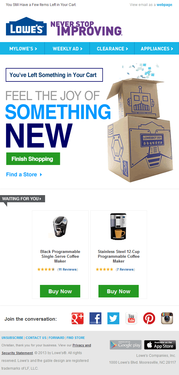
There is one thing you should never forget in any of your email: a prominent call to action with super-focused copy.
Here are some examples of popular calls to action:
- Take me to my cart
- Claim the item
- Complete my order
[Source: Smiley Cat](http://www.smileycat.com/design_elements/abandoned_cart_emails/index.php?page=2 target=)
Copy
Copy is the king, especially in the cart abandonment email.
And the copy starts with the subject line that definitely should not say “This is your cart abandonment reminder”.
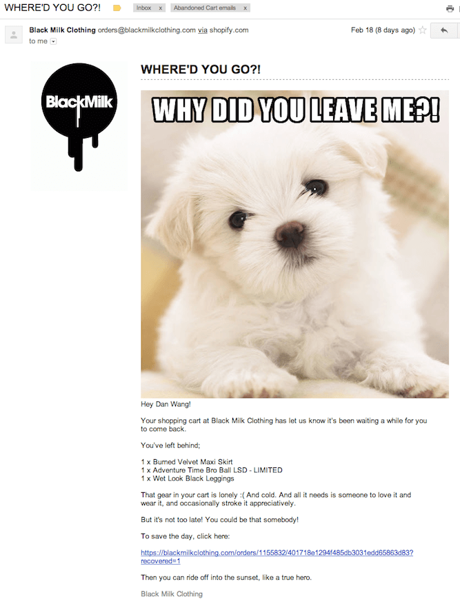
If you add a bit of humor, you can get some very cute and irresistible subject lines [like](http://blog.windsorcircle.com/25-subject-lines-for-cart-recovery target=):
- WHERE’D YOU GO?!
- Your cart MADE us send this reminder
- Your shopping cart is up to something…
- Your shopping cart is lonely!
- pssssttt… We think your shopping cart is stalking you (O.O)
In your subject line, you also can exploit such things as offers, urgency or scarcity:
- 10% off to finish your order
- Hurry! Before these items sell out
- Your saved cart is about to expire
In your email body copy you can continue to exploit a sense of urgency or scarcity, as well as offer a deal to your customers, like free shipping (even if they did not qualify before), or a discount.
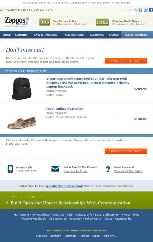
Cart abandonment emails are slightly different from other types of emails, so your copy can be pretty frivolous like in this email from Zappos: “There’s no time like the present to scoop up items left in your cart”.
Timing
Your first cart abandonment email should not be sent too early or too late.
Usually, the chance to win back your customer with the first abandoned cart email declines gradually four hours after they’ve stopped shopping. But the exact timing should be subject to testing, so that you can understand what works best for your specific audience.
Single cart abandonment email might not be enough, so some retailers send the second one within 24 hours from the first one.
Also, you should have a frequency cap for your cart abandonment emails to ensure that your customers are not bombarded with them. It is bad practice to send several cart abandonment emails within a short period of time.

