Have you ever wondered how color choice influences your email marketing campaign and conversion rate? Intriguing, even appealing subject line is definitely a key that makes people to open emails. But what happens when your customers see what is inside?
Exciting Red, Calming Green and Trustworthy Blue: Emotions behind Colors
Emotions, emotions, emotions… Do most people make their consumer choices based on rational analysis? Apparently, not: emotions greatly determine consumer decisions.
Emotions from previous experiences shape up consumer preferences and influence their behavior. And what is the primary mean to transmit emotions? Of course, it is color.
Colors help your company to stand out. Colors help you to make customers feel what you want them to feel, influence likability and purchase intent. The right will color help you sell.
Source: The Logo Company
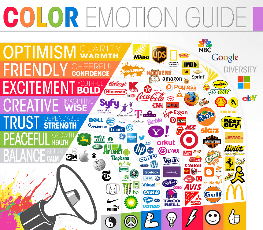
Almost 85% of consumers acknowledge that color is the primary reason to buy a particular product. Logo colors can even affect consumer emotions towards brands.
Red logos are associated with expertise and self-assurance, yellow logos are fun and modern, green logos seem to be masculine, sustainable and environmental-friendly, blue logos radiate confidence and reliability, and purple logos are feminine glamorous and charming.
Color can even influence ethical judgement of brands. A research shows that green and blue brands are perceived as more eco-friendly, while red is considered as environmentally unfriendly. At the same time blue is “greener” than green and is more associated with environmentalism.
Colors are often used for metaphorical representation of mood (have you ever heard of “having the blues” or “rose-colored glasses”?), but what colors are preferred by people when they are in a certain mood?
Apparently, a research shows that both depressed and happy people prefer blue, but it is the shade that matters. Depressed people incline towards darker shade of blue while happy people opt for lighter blue. Happy people like yellow, and depression and anxiety cause us to favor various shades of grey.
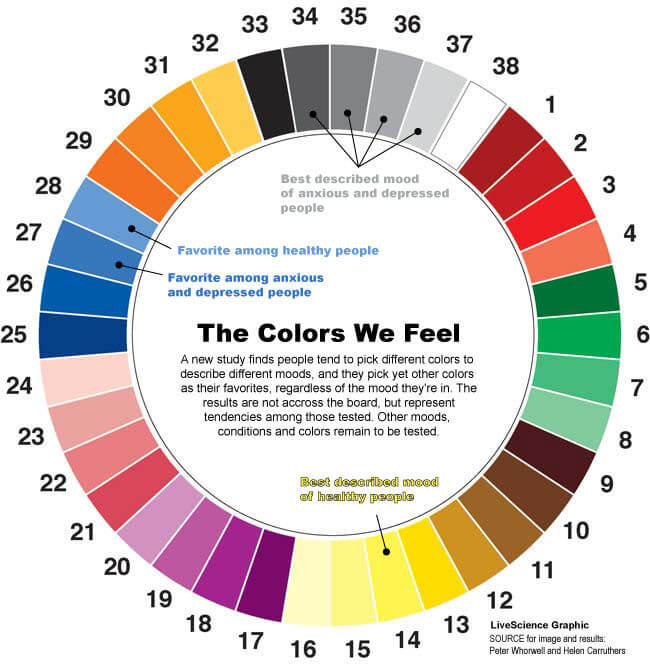
Source: LiveScience
Color is one of the things that make your company different and easily noticeable, so, when choosing colorrs for your email template, always keep in mind what emotions and mood you want to communicate to your customers.

Source: Business2Community
Blue for Men and Blue for Women?
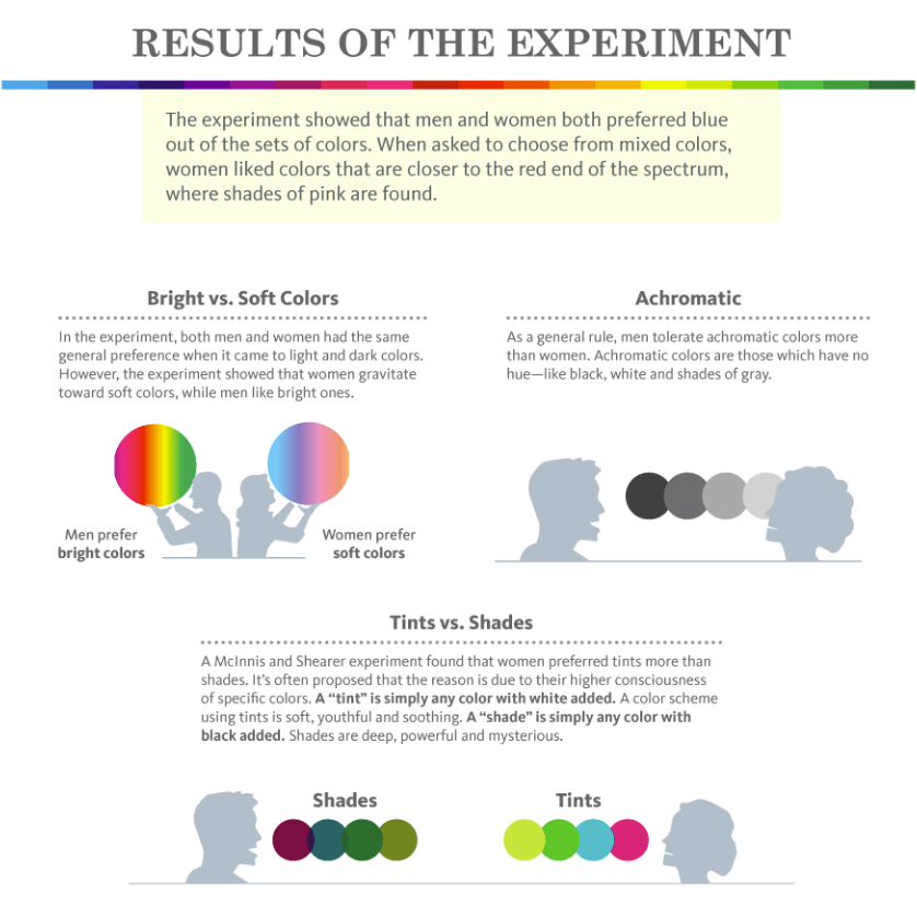
Color preferences vary by gender, the study conducted among 232 people from 22 countries by Joe Hallock shows.
Men generally tend to prefer blue, green and black, while women favor blue, purple and green.
Blue is the absolute favorite of the two genders. Some believe that it is because blue is the color of the sky and sea, soothing and calming. However, it might be that the world simply has the “blue fever” and dominance of blue is socially determined.
In the book “Blue: The History of a Color” Michel Pastoureau says that ancient Greeks believed that blue was ugly and barbaric and rarely used in the art. Over the time the popularity of blue skyrocketed, that, for instance, can be seen by blue becoming the dominant color in 20th century paintings. Nowadays we are surrounded by blue jeans, blue jumpers, blue hyperlinks and blue brands communicating trust, peace, order and loyalty.
Both sexes like blue, but women tend to define purple as another top color, may be that is why it is perceived as more feminine and glamorous.
The least favorite colors for men and women are orange, yellow and brown. It is interesting that these colors correspond to the colors marked by participants as “cheap” and “inexpensive”. Dark orange, yellow and brown may invoke associations with vomit, urine and rotting food. This might be the reason why they are generally so unpopular around the world.
Apart from that, women tend to prefer softer colors than men. Also, women favor tints (color with white added), while men like shades (color with black added).
Below you can see examples of male and female preferences from KISSmetrics blog.
Source: KISSmetrics
Blue is liked by both men and women, it is visible for people with color deficiency unlike red and green (this is why Facebook is blue), but is it a universal factor of success? The answer is no.
When you select color scheme for your email design, you should always keep in mind your target audience and adjust accordingly.
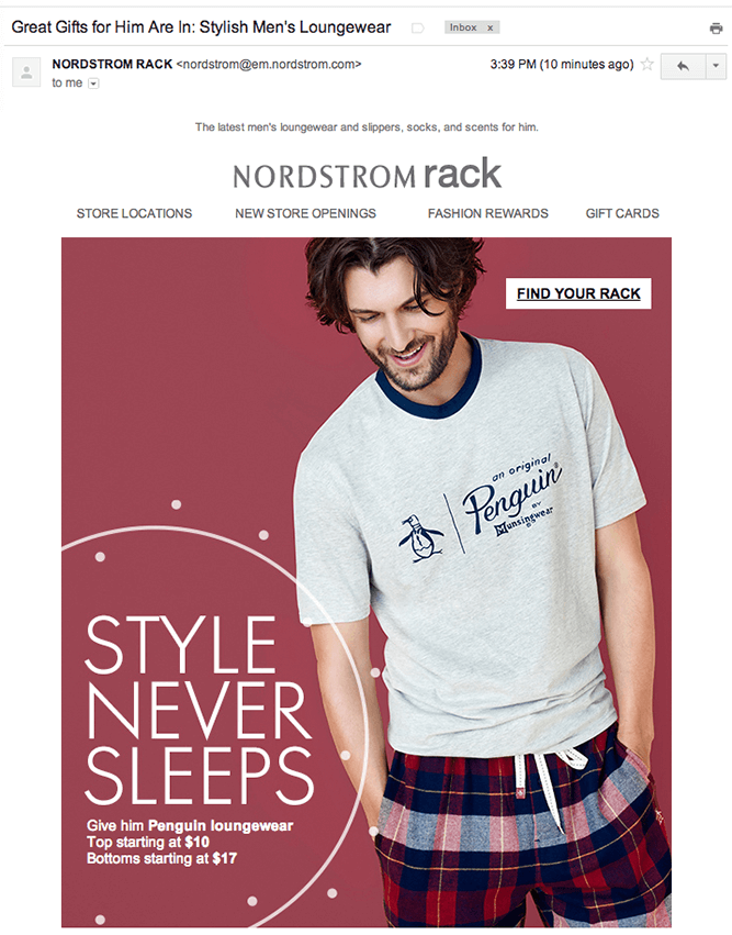
Email campaign addressed to women. Source: Shopify
Why do Little Girls Like Pink?
Recent studies show that our color preferences are determined by our experience. Customer’s color preferences are defined by entities of that color they encountered through their life and what experience they had with them, or even by social affiliation with the color, for instance, you can like certain color because it is the color of your favorite football team.
Why baby-girls wear pink and baby-boys wear blue? It was not always like that. The pink-blue demarcation line was established only in mid 1980th and is somehow connected to the rise of consumerism and spread of ultrasound. Before that baby clothing was primarily gender neutral. This is another example how color preferences are determined by social environment.
Why Japanese people refer to traffic lights as being blue rather than green?
Do all people perceive colors in the same way? Actually, not. The color perception and color meaning vary considerably among different cultures.
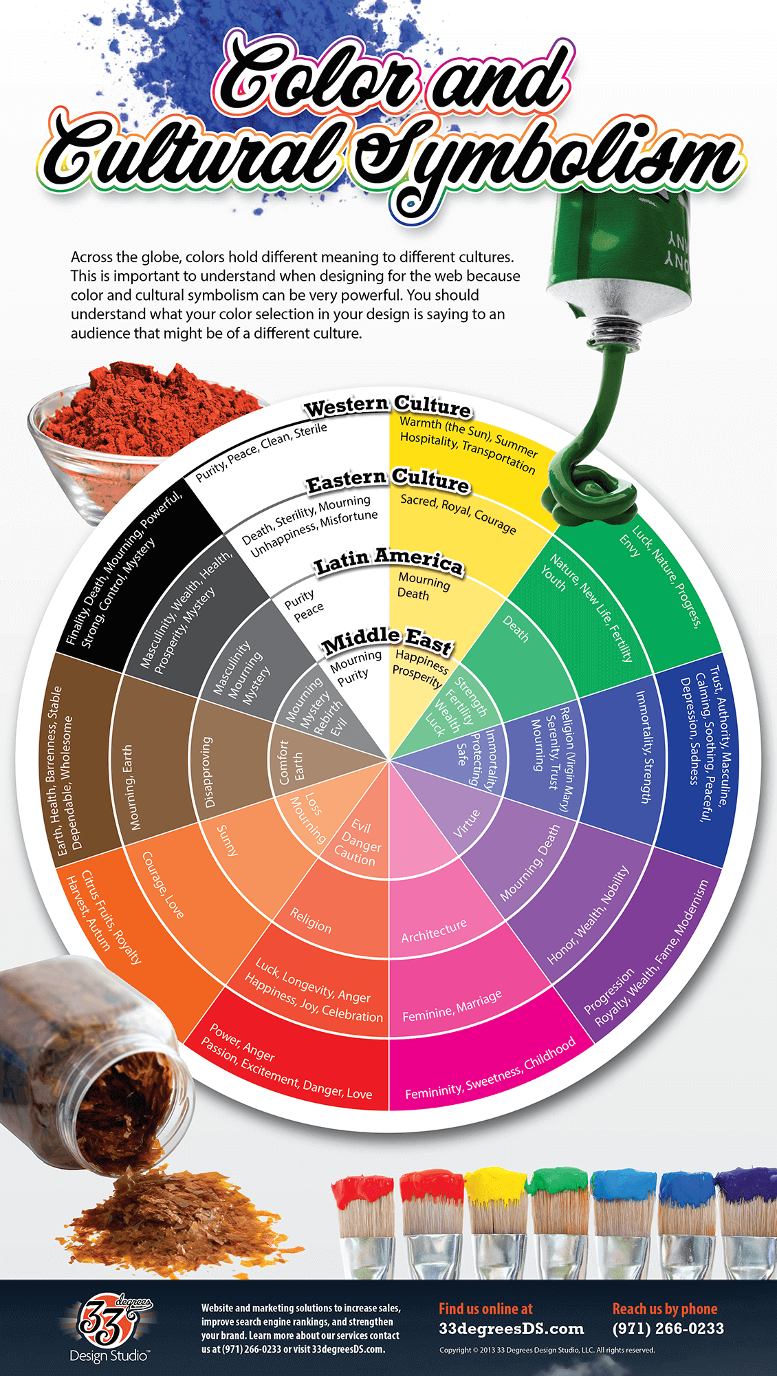
Color meaning around the world. Source: 33 Degrees Design
Moreover, linguistic relativity, meaning the language determining the limits of person’s experience, plays its role in color perception. Some languages have lack of words to describe the colors exiting in other cultures. Green and blue have the same hue and stand close to each other in the spectrum, the English language has two different names for these colors.
But in Japanese both green and blue were named for a long time by the same word Ao, only later the word Midori appeared describing the green end of the blue spectrum. Nowadays, Midori is used to distinguish green from blue, but a lot of green things, like vegetables, apples and traffic lights, are still blue in Japan and described as Ao.
Many Asian languages do not have distinction between blue and green as Shona language in Zimbabwe and the Boas language in Liberia have no words which distinguish red from orange.
It is important to remember that there are general trends in color preferences across cultures, but there is wide difference in color preferences among individuals, because their experience with things defines emotions they feel about colors.
Also, the meaning of colors varies across the cultures and this is worth considering when localizing your email design for specific cultural audience.
Email localization. Source: CampaignMonitor
Which is the Best Call-To-Action (CTA) Button Color? Red or Orange?
Background and text colors of your email template will set the general mood of your email campaign. What about call-to-action buttons? Have you ever wondered about what is the best color for CTA?
During A/B testing Hubspot found that red button performs 21% better than the green one. Gms.nl experience shows that orange button is also better than green. Unbounce simply advocates for big orange buttons. But for Monetate’s client it turned out that blue button works 9% better than the orange one. Have you already lost it?
Red or orange, it does not matter. It is impossible to predict which CTA button color will work the best in your email template and increase your conversion rate.
But it is possible to predict low conversion rate if your CTA does not stand out from the background. Monetate notices in their article:
“But, if you dig into the results, you’ll see that orange buttons were almost always tested against a control of no button at all. In cases like these, it’s hardly a surprise that orange buttons make a difference. Of course they do … when compared to no button at all! Practically any button will make a difference, regardless of color”.
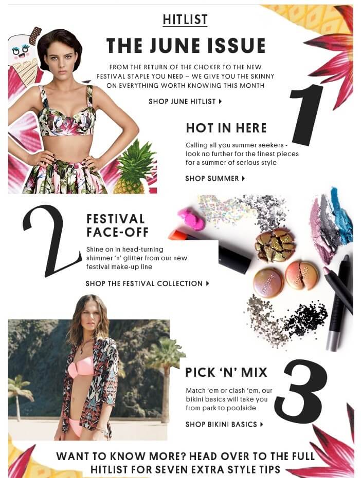
CTAs in TopShop newsletter are almost not visible. Source: Econsultancy
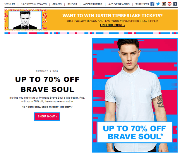
ASOS. Contrasting CTA. Source: Econsultancy
Attention span of people is getting shorter and shorter and color is the first thing customers see from your email template before they process the words.
The CTA should be the most obvious element of your email template, thus, when designing call-to-action button you should not disregard the isolation effect, because the item that stands out like a sore thumb is more likely to be remembered than the other items.
There is no magic and universal solution for CTA button color for your email design. Color matters a lot, but it is impossible to say which one has better conversion rates. However, you should always do everything possible to make your CTA button highly visible and easily findable on the screen.
Complementary and Pure Colors: How to Make Your Email CTA Eye-Catching
THREE DEEP developed simple Clockwork Conversion Color Model that helps to enhance user experience and leads to better conversion rates.
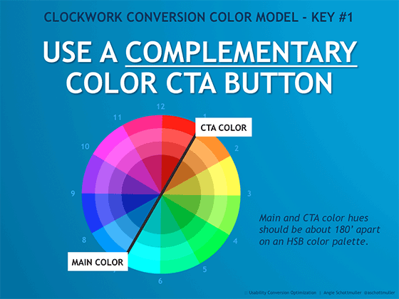
Clockwork Conversion Colour Model. Source: THREE DEEP
The Clockwork Conversion Colour Model is based on four principles:
- Use pure color (no added black, gray, or white) for the CTA button.
Use hue colors rather than tint, shade or tone colors to make CTA stand out. - Use a complementary color for your email call to action (CTA) button.
Complementary colors are the colors opposite each other on the RGB color wheel. Use complementary color of the background to leverage CTA. - Reserve the complementary color zone exclusively for CTA use only.
Complementary color zone is 15-minutes reversed zone of the color wheel (one section to the right and to the left from the complementary color). The analogue colors from this zone have buffer impact on the CTA. - Use shades, tones or tints for all other non-CTA colors.
Neutralize all other non-CTA colors by shades, tones or tints rather than pure colors (hues).
How many colors should you use in your email template?
Four colors are more than enough: main/accent color, link color, CTA color, and a grayscale option.
Color is an essential part of how we experience the world. Color communicates emotions and other non-verbal information. It is the first thing your customers notice when they open your email. Optimizing color scheme of your email template can definitely be one of the easiest ways to complement message conveyed by the email text and boost your conversion rate.