In this article you will learn:
- How to create mobile-friendly email design
- How to make your email copy mobile-friendly
More and more people read emails from their mobile phones. In February and March 2016 55% of emails were opened on mobile devices.
However, 54% of B2C companies are still using desktop-centric mobile design while the rest are trying to catch up with the trend by means of responsive or mobile-aware design. This figure looks surprising especially considering that 85% B2C companies have mobile versions of their landing pages.
Do you know how many of your customers read email on their mobile devices?
If not, it is a good time to determine their exact number and, if it is high enough, make your emails mobile-friendly.
Here are some design and copy tips that could help you with that.
Mobile-Friendly Email Design
Basically, there are three approaches to mobile-friendly design:
- Responsive email design. The content and layout of email are changed based on the user’s screen size. Nowadays it is a dominant email design approach used in B2C.
- **Responsive-aware design. **Only headers and footers of the email are responsive, while mobile-aware design is used for the rest.
- **Mobile-aware design. **It is the simplest option, because you use a single-column layout with large text and images, as well as big well-spaced buttons and links. So, you simplify your email almost to the minimum that’s why it looks good when scaled down to mobile devices.
Below you can find some universal mobile-friendly email design tips that apply to all of them.
1. Rule of thumb
When designing for mobile, you have to keep in mind that mobile phones are mostly steered by thumb. So, any links and calls to action should be easily tapped by one thumb.
Apple recommends to make calls to action 44px squared and according to Google they should be 48px squared.
You should allow enough spacing between the links. Otherwise it is very hard to access them.
Also, when you place your calls to action and links consider the areas that are most comfortable to tap. For the right dominant hand they are on the left side of the phone, while for the left dominant hand they are mirrored on the left side of the mobile device.
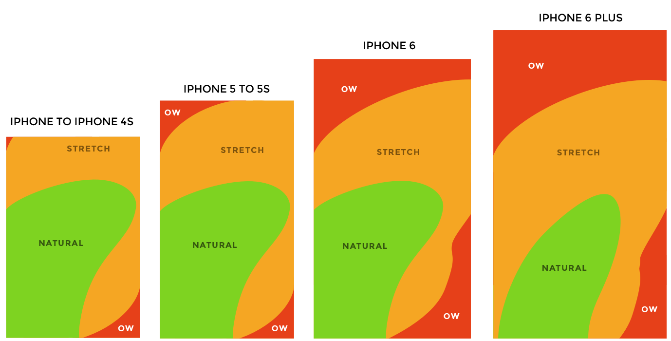
Source*: The blog of Scott Hurf*
Ideally, you should accommodate this by stretching your call to action buttons to full width on mobile screens to make it comfortable for both left- and right-handed users.
2. Layout
The width of your email layout should not be more than 600px because this size is still the safest width you can aim for. It will work even in those email clients which are full of advertising. like Yahoo Mail.
You can add 300-320px view to accommodate screens that are smaller than 480px.
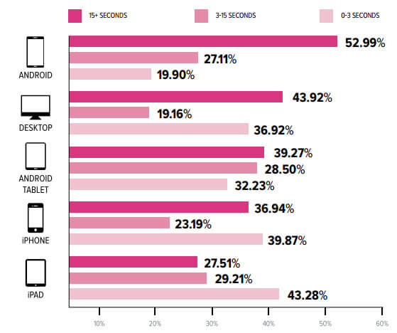
Moreover, add more white space (up to 15%). That will make it much easier to process the information. You have to optimize your email for 3-second read, because nearly half of mobile email readers spend less than 3 seconds reading your email.
If you are opted for mobile-aware design or responsive-aware design, use single column layout (in truly responsive design a two or three column layout can be easily transformed into one column by queries)
3. Fonts
The minimal font size displayed on iPhone is 13px. Keep that in mind, because anything smaller will be up-scaled in mobile-aware email design and can ruin your email. In mobile-aware design the font size doesn’t change in desktop and mobile version while in real responsive design it can be adjusted depending on screen size.
Minimum font size recommended by Apple is 16px, Google recommends 18-22px. So, test your font size before you send your email to your users.
4. Colors
Use contrasting colors that can be read easily on a small screen. Muddy colors can make emails completely unreadable.
5. Navigation and social share buttons
When possible, limit the navigation and hide social share buttons because if there is abundance of these elements it makes them very hard to use.
If it is not possible, reduce navigation and social share buttons to the minimum and make them easily clickable.
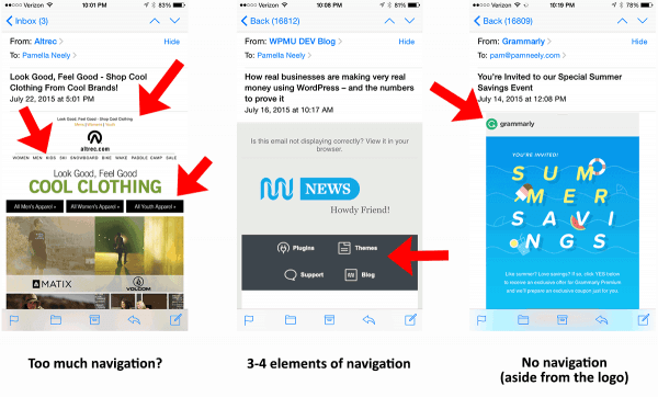
Source: Act On
6. Images
Images in your email should not be too heavy. Otherwise they will obstruct email loading.
You are good if you can keep the size of your email with images below 500 KB. The less the better!
Besides that, don’t forget about ALT Text, because there are still some email clients that don’t display images by default.
Check out our 12 Extremely Easy Tips for Effective Use of Images in Email Design for more information.
Mobile-Friendly Email Copy
When you create mobile-friendly email copy you need to focus on two goals:
- Make your subscriber open your email
- Optimize for 3-second read, because it is unlikely that someone would spend more time reading your email on a mobile device.
Source: Emailmonday
1. Subject line
Typically, you can see 60 characters of email subject line on a desktop. On mobile the subject line preview is limited to 25-30 characters.
So, either keep your subject line under 40 characters or put all important information within the first 30 characters.
2. Preheader text
Preheader text is the first line of your email copy. It provides more detailed information about the email content before you open the email itself.
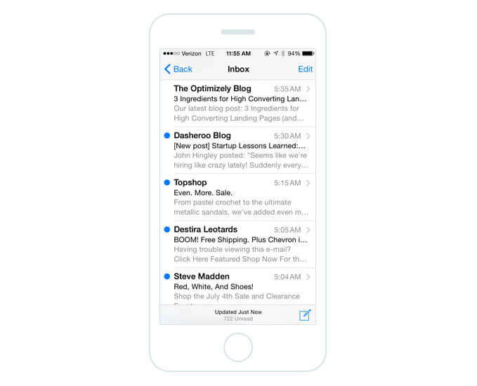
Source: Campaign Monitor
Don’t neglect preheader text as it can act as a hook that will make your readers to open your emails.
3. Body text
When creating your email, be brief and persuasive.
Your email copy should be easily scannable and consumable.
Use short paragraphs, headlines, bullet lists and other ways to break your copy down into easily digestible chunks of content.
Most likely, your readers will be multitasking when reading your email. So, you have to make it easy for them to read your text, otherwise they will stop reading after the first paragraph.
Brands have seen up to 146% in conversions by making email copy short and focused, ditching graphics, and putting CTA at the forefront.
Testing
Before you send your email to your audience, don’t forget to test it.
If your EPS doesn’t have email preview for mobile devices, you can us Litmus.com, Email on Acid or Inbox Inspector.
Key points of this article:
- You should not ignore mobile-friendly email design, if a significant part of your audience reads emails on mobile devices.
- It is up to you to decide what approach to mobile friendly devices you will use: mobile-aware, responsive-aware or responsive. Mobile-aware might be the easiest to implement as it is simple and does not require a lot of extra coding.
- *There are some factors, such as reading length and usual ways to tap on smarphones, you have to consider in your mobile design. *