The easy part of any email marketing campaign is to create emails of various sizes, shapes, and flavors. The hard part is to create emails that actually get opened and read. Before you even begin to create emails, first download our free guide, “The Definitive Guide to Email Marketing Strategy.” Then consider these statistics:
- According to MailChimp, email opens hit their peak between 9 a.m. and noon.
- Emails sent on Tuesdays achieve the highest open rates, according to a study conducted by Experian.
- Research conducted by ContactMonkey showed that open rates drop by 60 percent for emails with four or more words in the subject lines.
- B2B emails with words such as “reports,” “forecasts,” and “intelligence” in the subject lines have decreased open rates, according to Adestra.
Getting your email opened is more than just playing the statistical odds – in this case, sending your emails only between 9 a.m. and noon on Tuesdays, while limiting your subject lines to three words that are free of overused terms. To maximize effectiveness, keep these tips in mind when you create emails for any of your marketing campaigns.
First, Create Emails that get Opened
Start with an appealing subject line that differentiates you from everyone else competing for inbox space – subject lines that seduce your recipients into opening your emails.
This means that you need to create emails with subject lines that command attention. A vague subject line like “Our June Newsletter” will surely go unnoticed. However, “6 Email Marketing Secrets” will jump out at the recipient for the following reasons:
- Numbers in subject lines stop wandering eyes.
- “Secrets” is a power word that makes the subject line stand out. Power words are sensory and emotional words that attract attention.
- It piques curiosity. It infers that you know something the recipient doesn’t, and that you are willing to share this important information.
- It promises something good. If recipients understand exactly what they’ll learn or how you’ll make them more educated of better at their job, then they’ll be hungry to read more.
If your subject line is relevant to the recipient, reflects what’s enclosed in the email, and states a clear benefit, you will increase your chances that the email will be opened.

Second, Create Emails that are Engaging
So, your recipients are opening your emails. Now what? How do you gain their trust and keep them reading once the email is opened? Here are a few tips you should heed every time you create emails:
- Less is more. The best emails will be under 300 words.
- Check your grammar. Every test of email performance has shown that proper grammar improves conversion rates. What’s more, grammatical errors in subject lines are the fastest way to kill an otherwise good email marketing campaign.
- Highlight your product/service benefits. If you create emails that attempt to sell your product or service in your email, you are sure to see less-than-optimal conversion rates. Rather than selling your product or service, sell the benefit your product or service offers.
- **Have a clear call to action. **Don’t make your readers guess at what they should do next. Create emails that state it: “Get this special pricing now by clicking the link below.”
- Use the word “you.” Sprinkling “you” throughout your emails shows that you are interested in the recipient, and not just in selling a product or service. “You” is one of the most persuasive words in our copywriting arsenal. Use it willingly.
Third, Design Your Emails for Mobile
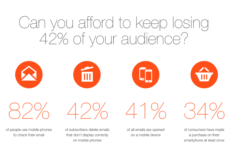
When you create emails, think mobile first. A recent study by ReturnPath reported that 63% of Americans and 41% of Europeans would either delete or close an email that is not optimized for mobile. That same study showed that approximately 88% of corporate emails are now being opened on mobile devices.
The take away? If your emails do not perform well on mobile devices, your email marketing campaign will suffer. Follow these 10 email design tactics, and you will see improvements in your email open and conversion rates.
Most email recipients will view your email in their email client’s preview pane with images turned off. For this reason, make sure your email template is not more than 600 pixels wide; emails wider than this will cause your recipients to have to scroll horizontally to read your entire message – which is a strict no-no.
Fourth, Create Emails that Adhere to Best-Practice Design
It is best practice to clearly state your customer value proposition in the first one-inch of height (roughly 100 pixels). If you are also able to get a link in that first inch, so much the better. While you may be tempted to put a beautifully designed header at the top of your email – and many designers do exactly that – your value proposition and link to your landing page will yield better results.
Other best practices include:
- Staying above the fold. Keep your main message and call-to-action above the fold – in other words, in the area of the email that is visible without scrolling. Content below the fold will not be seen by as many as 70% of recipients.
- Using bullets. Bullets are not only a great way to highlight important message points, but also introduces white space into the email, which improves readability.
- **Personalizing emails. **Studies conducted by Aberdeen Group have shown that sales conversion rates increase by 10% and click-through rates by 14% when adding personalized recommendations into marketing emails.
- Including links to landing pages. Your goal is to drive traffic to your website, product page, or landing page. To increase your conversion rates, include lots of links – the gold standards is at least one link per paragraph of text – and make sure your links look like links. Don’t underestimate the power of “click here” messaging.
Fifth, Bulletproof Your Emails with EDMdesigner
We spent more than three years to create the most flexible drag-and-drop responsive email editor on the planet. Our cloud-based email editor is used by end users, enterprises, and agencies to create emails that are stunning. Here are some of the robust features that you get with EDMdesigner.
- Drag-and-drop interface: We offer an extremely versatile drag and drop interface, so you can build almost any email design imaginable.
- Bulletproof responsive email code: No more HTML coding – ever – with compatibility with more than 90% of all desktop, mobile, and web email clients.
- Create email templates once and reuse forever: Save your email templates, as well as your favorite elements like a news block, branded header, or the unsubscribe information. Reuse them over and over again.
Try the demo and see for yourself by clicking here.
Additional Reading
- EDMdesigner: “The Definitive Guide to Email Marketing Strategy”
- Entrepreneur: “If Your Cold Sales E-mail Didn’t Get a Response, Make it Hot”
- Fast Company: “The 5 Things Your Emails Need to Include to Get People to Read and Respond’
- Entrepreneur: “Top 10 Ways to Get People to Read and Respond to Your Emails”


