On August 31, 2016, a huge thing happened. Gmail started to support display:none; in email. The email community blew up. Everybody was tweeting about it and a lot of email developers started to play around with it.Although it was very exciting news from Google, even bigger news happened on September 14, 2016. Google has announced that they will expand their CSS support, which means that they will support the style tag in the head of the email HTML. They are going to support many CSS properties but most importantly they will also support media queries.
Needless to say, this is the biggest news in email marketing and email design in the last decade.
Litmus, Email on Acid, Eliot Ross and many others have written great articles about it. They are focusing on the possibilities, the long and short term effects of this major update, and questioning the unknown things.
One of my favorite tweets on this topic is from Nicole Merlin, a well known email design and development expert from Australia:
WE CAN ALL RETIRE https://t.co/qKRTV6Nnev
— Nicole Merlin (@moonstrips) Sept 15. 2016.
As you can see, this is the holy grail of email design. Email developers have huge expectations for the update, in the hopes that it will rewrite the rules of email coding.
Just like anyone else on this field, we – at EDMdesigner – want to see it in real life already. We want to play around with it and we want to test every single detail to find the caveats and to rewire our brains to embrace the possibilities of HTML email of the 21st century.
We are so EXCITED! We want to know the most crucial details as soon as possible.
This is why we took the example HTML from the official documentation and we crafted some basic test cases to see what’s really possible in the new (web and mobile) email clients of Google.
We also included the Litmus tests of other email clients upfront to gain a more complete picture of the HTML email of the future. (At the moment we can just assume that everything will work smoothly on Gmail, but we will find out soon if we re-run the tests we created.)
Besides the basic examples, we created a more complex template in which we can show how much easier our lives and how much smaller our email HTMLs will be.
UPDATE 05/10/2016
On the 29th of August, rumours started to spread, that Gmail had started to support the stlye tag. We did not see any evidence for this, but it’s obvious that they cannot update the whole system all over the world at once.
We re-ran the tests on the 3rd of October. We saw some changes. Search for the world UPDATE in the article to see what we experienced.
The Most Important CSS Properties to Test
The most essential CSS properties to check are the ones which we can use to create layouts. These properties are the followings:
- width, min-width, max-width
- height, min-height, max-height
- float
- display
Together with media queries we can adopt our design to different screen sizes.
Below you can read short descriptions of them to help you understand why they are so critical in email design.
Width and Height Related CSS Properties
If you want to create complex layouts without tables, the most important CSS property is the width. Without width, all of the block elements will be 100% wide. In this case, it would not be possible to create multiple column layouts or to adjust them accordingly.
Until now, Gmail converted the width to min-width, so it changed the element to 100% wide, which usually messed up the design.
The min-width and max-width CSS properties are also very important. These properties help us to set the boundaries of an element. Together with media queries we can fine tune our elements on different devices. We can even adopt our design to large screens if we forget about the famous and well known 600px limitation.
With the min-height prop, we can create div based columns with the same height next to each other. You don’t want to use the simple height property for this, because with overflow: hidden some part of your content might not be visible.
Similar things could happen on the mobile view with using the height property. With media queries we can set its value to auto, to prevent unneccesary spaces on the mobile view.
The Float CSS Property
On the web, using float is the standard way to create complex layouts. To place elements next to each other, set the float property to left or right.
Unfortunately Outlook does not support float left and right, so it won’t be the way to go. (Or we need some fixes for legacy clients.)
Also, float left and right will allow you to wrap text around an image from one of the sides.
The Display CSS Property
As I said before, the first step was that Gmail started to support display: none from the 31st of August, 2016. With the combination of media queries it enables email designers to hide certain parts of the email on mobile devices with ease.
Besides that, the other display values are also crucial in email design.
With display: block you can set the width and height properties of an element and you can add margin, padding, and border to it. The default width is 100% and the default height is auto. If you want to create multi-column layouts without tables, it is necessary to set the width of a block element.
There are lots of elements in which the default display is block, but we can set it on inline or inline-block elements as well if we want to. (For example on a span.)
One of the most fundamental applications of display: block is when you are creating buttons. If you want to create a link that is easy to tap on a mobile device, you need to set the display property of the link to block. This means the link will have dimensions and will be significantly easier to tap on touch screens.
A typical example of an inline element is the text. They are placed next to each other and they don’t have measurable dimensions – it’s always the container which defines the available width, and the container’s height is calculated based on the needed space for the inline element. They cannot have margins, but they can have paddings on the left and right side of the element.
If you want to set the dimensions, borders, margins or paddings (to all directions) of these elements, then you need to set their display property to inline-block. As the name suggests, it’s the combination of inline and block elements. This can be another way to create complex layouts.
And there is the sci-fi category, the flex, flex-box, and grid properties. We also conducted a simple test with display: flex to see how these fancy new technologies can perform on different email clients.
Other Interesting CSS Properties
There are many more things which will be supported in Gmail, for example font related things to help us to use enhanced typography.
My favorites are the background related properties with which we will be able to use modern techniques in emails – which will significantly improve the visual possibilities.
To be honest, all of these properties compared to the previous ones seem to be secondary, so we will focus on ones described in the previous section.
Basic Tests
In this section, we assume that Google’s email clients will work properly. If they won’t then we will instantly see it on the tests and we will include them in the results in this study.
At the moment of writing this article, the changes haven’t been made yet, so on the Litmus tests, Gmail and Inbox results will look quite bad. Hopefully it will change very, very soon.
The tests are very simple and are focusing on the most important CSS properties described in the previous section. We test them in two ways: mobile first and desktop first.
We evaluate the results based on how it should look like on that specific email client.
TL;DR – skip to the summary of this section.
Mobile First Basic Tests
As I mentioned previously, we started out our tests based on the test HTML from the official developer documentation by Google. That small example is made in a mobile first fashion, which means that the default view is optimized for smaller screens. If the screen is large enough – in this case wider than 500px – then some CSS properties’ values will be overwritten.
These tests will only pass on those desktop or web email clients that support media queries. Most likely, these are the modern email clients.
On mobile email clients, everything should be fine. Again, we can only assume that these tests will pass on Gmail, Inbox, and Google apps. We hope for the best, but we will see soon.
Mobile First – fixed width
Failed on:
- Lotus Notes
- IBM Notes
- Outlooks under 2016
- Windows 10 Mail
- Outlook 2016 on Windows (but not on OS X)
- Office 365
UPDATE 05/10/2016
Litmus test results (update 05. 10. 2016)
Mobile First – min-width:
Failed on:
- Lotus Notes
- IBM Notes
- Outlooks under 2016(except 2011)
- Outlook 2016 on Windows (but not on OS X)
- Windows 10 Mail
- Outlook.com
- Office 365
UPDATE 05/10/2016
Litmus test results (update 05. 10. 2016)
Mobile First – max-width:
Failed on:
- Lotus Notes
- IBM Notes
- Outlooks under 2016(except 2011)
- Outlook 2016 on Windows (but not on OS X)
- Windows 10 Mail
- Outlook.com
- Office 365
UPDATE 05/10/2016
Litmus test results (update 05. 10. 2016)
Mobile First – min-height:
Failed on:
- Lotus Notes
- IBM Notes
- Outlooks under 2016(except 2011)
- Outlook 2016 on Windows (but not on OS X)
- Windows 10 Mail
- Outlook.com
- Office 365
UPDATE 05/10/2016
Litmus test results (update 05. 10. 2016)
Mobile First – display:
Failed on:
- Lotus Notes
- IBM Notes
- Outlooks under 2016(except 2011)
- Outlook 2016 on Windows (but not on OS X)
- Windows 10 Mail
- Outlook.com
- Office 365
UPDATE 05/10/2016
Litmus test results (update 05. 10. 2016)
Mobile First – float:
Failed on:
- Lotus Notes
- IBM Notes
- Outlooks under 2016(except 2011)
- Outlook 2016 on Windows (but not on OS X)
- Windows 10 Mail
- Outlook.com
- Office 365
UPDATE 05/10/2016
Litmus test results (update 05. 10. 2016)
Desktop First Basic Tests
Unlike in the mobile first tests, here we start out from the desktop view, and if the width is not big enough, we apply different values to certain CSS properties on certain elements.
This means that those mobile clients which support media queries should work well.
The desktop clients also should work well if they apply the examined CSS property to the actual HTML element. In these cases these are ***div***s, so there has to be tons of problems with Outlooks. (OMG, that dinosaur again!)
Desktop First – fixed width:
Failed on:
- Outlook 2007/2010/2013
- Outlook 2016 on Windows (but not on OS X)
- Windows 10 Mail
UPDATE 05/10/2016
Litmus test results (update 05. 10. 2016)
Desktop First – min-width:
Failed on:
- Outlook 2007/2010/2013
- Outlook 2016 on Windows (but not on OS X)
- Windows 10 Mail
UPDATE 05/10/2016
Litmus test results (update 05. 10. 2016)
Desktop First – max-width:
Failed on:
- Lotus Notes
- IBM Notes
- Outlooks under 2016(except 2011)
- Outlook 2016 on Windows (but not on OS X)
- Windows 10 Mail
UPDATE 05/10/2016
Litmus test results (update 05. 10. 2016)
Desktop First – min-height:
Failed on:
- Lotus Notes
- IBM Notes
- Outlooks under 2016(except 2011)
- Outlook 2016 on Windows (but not on OS X)
- Windows 10 Mail
UPDATE 05/10/2016
Litmus test results (update 05. 10. 2016)
Desktop First – display:
Inline/inline-block or block handling failed on:
- Lotus Notes
- IBM Notes
- Outlooks under 2016 (except 2011)
- Outlook 2016 on Windows (but not on OS X)
- Windows 10 Mail;
Flex handling failed on:
- Lotus Notes
- IBM Notes
- Outlooks under 2016(except 2011)
- Outlook 2016 on Windows (but not on OS X)
- Windows 10 Mail
- GMX.de
- Web.de
- Yahoo Mail
UPDATE 05/10/2016
Litmus test results (update 05. 10. 2016)
Flex does work on Gmail and Inbox webmails!
Desktop First – float:
Failed on:
- Outlook 2007/2010/2013
- Windows Mail
- Outlook.com
- Office 365
UPDATE 05/10/2016
Litmus test results (update 05. 10. 2016)
Summary of the Basic Tests
As you can see, the results of the mobile first tests were much worse than the desktop first. (Again, here we exclude Gmail from the investigation, because we assume that it will work nicely soon.) It’s because desktop email clients have been existing for a long, long time – much before media queries arose.
Based on this, we can conclude that desktop first approach can be a better solution especially if we want to use multi-column layouts on desktop (or web based) email clients.
You still have to check what kind of legacy email clients you have to support, because each of them might need different fixes and hacks to make the email enjoyable. If you still have lots of people with legacy mobiles on your list, then you might stick to the mobile first approach. Even better if you simply create a one-column layout. Just don’t overcomplicate things.
Let’s talk about our favorite prehistoric creatures: Outlooks. Well… As we know – and it’s clearly visible from the tests – most of the Outlooks don’t apply the width and float CSS properties to divs, so we still have to use tables.
I hope Litmus and Microsoft will make email better very, very soon. Until that, it might be an option to use a hybrid solution, where we use IE conditionals so only Outlooks will have to use the greatest invention of the 90’s.
Last but not least, when Gmail will support the style tag, we can forget about inlining. Or can we? On Outlooks and on old legacy webmails you have to put the properties inline on td elements. Therefore you will need to check the proportions of different email clients on your list thoroughly.
If you don’t have to support those clients, then the size of your email will shrink a lot. What a great day it will be!
UPDATE 05/10/2016
From the updated basic tests it’s clearly visible, that Gmail and Inbox supports the style tag – and media queries also.
The downside is that the update of Gmail and Inbox apps might take a while. On older Android versions, people might not be able to update their Gmail app.
We tried some test emails on several devices. On my Nexus 5X, the basic example from the official gmail documentation worked, but it did not on my colleague’s smartphone with a little bit older Android.
Unfortunately if you use your Gmail in Google Apps, that’s still not supporting the style tag.
A Complex Example
In the previous section we have checked the selected basic features. Now let’s build a more complex example with multiple columns. We will create a template with asymmetric multi-column, which is usually a tricky thing to handle. Besides that, we will hide the last column in our template on mobile devices.
Based on the take aways from the previous section, we definitely start from a desktop first approach.
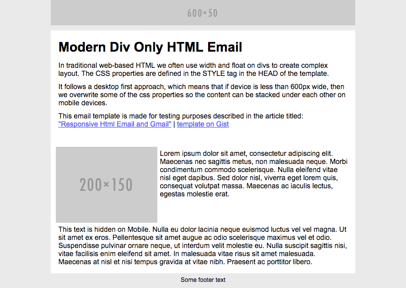
Above you can see the desktop version of the template in a browser. This is the end result of what we want to see on desktop and web based email clients.
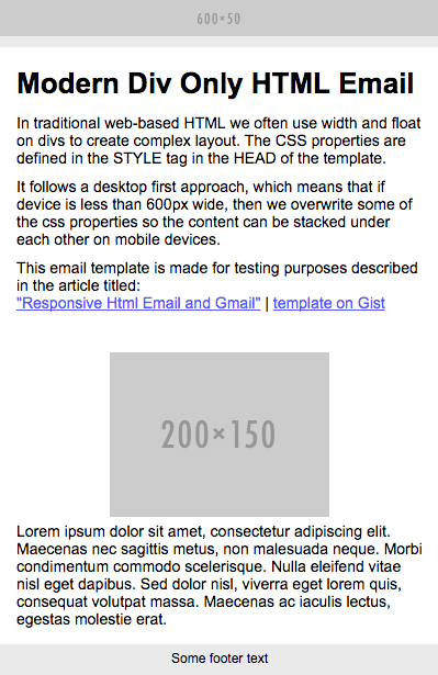
On this picture, you can see the mobile version of the template. As you can see, the multi-column is stacked under each other and the last paragraph is hidden. If we won’t see something very similar on mobile email clients, then there will still be inconsistency in the universe.
In these examples, the screenshots of Google’s email clients won’t be very nice because the update has not yet been released prior to publishing this article. We will include the updated Litmus tests and screenshots when they are available.
Modern Div Only HTML Email
In traditional web-based HTML we often use width and float on divs to create complex layout. The CSS properties are defined in the style tag in the head of the template.
This template follows a desktop first approach, which means that if the device is less than 600px wide, then we overwrite some of the CSS properties so the content can be stacked under each other on mobile devices.
When the changes will be live on Gmail, this template should render properly.
The results
Below, you can see the screenshots from the Litmus tests of some of the most important email clients.
Android Gmail App – before the update

Apple Mail 9
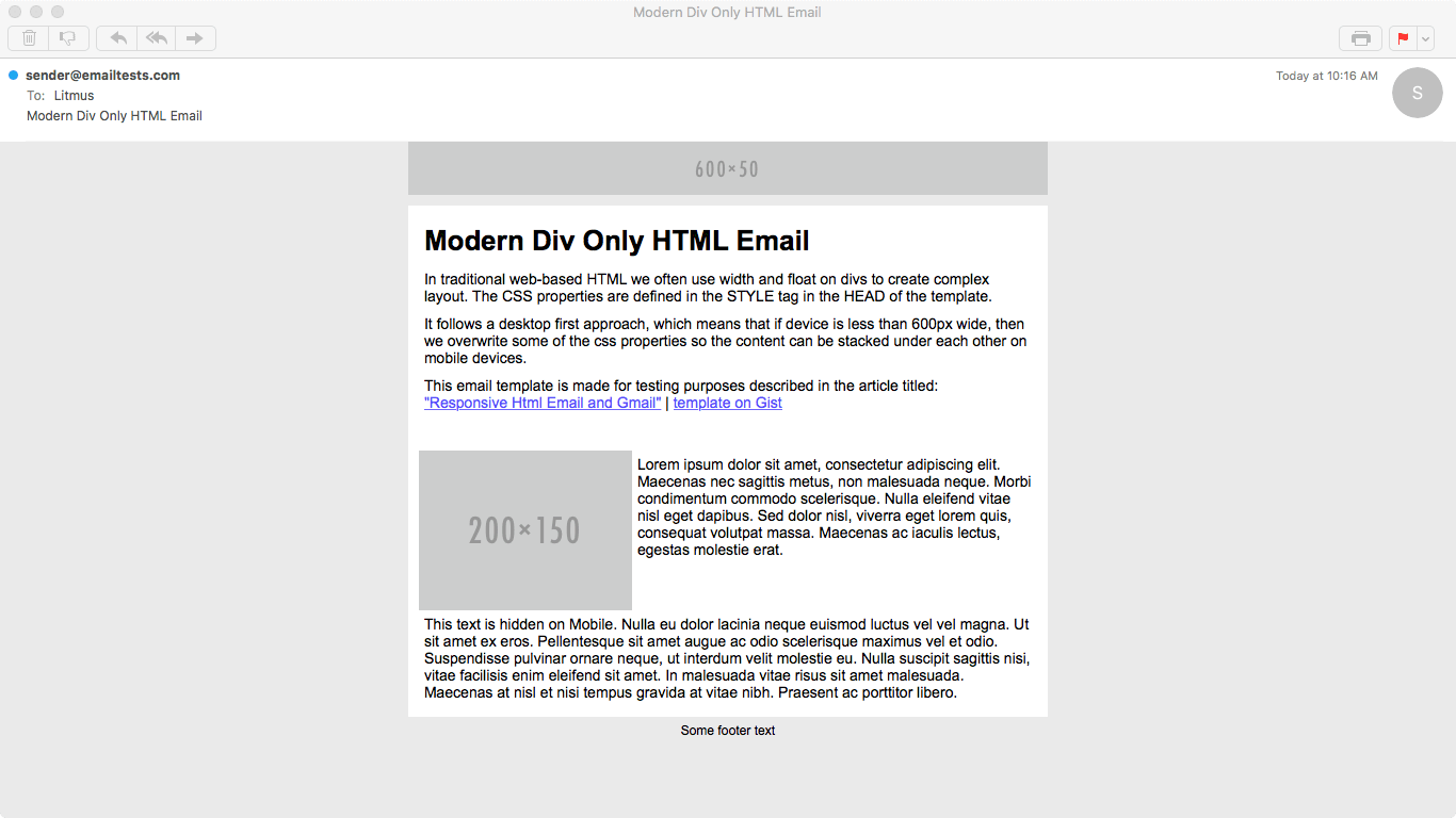
Gmail on Chrome – before the update
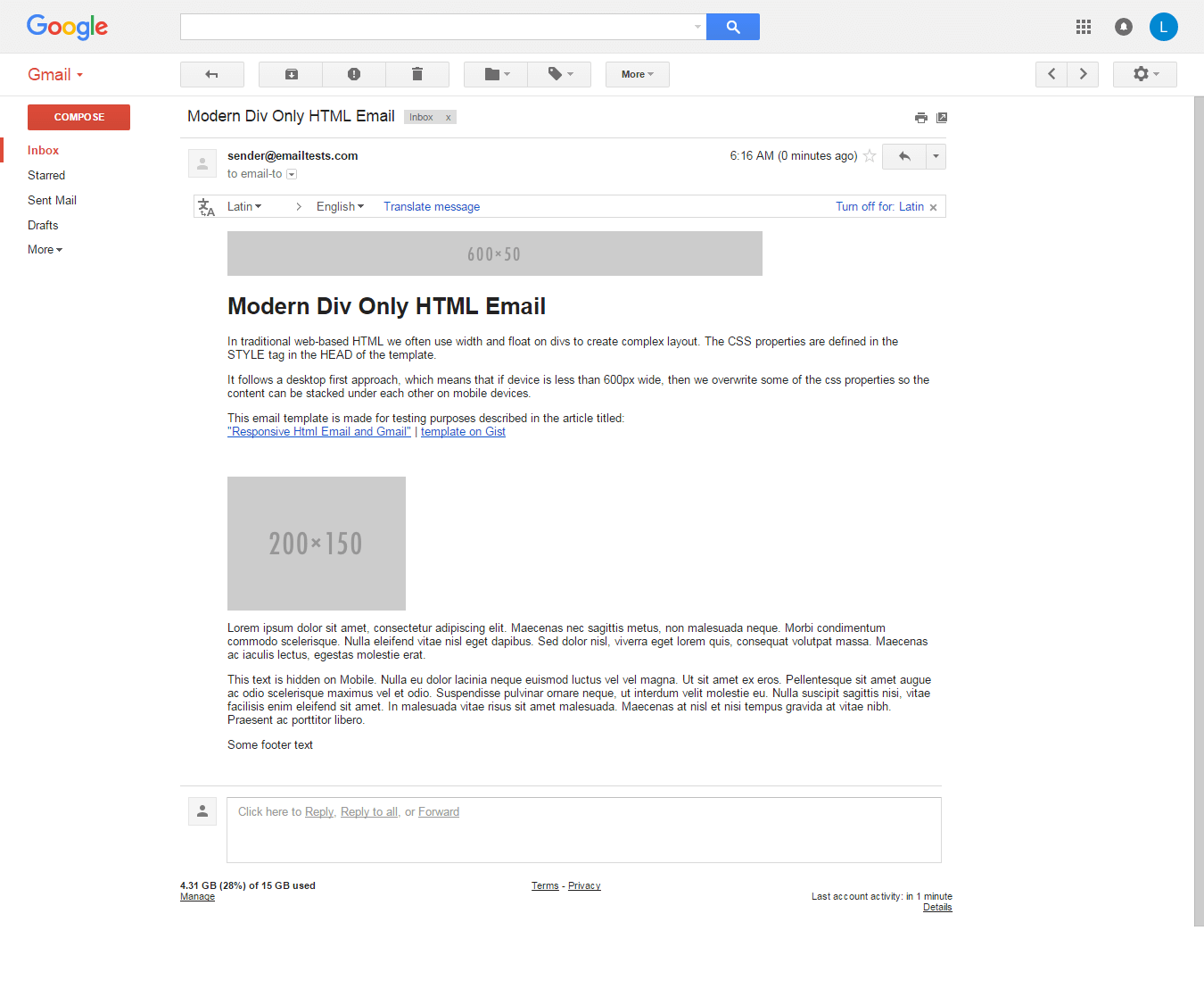
Inbox on Chrome – before the update
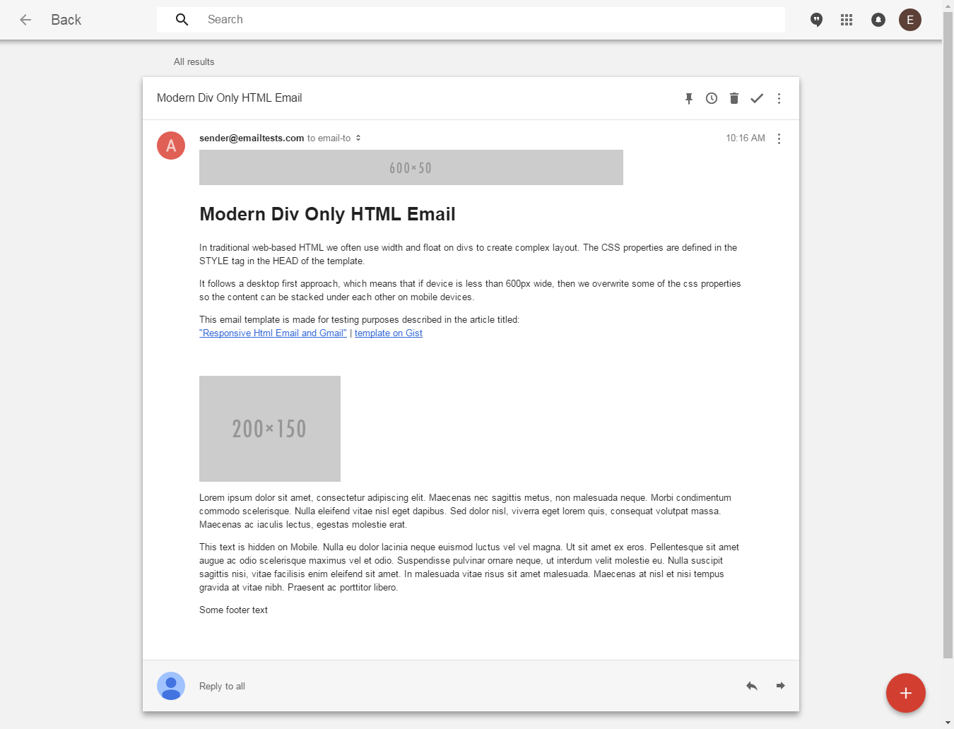
Outlook 2013
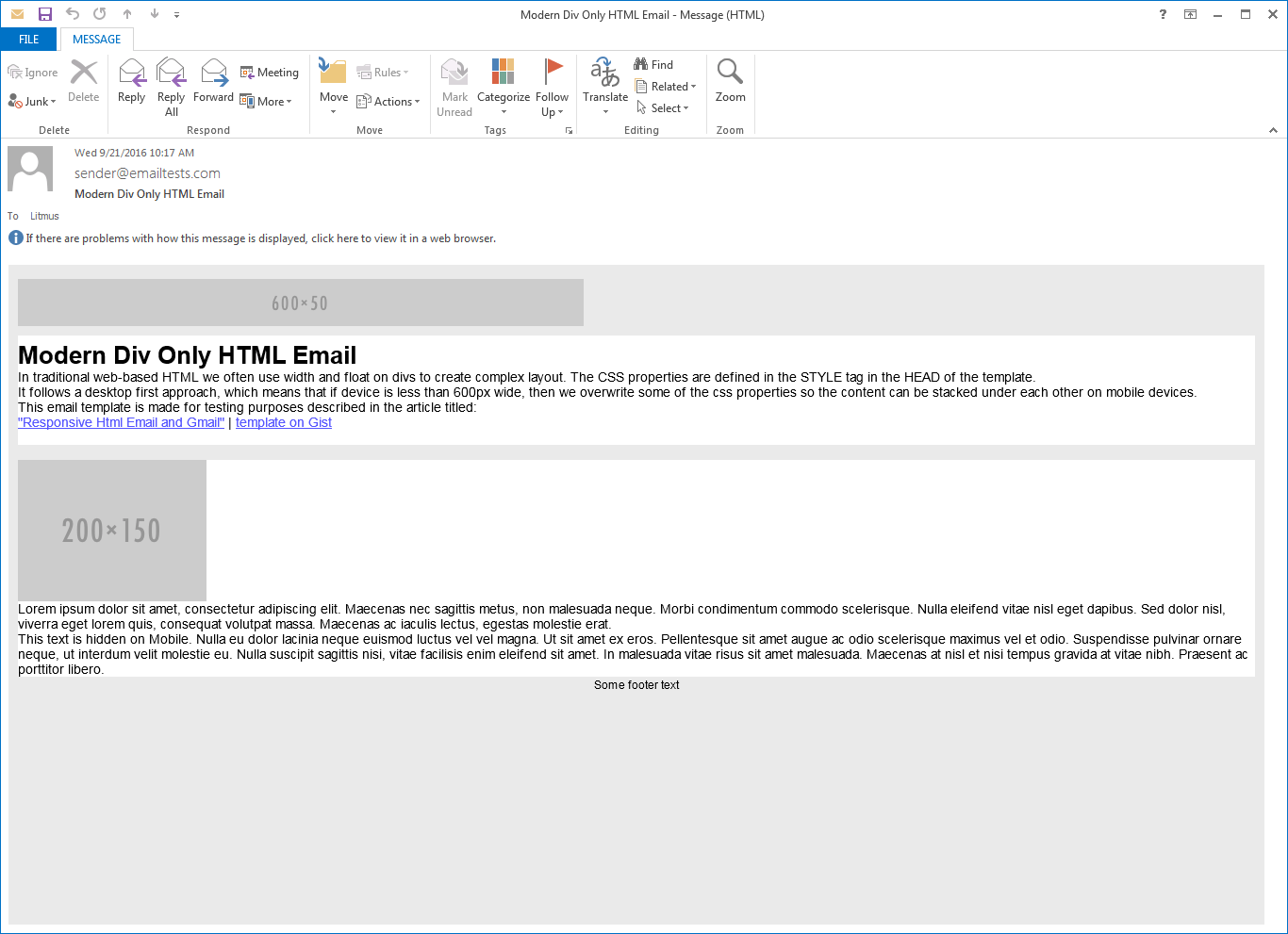
Litmus test results | The size of this email is 4724 bytes.
We will include the screenshots of Google’s email clients after they will have extended their CSS support.
As you can see in the tests, for Outlooks it’s not a good solution because they don’t apply the width and float CSS properties on divs. We need to use tables to fix it, but we can use them together with IE conditionals.
UPDATE 05/10/2016
After looking at the div-only test, we were devestated. Nothing worked, although the basic tests worked well.
We figured out that Gmail still strips out the style tag in some cases. It happens with the CSS resets, so if we put that into a separate style tag, everything will be fine!
You can check out the updated code and test results below:
Litmus test results – 05. 10. 2016
Hybrid – Div and Table Based – HTML Email
On old Outlooks and on IE rendering engine based email clients, we can stabilize our code with conditional comments and tables. (Those email clients do not support float and width properties on divs as we mentioned several times before.)
The results
Below, you can see the screenshots from the Litmus tests of some of the most important email clients.
Android Gmail App – before the update

Apple Mail 9
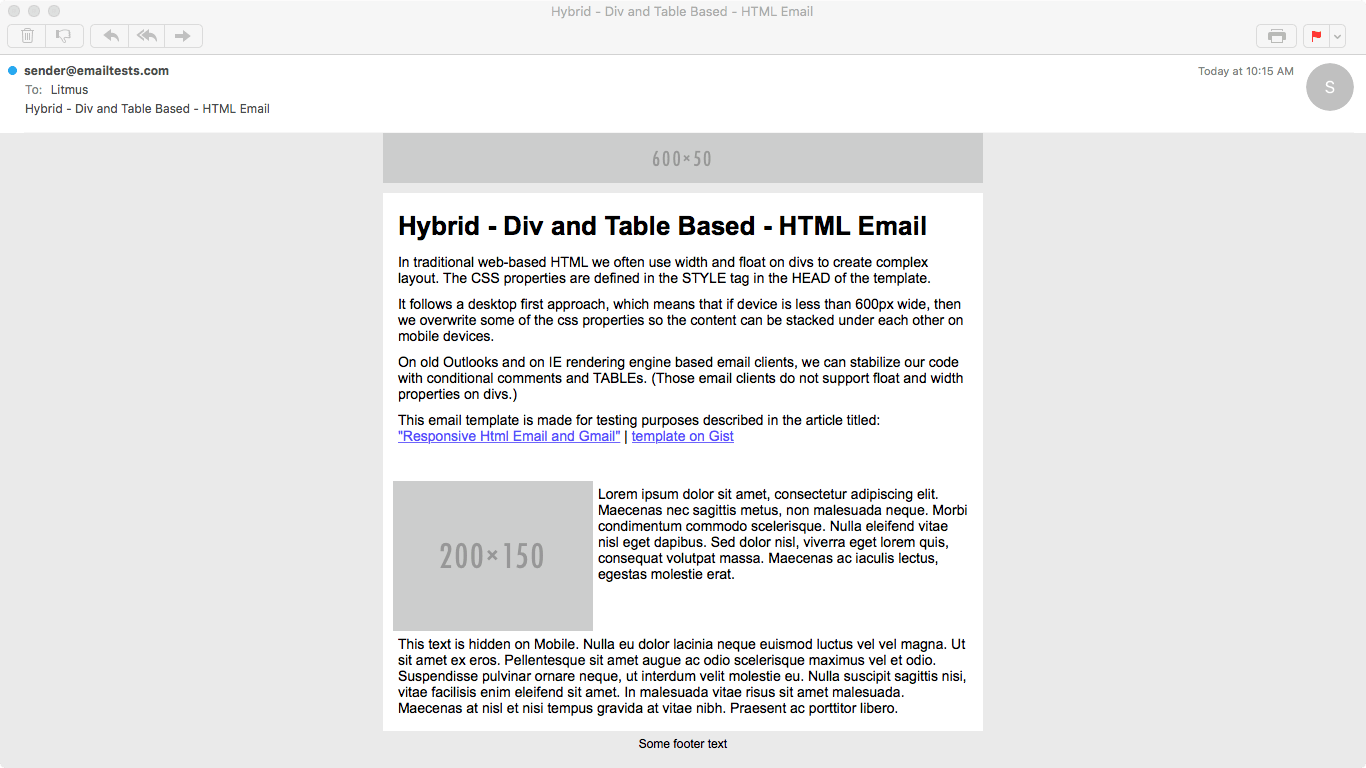
Gmail on Chrome – before the update
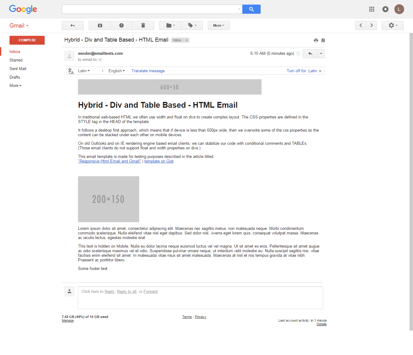
Inbox on Chrome – before the update
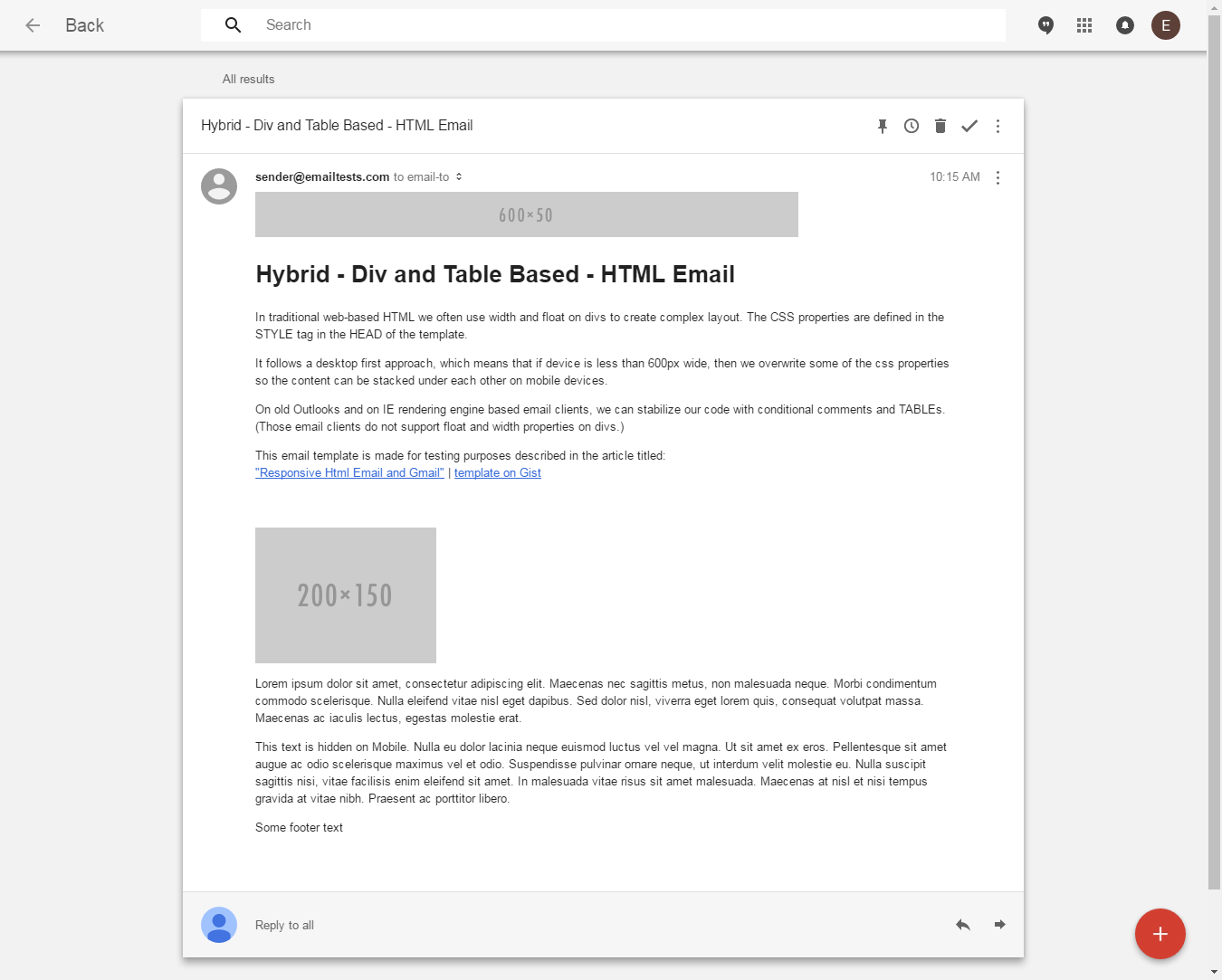
Outlook 2013
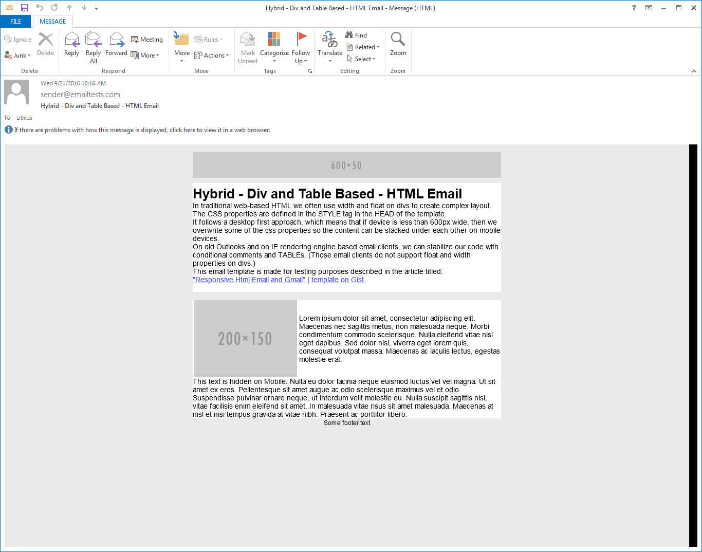
Litmus test results | The size of this email is 5591 bytes.
We will include the screenshots of Google’s email clients after they will have extended their CSS support.
We can be very happy, because the layout on Outlooks are fixed! As you can see with this method, the size of the HTML is not extremely big, but it’s already rendering well on every important email client.
If you look into the tests carefuly, you will see that there are some clients which don’t render the layout well. In our test case it’s Web.de and Gmx.de and there might be tons of legacy desktop and web based clients for which tables are the only solution. With this hybrid approach we applied tables only to Outlooks, that’s the reason why they did not render well on other legacy clients.
UPDATE 05/10/2016
We applied the fix on this template as well. Below, you can see the updated code, we separated the CSS resets into a separate style tag:
Litmus test results – 05. 10. 2016
The Original EDMdesigner Method
On legacy email clients, in most of the cases DIVs or CSS properties on them are not supported. In the case of Outlooks, the only way to format our layout property is to use TABLE/TR/TD tags.
These old clients do not support media queries, so the destop first approach is the way to go.
The results
Below, you can see the screenshots from the Litmus tests of some of the most important email clients.
Android Gmail App – before the update

Apple Mail 9
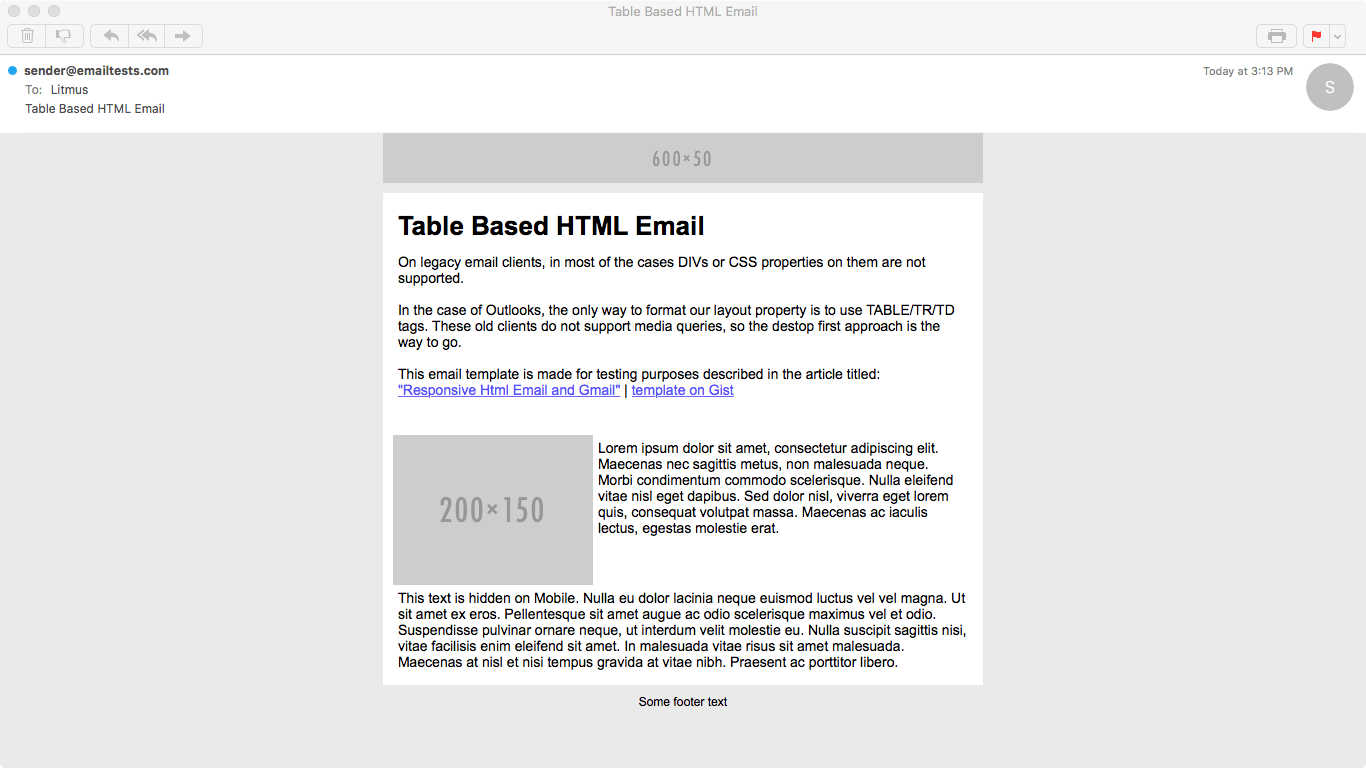
Gmail on Chrome – before the update
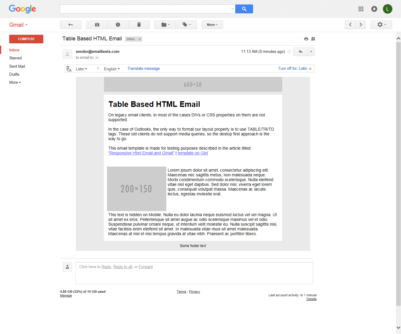
Inbox on Chrome – before the update
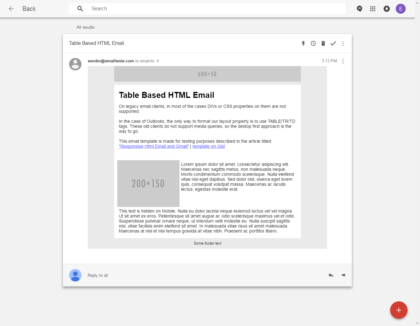
Outlook 2013
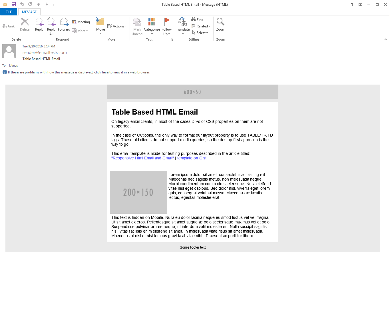
Litmus test results | The size of this email is 13205 bytes.
We will include the screenshots of Google’s email clients after they will have extended their CSS support.
This method performs well on original/old gmail and on legacy clients also (including Web.de and Gmx.de). As you can see, the drawback is the size. Everything is inlined and everything is declared multiple times to make this template render well on most of the email clients.
We generated this email with our generator based on our own document format, we worked for years to make our templates the most robust ones on the market, but again because of it they grew quite big.
We still need to work on the size, but we will experiment with the hybrid approach as well.
A notable thing is that templates generated with our generator are responsive already, so you don’t have to worry about the Gmail update, they will adapt automatically.
UPDATE 05/10/2016
We did not have to change anything on the template we generated with our generator. It seems like that templates made with our software future-proof and supports legacy clients at the same time! 😉
Conclusion
Gmail is a huge player on the market so if we assume that Gmail (and all the other email clients from Google) will support media queries, that’s truly a game changer on this field. (We will update this article as soon as they do.)
We will be able to change a lot of things. We won’t have to necessarily inline every CSS property – which has very good effect on the size of the email -, although if you want to support legacy clients, that’s still a must. That’s the same for tables. Outlooks are the biggest friends of tables, and since those clients have huge share on the market, we will still need to use them in some way.
If your table based design is prepared for responsive techniques, then this change probably won’t cause you a lot of headaches, but of course it’s better to check. We are quite confident, that our generated HTMLs will render beautifully after Gmail starts to support the style tag, but of course we are testing continuously if the updates are out yet.
We are curiously waiting for the updates to happen to check out everything as soon as possible. There are some questions which are still poking at the back of our brains from time to time.
Will Gmail and Inbox work in the same way? And what about Google Apps?
Will the updates come out at the same time? Will there be any time differences between the updates in different countries?
What about mobile clients? How fast will users update them? When will we able to say that most of the users (90%+) use the new version already?
UPDATE 05/10/2016
Although the progress of the update is slow, we can be very happy because the features that we saw in the announcement are becoming true.
Gmail and Inbox are supporting the style already in the browser and there are promising results on modern Android devices as well.
We figured out that we have to place the CSS resets in a separate style tag, because Gmail strips out the style tags with certain content. Consequently, we updated the HTMLs in the complex examples section.
My final thought is that we are extremely happy that we did not have to update the code which was generated by our software, because it’s stable as it has been for years. There is only an alignment problem, which we might be able to fix very soon thanks to the Gmail update.

