In email development, the challenge often lies in hardly maintainable code. Development can turn from fun to nightmare quickly if you need to scroll up and down between the HTML and CSS each time you need to find something in your email template.
In this post, we'll try to change this unpleasant situation regarding CSS by the use of a preprocessor. By reading through the article you'll gain knowledge about how to organize your template styles better. You can learn about how to apply modular design by creating reusable code components in the style files.
Throughout the post, we'll discuss what a preprocessor is and how it helps us better organize our code. I'll give you some background on the available options and why I chose Sass.
I'll walk you through an example to touch and feel it in action. You'll see that thinking in components is a natural way for managing CSS code.
In our next article, we'll go on to improve our workflow regarding how to use styles efficiently. We'll compare a few of the most frequently applied inliners and offer best practices for using them.
CSS Preprocessors
So what CSS preprocessors are and why are they useful for email coders?
Probably it's not new: they are dynamic CSS extension languages, extending the functionalities of the CSS language. In email development, we can benefit from these features and come up with structural guidelines and ideas that will promote maintainable code.
Sass, Less, Stylus
The three most important preprocessors of today are Sass, Less and Stylus - their popularity follows the same order too. The main keywords to remember them by are: variables, nesting, mixins, imports, and selector inheritance. Each language has these functionalities implemented with their own syntax. I'll explain all you need to know about these expressions in the next section with a thorough example.
Conceptually, the power of preprocessors lies in:
- the possibility to eliminate code repetition in CSS
- better showing the corresponding parts, like separate files for components or nested selectors
- less code results in faster development time
- they are easy to adapt to as regular CSS is valid in the files that are processed by the preprocessor
It may seem hard to choose your preferred CSS preprocessor language. You may consider the quality of documentation, comparison articles or just pick the one that you may have already seen before. For a clearer understanding of their similarities and differences, I suggest to read this article - it's very in-depth about what aspects to consider.
Sass was the first preprocessor language to introduce a new, indented syntax to simplify the code. It has a large user base and other preprocessors (Less, Stylus and many other) picked up this python-like syntax,
where only indentation and newline characters are used to separate rules and code blocks:
       #main
         background-color: blue
         color: #eee
However, SCSS, the syntax that uses block formatting like CSS:
       #main {
         background-color: blue;
         color: #eee;
       }
gained bigger traction. You can use regular CSS without any problems in preprocessed files an that makes far more easier to adapt to using SCSS as well. This syntax duality is also present in Less.
I turned to Sass because this similar syntax to CSS, which is painless to follow. Sass also has the most customizable functions and it was a plus that I've already used it in my projects before. Though we'll use Sass in our example, the operations we'll carry out would be achievable through every other CSS preprocessor language.
Now, you need to pay attention to the fact that preprocessed files aren't interpreted directly in the browser. Before your work would be actually usable, you need to compile the files to regular CSS. I'll also show that in the upcoming section, so let's go on.
Demo project
As mentioned previously, we are going to make a sample project in Sass to show the most well-known and useful features of preprocessors.
Our main idea is to develop a component library, which can be shared among future projects. We'll have general components with customizable parameters varied by each project later. This will speed up development time radically, as we don't have to re-create general units each and every time. This modular design concept results in easily maintainable and scalable code. That's being said let's discuss the markup that comes up repeatedly in email templates.
Build The Initial HTML Markup
Each email has call-to-action buttons - that goes without saying. For simplicity's sake I borrow Campaign Monitor's button without the VML (I know, we say yes to poor results in Outlooks, but they aren't our priority now):
        <div>
            <a href="https://edmdesigner.com"
            style="
                background-color:#556270;
                border:1px solid #1e3650;
                border-radius:4px;color:#ffffff;
                display:inline-block;
                font-family:sans-serif;
                font-size:13px;
                font-weight:bold;
                line-height:40px;
                text-align:center;
                text-decoration:none;width:200px;
                -webkit-text-size-adjust:none;
                ">
                Show me the button!
            </a>
        </div>
We'll use this in our exemplary template and will work on it as the "call-to-action button component" when we define the styles.
The next thing you often find yourself using I'm pretty sure, is a hero unit, like this:
		<div class="hero">
		    <img src="hero.png" />
		    <h1>HERO</h1>
		    <p>Description</p>
		</div>
which is translated to something as below in the email world:
<table class="hero" width="100%" cellpadding="0" cellspacing="0" style="min-width:100%;">
    <tr>
        <td width="100%" style="min-width:100%;background-color:#FFFFFF;color:#000000;">

            <!-- Hero image -->
            <table class="col33" align="left" cellpadding="0" cellspacing="0"
                border="0" width="100%"
            >
                <tr>
                    <td width="100%"
                        style="background-color:#F8F7F0;color:#58585A;padding:10px;"
                        align="center"
                    >
                        <img alt="wonderful Sass logo" src="example.png"
                        style="display: block; max-width: 100%;"
                        />
                    </td>
                </tr>
            </table>

            <!-- H1 -->
            <table class="col67" align="left" cellpadding="0" cellspacing="0"
                border="0" width="100%"
                >
                <tr>
                    <td width="100%">
                        <!-- H1 -->
                        <table cellpadding="0" cellspacing="0" border="0" width="100%">
                            <tr>
                                <td style="background-color:#F8F7F0;color:#58585A;
                                    padding:10px;"
                                    align="center"
                                >
                                    <h1>
                                        Email coding is the best
                                    </h1>
                                </td>
                            </tr>
                        </table>
                    </td>
                </tr>
            </table>

             ...

        </td>
    </tr>
</table>
This two components will be the basis of the project, so remember them well. You can download them for the next step from Github.
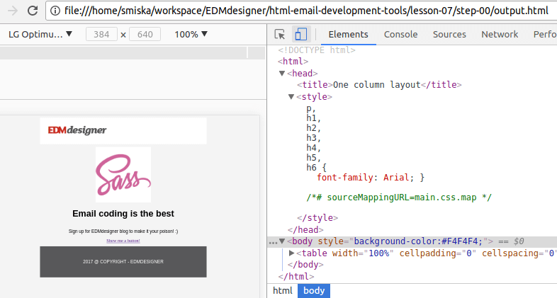
The project we're building will look as follows in the end:
You may wish to browse the working folder of the final step to get familiar with the project before you go on. A quick glance at what to expect in the end will probably make easier to follow along the steps.
Make SCSS Work in Email Template
Our first task is to learn how to compile a single Sass file into regular CSS. Remember that it's necessary in order to make our styles to work.
We have two options:
- Install Sass and use the Sass compiler for the task:
The following guide will help you install Sass on your system. Windows users, check out this guide. for the installation steps.
Once you're ready, the command as below will do the trick on the command line:
sass input.scss output.css
This exercise is cumbersome to do on each modification of our file(s). To make the duty automatic you can put a --watch flag in the end, so the file is re-compiled on every saved update.
- We can also continue the path we started in earlier tutorials and put scripts into use to compile and inline styles.
For this tutorial, we'll stick to the first option, as it is much simpler. However, we'll have an article about task automation tools, like Gulp, later in the tutorial series. It'll open the horizon to a vast amount of opportunities. You may not want to miss it. Sign up if you think you'd be interested.
There are also various tools that support live compilation. If you are impatient to start off experimenting with Sass immediately try this one online.
Getting the awkwardness of the compilation out of the way, we can dive into the fun part writing SCSS. I imagine that you are quite curious to try things out.
First, create a project folder with folders for CSS and SCSS files. Add the main.scss to your SCSS folder and the template you downloaded in the previous section and a typography.scss to get ready for some initial text styling.
        sass-awesomeness/
            |_ CSS/
            |_ SCSS/
            |   |
            |   |_main.scss
            |   |_typography.scss
            |
            |_ index.html
The way we want the example to work is to have a single main.scss that gathers all the preprocessed style sheets. All of these styles will be pushed to a main.css file in the CSS folder.
Each component will have its own style sheet, which is core for modularity. This separates the concerns and makes absolutely clear where to look for a specific style declaration when you want to change something.
The @import Directive
To pull the styles of typography.scss for example into main.scss, we need to use the @import directive in main.scss. It'll tell Sass where the location and name of the file is. In our project we add:
/* main.scss */

        @import 'typography';
We can use just the name of the file as both files are in the same folder and Sass will resolve the file extention.
And we add any styles to the typography file:
/* typograhy.scss */

        p, h1, h2, h3, h4, h5, h6 { font-family: Arial; }
You can try less modest styles as well.
In the end, we need to compile the Sass files. To refresh your memories:
        sass ./scss/main.scss ./css/main.css

        (or with --watch as an optional argument,
        note the colon in the middle!)

        sass --watch ./scss/main.scss:./css/main.css
This will output all the existing SCCS styles linked with @import into css/main.css. Our final job is to make that appear in the HTML of our email template.
Include CSS Into HTML Document
Higher client support dictates to inline whenever that's possible. But as our goal is to learn about preprocessors, instead of introducing inliner tools, we work with simple command line script. In our next article, we'll make up for it and show inlining in detail.
In the markup we have opened a style tag with the following string "replace me". The below command will take this string and push all of the content of main.css into its place:
         sed -e '/replace me/{r ./css/main.css' -e 'd}' index.html >
         output.html
I'm not an expert to say if this is the optimal way of doing this, but I think it's quite simple and self-explanatory what happens.
If you open up the project in the browser now, you can inspect if everything is included as expected.
Did you got it right? Well done!
The Button Component
This is the step where we create our very first reusable component. We'll use variables to define color schemes and dimensions for the button component and apply mixins to avoid duplication of code-blocks. Mixins are used in pair with @include directives, so be prepared to meet them as well. In the meantime you can pick up how nesting works too.
If you are new to preprocessors you may think that it's complex, but believe me it's not. If I could learn it, then so can you.
Variables, Nesting, and Inheritance
Variables are the cornerstone to achieve "DRY" code with preprocessors. You can create them in global or local scope (eg. inside a mixin). You can pass them around and use them inside functions and custom calculations.
Nesting lets you visually indicate the hierarchy of selectors and properties.
This two concepts can be introduced smoothly with the button component. I promised separate variables for color and dimensions, here they are:
        $defaultColor: #ccdd22;
        $primaryColor: #ffbbcc;
        $defaultFontColor: #ffffff;

        $defaultWidth: 200px;
        $defaultHeight: 40px;

        $defaultBorder: 1px solid #1e3650;
and you may include them like this:
        .button {
            background-color: $defaultColor;
            color: $defaultFontColor;

            font: {
                size: 13px;
                weight: bold;
            }

            text: {
                align: center;
                decoration: none;
            }

            width: $defaultWidth;
            line-height: $defaultHeight;

            display: inline-block;
            border: $defaultBorder;
            border-radius: 4px;

            &-primary {
                background-color: $primaryColor;
                color: $defaultFontColor;
            }
        }
Inheritance is what you see at the end of this code snippet. The &-primary will be compiled to .button-primary, the & sign is only a placeholder for the parent selector. This primary button is the child of the default .button class, as it is placed within it. It will inherit the properties defined in its parent and it completes it with its additional styles.
If you wish instant feedback at this point, you can observe the compiled CSS at Sassmeister.com.
Mixins and the @include Directive
Mixins are very handy, function-like creatures in preprocessors. You can declare any SCSS within them and reuse them several times in the code with the @include directive:
        @mixin color($color1, $color2) {
             background-color: $color1;
             color: $color2;
        }

        .button {

              ...

              @include color($defaultColor, $defaultFontColor);
         }
The first part of the above code declares a color mixin and accepts two parameters and matches the corresponding property. In the button class, we're "calling" this mixin with the @include directive and pass in the pre-defined color properties.
For class declarations, which are going to extend this button class, we only need to add the @include with new color parameters.
We can do the same for the dimensions, check it out in the end results.
I strongly suggest to compile this step in the terminal. You can apply the --watch flag version as well, as we are going to continuously add to the project. Don't forget: you need to @import 'buttons'; in the main.scss first.
After we push the styles to the style tag with our script, that's what we are at:
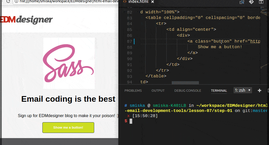
You can checko out the full source code here
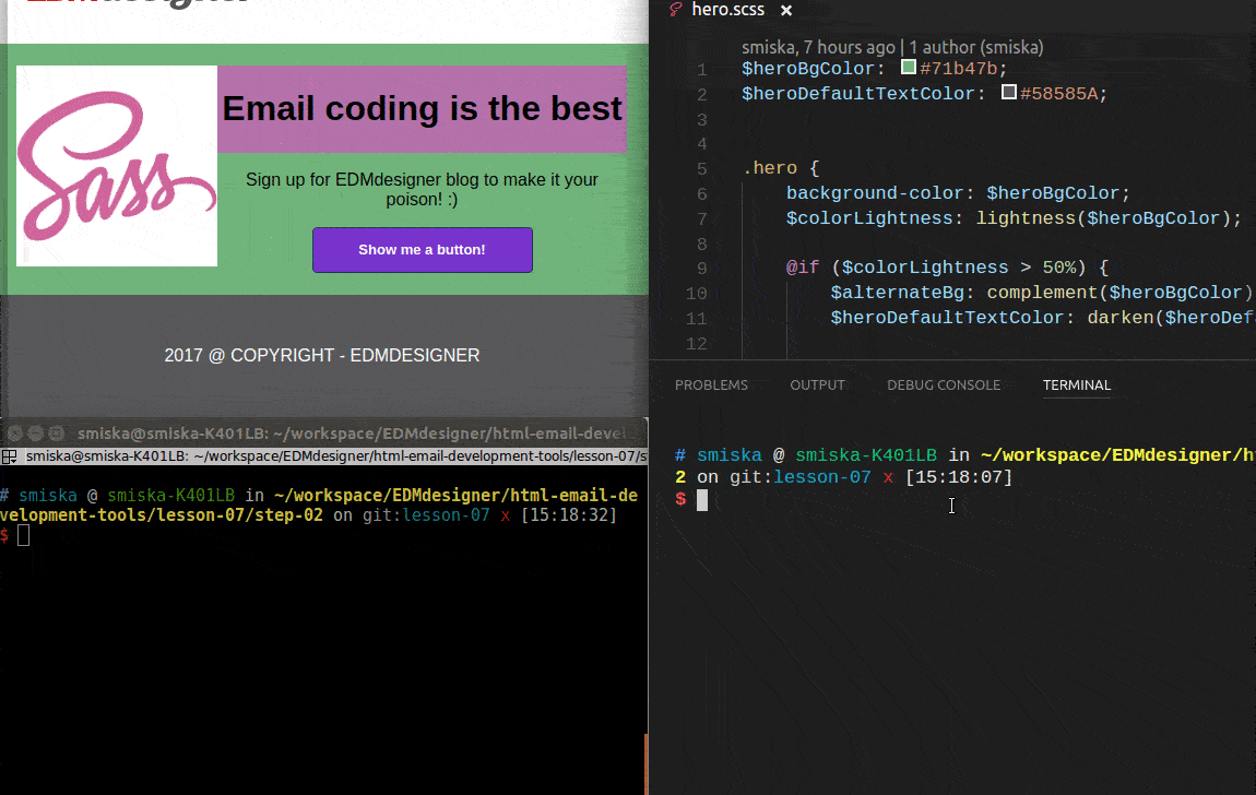
The Hero Unit Component
I've shown you the HTML for the component: in a container, we have a title, an img and a p tag for the descriptions. We want to be able to customize text color and an optional extra background color for the parts of the component.
The @if Directive and Functions
This will need two new concept: the @if directive and functions. Sass has wide-variety of options for customizing colors.
We start by defining the default colors in varialbes. Then you can see that we measure the lightness of the given color: $colorLightness: lightness($heroBgColor), and have two different decision and outcome based on the input value:
        $heroBgColor: #71b47b;
        $heroDefaultTextColor: #58585A;


        .hero {
            background-color: $heroBgColor;
            $colorLightness: lightness($heroBgColor);

            @if ($colorLightness > 50%) {
                $heroDefaultTextColor: darken($heroDefaultTextColor, 30%);

                color: $heroDefaultTextColor;
            } @else {
                $heroDefaultTextColor: lighten($heroDefaultTextColor, 30%);

                color: $heroDefaultTextColor;
            }
         }
If the initial background-color is light colored (as the lightness is higher than 50%), we darken() the default text and set it to the color property. If the background is dark-toned, we raise the lightness of the text color.
Define Layout With Media Query Mixin
The component will have an outer .hero class on the outer container and for each the wrapper table of each blog (title, img, p), we apply a class for the desired width value. As the following width cover most of the use cases, we have .col33, .col50 and .col67 in our markup. Let's create the same in the SCSS.
We append the corresponding CSS to the end of our class declaration.
        .hero {

                 ...

            .col33 {
                width: 33%;
            }

            .col67 {
                width: 67%;
            }

            .col50 {
                width: 50%;
            }

        }
This controls the width of desktop and webmail clients. For mobile users, we need to reorder the hero components parts and for that, we define a media query mixin.
We do this by mixin because:
- You'll often encounter this in others work
- You may reuse the same media query declaration with different breakpoints when you build complex layouts.
If you get stuck, just check out the Sass documentation.
        @mixin mobile {
            @media only screen and (max-width: $reorderBreakPoint) {

                @content;
            }
        }

        @include mobile {
            .container, .col33, .col67, .col50  {
                width: 100% !important;
            }
        }
What you can see above is that:
- we include our media query in a named mixin block
- pass in a
$reorderBreakPointvariable - this will be defined inlayout.scss
-the@contentdirective will include the content defined in the@includedirective
Last but not least, we need a layout.scss basically just to handle the templates structure: it'll define the width of the email and the breakpoint values we want to use.
$containerWidth: 600px;
$reorderBreakPoint: $containerWidth - 1px;

.container {
    width: $containerWidth;
}
If we put all of this together, compile it and embed the contents of main.css we are done with our work.
You can check it out in the end results.
Among the working files, you can also find a slightly improved version of the project with resets.scss and a nice example for mixins in the typography.scss. I also included a mixin for the button component's dimensions in buttons.scss. I'm confident that you'll figure out how they work. If you'd have questions along the way, feel free to ask them in the comments section below the article.
That's it for a short introduction about CSS preprocessors. I hope you agree that they provide more flexibility and control regarding design and maintenance of style rules. They apply changes better compared to regular CSS. You could see two example of general components. You can use them in future projects and you've learned how to quickly update your design.
Summary
We've covered preprocessors as the first step of CSS code handling in this article. Our next post will continue this thread having its focus on style declaration inliner tools.
First in the post, we discussed the qualities specific to preprocessor languages. We selected Sass and learned to compile Sass files through the command line. We also saw a terminal based command to include all styles in the style tag.
We've seen before that HTML structure is often helped with code snippets and generators by creating components or modules all the time.
We showed that CSS can be similarly adjusted to apply modularity and logic by using preprocessors. We learned about the must-know features and built a hero unit and a button component using them that we can include in our next project.
Thanks for joining us! See you next time as well.