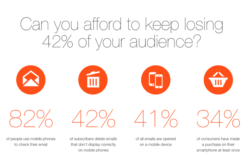
We could write series of articles about all of the items on this list – and on some of it we actually have, so if you are interested in the details, read back, we have great content for you. But now we will give you kind of a checklist instead, that you can implement immediately. Read it, open up your email editor and check if your marketing email design could use a facelift.
Keep width at 600 pixels
It is true that most of us now read email on our phones, but you also have to think about those using desktop, which is still a huge audience. When using an email client (web-based or not) your screen is usually filled with a lot of stuff: menus, folders, address books and so on. So your email will have a limited space to be displayed.
According to best practices you may be wise to choose 600 pixels, which can be divided by 12, 6, 4 and 2 – which is nice if you want to have even columns. Also, limiting your width makes your email more easily readable. Optimal readability is reached with around 50-60 characters in a row.
If your email is too wide, readers will have trouble focusing on the copy, they will more likely to be lost occasionally – not continuing the correct row –, which would be a very bad thing for you.
Use white space (wisely)
White spaces are widely used in design because they are convenient – for the readers. They give a chance for the eyes to rest from constant stimulation. You should use active and passive white spaces alike.
An active white space is something that has clear function, like emphasizing an important part of the copy. Your CTA for example, which will stand out more if you leave some space around it. A passive white space is for example the space around the main body or sections you leave empty.
Both will serve you well as you will find it easier to keep and direct the attention of your readers. You can make things stand out and enable reader to skim through the email.
Look at this email for example, it instantly catches attention with being simple and guiding your eye to where the important stuff is. We have to add that the girl in the picture should stare right at the text where you want your readers to look. Here you can find more tips to optimize your emails for conversions.
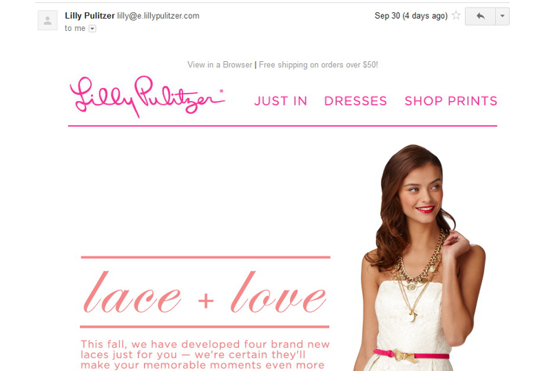 Source: Business2Community
Less is more
Yes, this is a cliché but stay with us We are not saying that you should not use visuals: you should use them in a very conscious way. Images and graphics can be great if they direct the attention of the reader to where you want it to be.
For example the caption of an image is a great place to put something important as they are 300% more likely to read it than the copy itself. If you include an image, make good use of it.
If you use images, make sure they are relevant and not distracting. If you want to know exactly how much visual is too much, head on to our detailed article.
No background images
If you are using background images in your email, you should probably lose them now.
- They are distracting – your message will be in the main body, no reason to direct the attention of the recipient anywhere else.
- They will cost you – the more images you use the more time it will take for your email to load and open. This can cause deliverability issues and lead to decreased conversion too. If your mail takes too long to load, you will lose readers for every fraction of a second.
- They may not be supported – several clients do not even display background images.
Use a footer
You should present you message first. Important parts of the text should occupy the header, so if you have any navigation, you should place it in the footer.
Also, you should include an unsubscribe link, contact information and your policies – all of these will find a comfortable place in your footer.
Use “large”, visible CTAs
A button drives much more attention to itself than a simple text link, especially if you place it in the right place. It is also great for mobile users as they can easily click on a button and don’t have to carefully aim.
Keep in mind that the smallest conveniently tappable area is 44×44 pixels – create a CTA of at least that size.
How much more attention will you get with a button? Just look at this example of a website and decide for yourself:
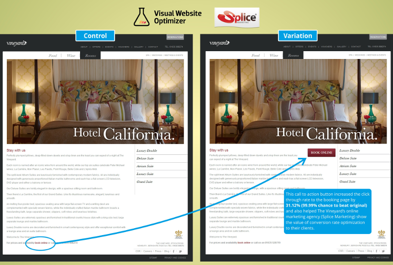 Source: VWO
Don’t get crazy with fonts
Email clients still only support a handful of typefaces, therefore if you get too unique with your choice, you may make your message unreadable.
You can of course get a bit creative: play with text size, color and separate the more important parts of the copy from the rest of the text.
Too many columns?
Most designers will advise you to use a strict one-column format, and for good reason – it is the best for being responsive. Having multiple columns won’t be a big issue if you are using a responsive email editor but in Gmail App some things may go wrong, even if the whole email community is trying to push Gmail to support responsive email design… but they still ignore our best practices.
Consider the F pattern
The F reading pattern, confirmed by many heat map studies means that we look at what we think is important, and that tends to form an F shape. When placing your most important content you should keep this in mind.
Did we cover everything?
Of course not: designing an email is something that you will learn in the long run after performing A/B tests, getting to know your email editor, your audience and so on.
But if you go through this list and look at your own previous designs, you are likely to find something that you have done wrong in the past.
We hope that we could help you! Stay tuned, we will be back with more useful articles soon. Please make sure that you subscribed to our newsletter, so you won’t miss an update.

