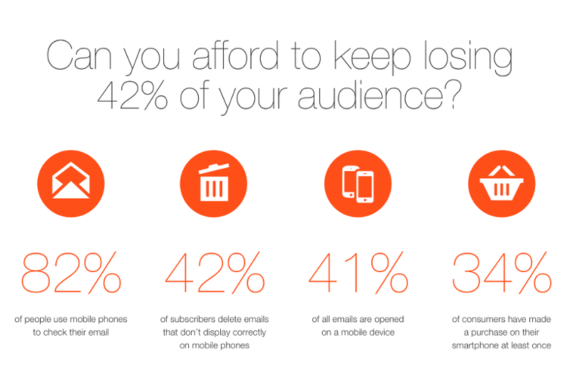
We receive at least one email per week which complains about that the responsive email template, what we generate, is not responsive in Gmail mobile app. We always have to tell, that this is the best what we can do and Gmail has to be blamed, not your email coder, service provider or marketing agency.
It’s an evil feature of Gmail, not a bug in your template. Google kills your CSS media queries in Gmail on purpose.
 source: Litmus.com
What can you do?
If you are worried about your subscribers, who read your emails on Gmail mobile, you have to use a really simple, fluid, one-column, mobile first email template, which will naturally look good on mobile and desktop as well. It may be a cutback from your multi column design, but that’s still the best, bulletproof solution. Implement these tips, and you’re good to go on Gmail mobile as well:
- Fluid, one column layout (instead of fixed pixels for sizing, you have to use percentages)
- 600 px wide body and images
- Large text which is readable on all devices
- Big, mobile friendly calls-to-action (avoid simple text links)
Do you need help? Just drop us a line, we are always happy to hear from you!


