I recently bumped in to a really popular article – from designers to designers – about the 50 best email designs. I have to admit that most of the mentioned designs are really beautiful, but there’s a common problem with all of them. Background images!
 image source: Canva.com
We all love beautiful photos, illustrations, especially if they are crafted by talented designers, who can do nice tricks with Photoshop. The problem is usually that they simply don’t know the limitations of email coding, and create a really beautiful email design which is hard to handle from a coding perspective. I’ll tell you why!
In Outlook only one background image works!
Actually that one is the main background image, which is used on the body-tag. Who wants to learn more about the coding part, can check out this thread on Stackoverflow. This is the reason why image slicing is a really common workaround for us, email coders.
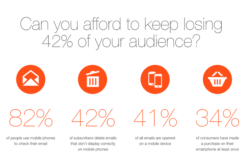
Any time we get a design like any of the above, we have to figure out how to make these designs work in email. With image slicing, it’s quite easy to make these design look great in desktop email clients – if images are enabled to display and also if you managed to avoid SPAM folder since your text to image ratio is too low. But **how will these email designs look on mobile? **
**Far from ideal. **What may happen with them on mobile?
- Option A: Full width (content/foreground) images will scale down to mobile width: Making the text written on them hardly readable.
- Option B: Smaller images (in a multi-column) will reorder into one column on mobile (by default in EDMdesigner). This reordering can be manually switched off though, so you may end up with Option A.
- Option C: You may use the “hide on mobile” function – it’s available for EDMdesigner users, but generally not available in most web based email editors – to hide some of the images from mobile users. Please note that the hide on mobile doesn’t work in Gmail App (just like responsive email designs, because the lack of CSS media query support).
- Option D: With the combination of hide on mobile / hide on desktop functions (coming soon) you can use totally different content on mobile and desktop as well. The biggest problem with this technique is that your email HTML will be super complicated and larger in size as well.
Best practice: Use text, images and buttons separately – Avoid overlaying!
We know that it’s challenging to deliver something beautiful without images, but check out for example Litmus newsletters. They are beautiful and are designed in line with best practices and also in some cases with the freshest email coding tricks. But there are also great examples in the original article from Canva, so there’s still hope for us email coders!
 image source: Canva.com


