We discussed in one of our blog posts earlier how different visuals can have positive effects on your email conversions. You have to understand what colors to use, how to align the different elements of your email template, but since email is strongly linked to your website, you not only have to use your email editor to create stunning newsletters, but also need to invest into keeping a consistent look and tone on your website as well.
Lining up your email templates and landing page
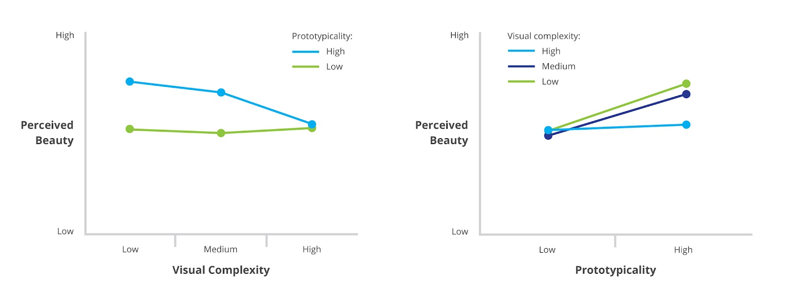
You should pay attention to maintaining a consistent brand image while creating your emails and landing pages. Users like familiarity – they prefer sites that are in some way familiar to them, that they can instantly understand. This is not speculation: Google has confirmed with a detailed study they conducted few years ago.
 image source: Google Research Blog
What does it mean for your email campaigns?
When a user clicks on your CTA, they are on their way to conversion – they are interested in your offer, and already have just made the first step. But if you guide them to a site which is completely different from the email in terms of design – even if the content is relevant – they will, at least subconsciously, feel tricked.
The experience is like when you click on a promising link online and your are taken to a completely different site, like a pop-up ad. You will immediately loose all trust that you had and start from zero.
Of course you don’t want to risk trust that you have already gained. It is not easy to achieve a high click-through rate in emails, you have to work hard on design, copy and data, and you don’t want to throw that all away.
Use consistent design and style in all your communications!
Having your brand identity shouldn’t be a luxury for any business (online or offline) nowadays. You cannot be truly successful with a new company, if you are trying to market your product or service in an “ugly packaging”. Your website, emails, flyers, business cards, whatever… have to look professional or at least good, to have a chance to succeed.
If you work with experienced designers, this whole consistency should not be a real problem for you, but if you are switching from one design(er) to another you have to be careful. Always pay attention to the details and use the same visual elements, logo, CTA style and tone on your website and in the email templates that you create with your responsive email editor.
This way users will always know that they are on the right track, even when they receive the first confirmation email about their newsletter subscription and also when they clicked on an interesting offer in your email. Consistency just feels natural, and it’s highly expected.
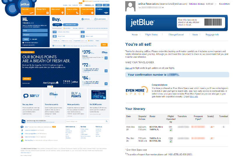
Take a look at this example from Jetblue:
 Image source: Nielsen Norman Group
This also applies to your copy. Keep consistent tone, wording, and writing style as well. Make your leads feel that they are still communicating with the same entity or person (if you are building a more personal business). If they click on a CTA in your email the first thing you want to tell them – directly or indirectly – is that they at the right place and can read more about the specific deal or make a purchase right on.
When you open your email editor, don’t just think about creating a good looking responsive email, but one that fits into your already established visual identity. Users like familiarity and continuity so you should give them what they expect.
This is one of the reasons why we built in the “Complex” element or “Favorite” element to EDMdesigner. This way you can easily save any part of your responsive email template. For example you can save the header, footer or also content blocks like your mission statement, news block or whatever you want. This function is really handy for those who have to create numerous email templates a month.
You can try the demo after a single click on our main page and even start using our responsive email editor for free after a short registration!


