Sadly, even in 2016 your responsive email templates won’t work perfectly on all email client. The story starts with email clients that do not support CSS media queries. Without media queries you can’t build a traditional responsive email.
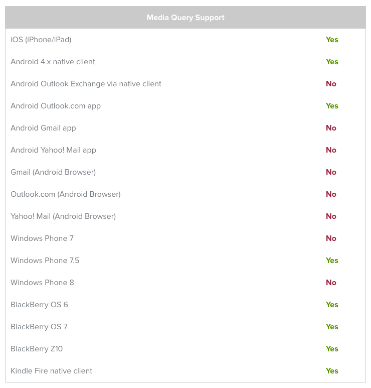 Image source: Litmus.com
Why do some email clients ban media queries?
Email client developer’s priority is not to support responsive email design but to make sure that their email users will be safe from cybercriminals.
A side effect of this fear is that still responsive emails won’t work properly on Gmail or Inbox mobile apps, and many other email clients. We are focusing on Google’s services now, since their service has 100s of millions users all around the globe.
Email designers have been praying to Google for ages for responsive email support, but still… no success with the prayers.
Gmail and Google Inbox will “crumple” your responsive email templates
Unfortunately Gmail and even the new Google Inbox app’s HTML rendering engines are not “advanced” enough to fancy proper responsive email coding techniques, so most mobile-friendly email templates will look a bit strange on these email clients.
Elements of your email templates will loose their width properties, which causes several things to misbehave: Images and background colors may be distorted, the different blocks of your email templates might be scaled to various different sizes so the overall design is likely to look a bit awkward, especially if you are using “hide on mobile” techniques, since these email clients will completely ignore it, and even hidden elements will show up.
How can you fix this?
If you add a fixed size image – for example an 600 x 400px – into each of your template blocks and/or columns (in case you have multiple columns in the design). Since you are using the same image size all around your email template, each picture will be scaled in the same way – so will look good on mobile too. Don’t worry, you don’t have to make the minor social icons that big, they can stay the same as before.
It’s also worth to keep images and text together in the same wrapper element (it’c called Box in case you are using EDMdesigner), since in this case images will help stretching the whole container to the full-width of the viewer’s mobile device.
If you obey the above limitations it’s quite likely that your email template will look good on Gmail and Inbox too. At least that’s the case if you are using our responsive email editor.
But always test the templates before sending! It’s an **experimental approach we mentioned, and might not work in every case. **
Testing will require some time and energy, but it’s worth your time, since according to recent email client market share data, around 10-20% of your emails are opened in a Gmail or Inbox mobile app. So take your time, and experiment with the above fixes.
Do you have any other tips to add? Please tell us in the comments section!