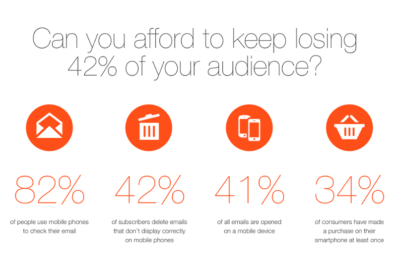
Due the growing number of smartphones, nowadays there is an increasing need for a responsive-like behavior in emails that was first introduced on web pages. At first sight, we can conclude that both websites and emails have very similar settings: they are both built on HTML base, using CSS. However, to understand the differences better, we need to go back to the basics and take a look at how these two things evolved.
The origins
For those who have been working with websites for a long time, it is pretty evident that there are huge differences among web browsers. In awful many cases these differences could change the thoroughly estimated development time and even modify the initial plans. These “unexpected” situations often originate from each browser’s individual history. In most cases we just cannot break some rules in certain environments, and this is not only true for programming, but for rational science as well. For example 2+2 is 4, no matter how we approach it. However, these rules do not always apply to the world of HTML and CSS, because in many cases the behavior of browsers are based on loosely interpreted standards, while it is also accepted that all players try to follow their own path during development.
In the dawn of browsing, during the early days the web developer professionals were struggling with the versions of Netscape and then Internet Explorer. Nowadays there is a much wider and more colorful palette out there (Chrome, Firefox, Opera, Safari, etc), thus making professionals suffer even more with optimization.
The speed of how these browsers progress is growing rapidly, at times resulting in weekly updates which segments the browser market even further. If we look at the browsers as channels to reach customers the overall picture becomes even more blurry. The vast expansion of smartphones in the past few years complicates our lives even further. They bring new browsers and platforms to the show. This resulted in more than a handful or even hundreds of different browsers, based on the various devices, platforms, versions and applications available on the market as of today.
What do browsers have to do with emails? – you might ask. The answer is fairly simple. Technically speaking the email client is some sort of browser itself. It is a software that understands and visualizes the HTML code. In many cases they are simply built on the engine of specific browsers (Outlook – IE/Trident), Thunderbird (Firefox/Gecko).
Fundamentally, the email protocol is a communication protocol, thus the description of the message contains the position of the HTML section. However each browser has a different HTML rendering/visualizing capability as the protocol does not specify this at all. This pretty much results in what it sounds like: there is no generally accepted and used standard out there today.
The main problem to tackle is to understand which options and methods each browser uses from the HTML and CSS palette. What is the minimum set of requirements for a browser? What is the advised level? What should it support? The list of questions could go on.
The process of adapting certain standards for browsers with the hyped HTML5 and CSS3 is pretty similar to the world of email readers. The actual speed of this change is much faster in the browsers’ world. Unfortunately, almost only the bad habits were transferred from the evolution of browsers to the email client world. With the rising number of email clients and new platforms a certain type of evolution occurred in this field as well, however the inherited bad routines and habits tend to shape an obscure future. While modern browsers and their fast development with automatic updates slowly but steadily diminish and erase the non-competitive players, the process is rather slower and has less impact in the world of email.
E-mail readers and their nature
No question: we read emails every day. It is part of our daily routine. Pretty much all of us can relate to how long we have been reading them. But it is not so obvious to list all the clients and readers we have been using since we have have opened our first one. We have seen many solutions in the past few decades, from regular email clients (Outlook Express, MS Outlook, Thunderbird, Apple Mail, etc.) to browser based services (Gmail, Yahoo Mail, Hotmail/Outlook.com, freemail.hu, citromail.hu, etc), while nowadays mobile devices and tablets start to dominate our email reading preferences. And these device offer us other ways to handle email.

HTML box model
Every website, email or basically anything that is built on an HTML base rely on the existence of a few common attributes.
An element, based on it’s type can have different attributes, but it is true for every type that it can have it’s own size (width and height), font, font size, color, background color, margin (to separate an element from surrounding elements) and padding (to separate elements that contain other elements). With all this being said, all major clients or client families have their major deficiencies. In many cases they handle attached pictures in a different way, while having different requirements for every email sending solution. Currently it is advised to add pictures to the HTML code with absolute URLs, hosted on a web server instead of attaching them. While it is common today to use many custom fonts for websites and they are browser-independent, the case is somewhat different with emails as not all solutions support custom fonts. Techniques similar to this count on using different linked resources, thus enabling a wide variety of development options. The basic requirement of truly responsive solutions is the ability to use “CSS Media Query” between tags, which enables us to set which preferences should determine our HTML elements, their size, position or even their color at any given resolution.

Let’s take a look at some of the more important clients to better understand the situation.
Outlook Express and MS Outlook versions
The different installed versions of Outlook were popular for a long time, and in some cases they are still dominant in corporate environments with all their pros and cons. Their biggest disadvantage is that they disregard and overlook padding values and in many cases the margin values as well, though these are important formatting principles for the HTML language. They can rarely handle background images and they do not support the technologies needed for truly responsive behavior.
Lotus Notes
It is relatively hard to find many Lotus Notes users, but if they are a significant chunk of our target audience, than we have to understand our possibilities that are very narrow, indeed.
This system not only has the same disadvantages as Outlook, but there are additional difficulties as well. Most versions of Lotus Notes handle email content poorly, and for example if there’s a line break in any URL by mistake, it will destroy it right away.
Thunderbird and modern, regularly updated competitors
As these contestants have a fairly short history, they get updated often, or the continuous update is a built-in feature already. The progress of such solutions is pretty much guaranteed, resulting in very well displaying ability. Often they can deliver the same performance as a state-of-the-art web browser.
Web clients
The speciality of web clients is that they do not require any installed software, it is enough to open a browser and navigate to a certain site to use our email “client”. The display software works differently than in the cases discussed above. The main difference is that these clients not only display the HTML code of the message, but display the user interface of the software as well. Nonetheless, the displayed message is not filtered by the browser, but the email service first. So the browser will display only those elements that the email service allows.
These email service providers, even if they are smaller or bigger (Gmail, Yahoo Mail, Outlook.com) have certain limitations or even disadvantages regarding how they handle HTML and/or CSS. For example all of them clear thetag and replaces it with another HTML tag.
Gmail rejects the CSS attributes used in the tag even though it is supported everywhere else, the only workaround is to define inline styles, which is a very old-fashioned solution. To complicate things even further Gmail disregards every attribute of certain elements (It is different in the Android 4+ Gmail app, which will be discussed later).
Yahoo Mail, works pretty well, but has a serious CSS bug, that interprets all kind of media queries, even those which are not valid.
Outlook.com is a fairly new contestant, available from all web surfaces and it is the successor of previous Microsoft owned email solutions. It gets serious updates regularly, not like other email clients. It** replaces the predefined css classes and ids** – like Yahoo, and AOL Mail – for security reasons, which makes it harder to define targeted css.
Applications
On mobile platforms we handle emails through applications. In most cases we use the native apps of the operating system, which support most of the attributes of HTML, so it is an optimal platform for us. The earlier versions of Android have a more limited functionality, but still support the standard better than the desktop clients. Some email service providers make their own apps available for smartphones as well, such as Gmail. The version of the Gmail app is dependent on the Android version itself, thus influencing the HTML/CSS supporting capabilities. While the latest 4.0+ Android app supports some CSS besides the elements, the 2.1-3.x Android Gmail apps still lack the ability to live up to the standards.
More and more clients are renewed and improved, thus it is vital to test the major players relevant to us every quarter. Needless to say, but this is why it is so important to test our HTML emails before sending them out. We use the service of Litmus.com to do so, which is the best available email testing solution in the market.
To be continued…
We are going to dive into the market a little deeper next week. Thanks for reading and please post a comment if you have something to add!


