Email development relies heavily on the use of tables. In our experience it's best to use them in every aspect of layout and structuring. That is the basis of our drag and drop email editor's success and reliability. However, you also apply tables when you need to present a large amount of well-formatted data. Let's go over that right now in this 11th chapter of the Modern HTML Email Tutorial series.
The first part of the article will show you how to design responsive tables. We continue to build on the previous chapters' well-discussed principles — if you are new to the tutorial series you might want to browse through our previous posts as well. We'll end this section by examining the limits of responsive tables.
In the second part we examine a clever new approach. The method is called card layout design. It will help us to overcome some clients' failing support and provide a robust solution for tabular data. The concept is to organize the data in cards, which stack on top of each other on mobile devices. Instead of table cells, the multi-column pattern gives the structure. The Drop Calc Method will enable this new effective way.
In our posts we are dedicated to deliver fresh and innovative ideas in a detailed manner. We provide easy to understand learning opportunities in email HTML and coding. Great fun is ahead! Make sure you don't miss it!
Creating a Simple Responsive Data Table
In this section we will go over the basics of responsive tables. We start with a very simple table — it is only fluid — and we'll update its design in every subsection. In each step we are going to see improvements as we implement the necessary properties.
Testing a Fluid Data Table
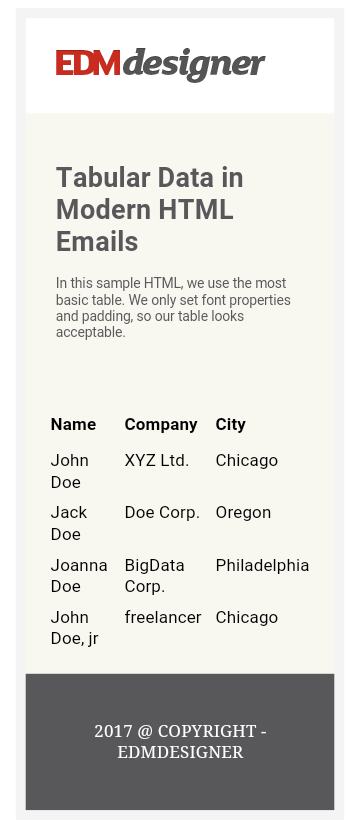
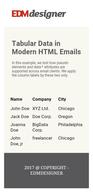
First, let's start off with a 3x4 table. We insert it into the well-known template we created in one of the previous tutorials.
The table has only font properties defined in th and td elements and padding: 5px;.
This is how the initial code of the table looks like:
...
<table width="100%" cellpadding="0" cellspacing="0" style="min-width:100%;">
    <thead>
      <tr>
        <th scope="col" style="padding:5px; font-family: Arial,sans-serif; font-size: 16px; line-height:20px;line-height:30px">Name</th>
        <th scope="col" style="padding:5px; font-family: Arial,sans-serif; font-size: 16px; line-height:20px;line-height:30px">Company</th>
        <th scope="col" style="padding:5px; font-family: Arial,sans-serif; font-size: 16px; line-height:20px;line-height:30px">City</th>
      </tr>
    </thead>
    <tbody>
      <tr>
        <td valign="top" style="padding:5px; font-family: Arial,sans-serif; font-size: 16px; line-height:20px;">John Doe</td>
        <td valign="top" style="padding:5px; font-family: Arial,sans-serif; font-size: 16px; line-height:20px;">XYZ Ltd.</td>
        <td valign="top" style="padding:5px; font-family: Arial,sans-serif; font-size: 16px; line-height:20px;">Chicago</td>
      </tr>
           ...
      <tr>
        <td valign="top" style="padding:5px; font-family: Arial,sans-serif; font-size: 16px; line-height:20px;">John Doe, jr</td>
        <td valign="top" style="padding:5px; font-family: Arial,sans-serif; font-size: 16px; line-height:20px;">freelancer</td>
        <td valign="top" style="padding:5px; font-family: Arial,sans-serif; font-size: 16px; line-height:20px;">Chicago</td>
      </tr>
    </tbody>
</table>

...
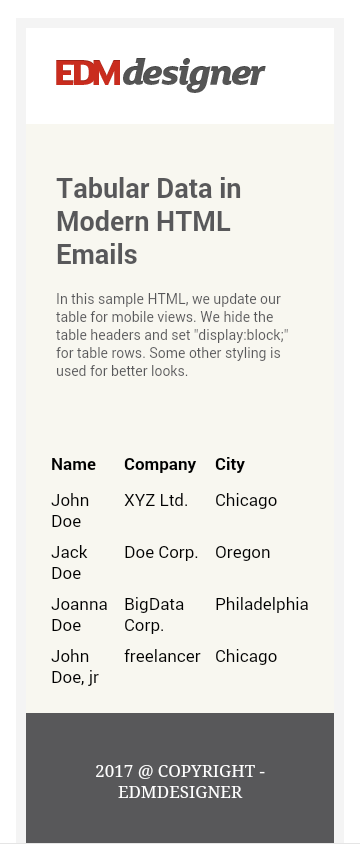
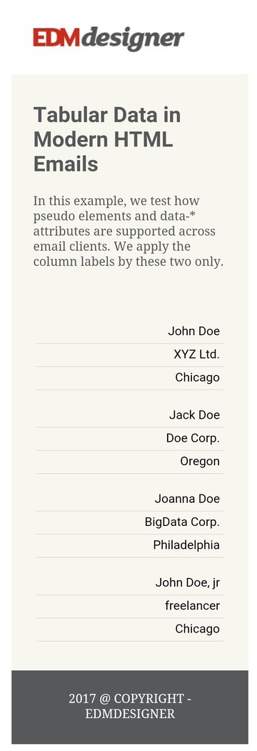
We do not apply any CSS in the style tag yet. If you take a look at the Litmus test, you'll see that desktop clients are quite nice. However, if you direct your attention to mobile clients, you'll come across previews like the one below in Android 6.0:
The table layout remains the same, but the table itself shrinks to adapt to the viewport width. This looks a bit crowded already. But imagine that you have much longer data strings or just add three more columns to the right! The result would be a disaster.
So, the main reason behind responsive design is to get better experience on mobile devices.
Check out the full source code of this step on GitHub.
Litmus test results
Responsive Table Design Through Media Query
In the previous subsection, you could see that it is necessary to design the data tables for mobile email clients. If you miss out on that, your emails will not look good on mobile devices. Let's see what we can do about it!
The first thing you would probably think of is to target the table(s) with specific classes or ids. Then you would use CSS through media queries to alter the design. That's exactly what we are going to do!
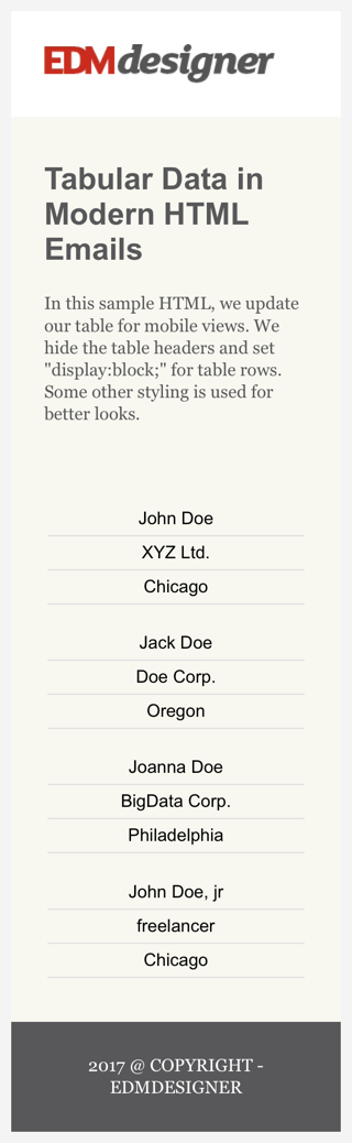
The concept is to reorganize the original table so each cell takes up a full row — spanning the full width of its container element. The cells stack on top of each other on small screens, so the content remains readable.
The following styles are added to the email template's head element:
    @media all and (max-width: 599px) {

      .smarttable {
        border: 0px;
      }
      .smarttable thead {
        display:none;
        border: none;
        height: 0px;
        margin: 0px;
        overflow: hidden;
        padding: 0px;
        max-width:0px;
        max-height:0px;
      }
      .smarttable tr {
        display: block;
        width:90%;
        margin:20px auto;
      }
      .smarttable td {
        border-bottom: 1px solid #ddd;
        display: block;
        font-size: 15px;
        text-align: center;
      }
   }
.. and we use it on the table of course:
<table class="smarttable" width="100%" cellpadding="0" cellspacing="0" style="min-width:100%;">
 ...
The CSS code above shows the first thing we do: hiding the th elements. This is necessary, because you don't want the th elements to show either above the table (which will be stacked, don't forget), or repeated with every cell. It wouldn't make much sense. You'll see in the next subsection what to do instead.
Then we use the display:block; property on the tds to make them behave as block-level elements. This way each cell takes up a whole line, leaving no space there for the others. This creates the stacked structure. Lastly, we set border-bottom property for a soft separation, and we center the text.
On mobile devices you can observe that the cells reflow and stack, where the clients recognize the styles defined in the style tag.
This occurs in iOS devices:
... but fails in Androids and Gmail Apps:
Webmail client and desktop previews remain intact, as the media queries only target mobile devices based on the width property.
You can view the full source code of this step on GitHub.
Litmus test results
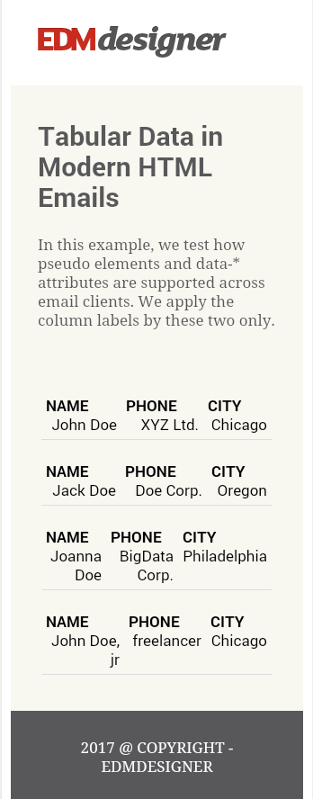
Naming Table Cells with CSS Pseudo-Elements
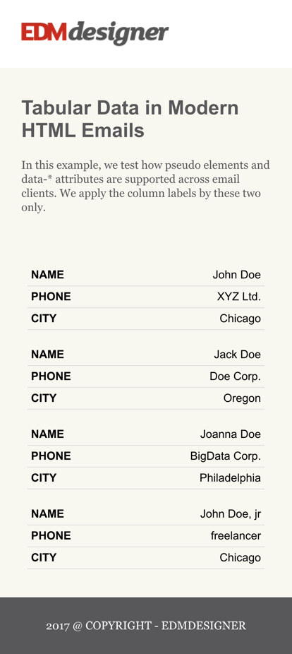
We have seen how to organize tabular data in a vertical stack. Now we are going to add labels to them using pseudo-elements. This technique is often used in web development, however we need to confirm that it works in email too.
We define the pseudo-elements in the style tag as follows:
...

      .smarttable td:before {
        content: attr(data-label);
        float: left;
        font-weight: bold;
        text-transform: uppercase;
      }


...
This means that we provide content with the data attribute to be appended before the content of the cell. It will be left aligned, bold and uppercase.
We have to match the attribute in the HTML too:
<td data-label="Name" valign="top" style="padding:5px; font-family: Arial,sans-serif; font-size: 16px; line-height:20px;">John Doe</td>
The value of the data attribute in the HTML will be appended before the cell content. The previews show that this is well-supported in iOS devices:
... but not in Androids. Even Android 4.4 — which supports the style tag — doesn't display correctly.
I also ran a quick test to see if the example HTML looks different in my own device:
| Android 6.0 Comparison | |
|---|---|
| Litmus preview | Own device preview |
|
|
In an Android 6.0 with the latest Gmail updates (my device), the style tag is already supported. That means that we have full-width table cells which are stacked correctly. However the CSS pseudo-element is not supported, as we don't have the cell labels.
So, pseudo-elements are not supported by the majority of Android devices. You have to think of fallbacks, if you use responsive tables. We just need a more robust way.
Check out the full source code of this step on GitHub.
Litmus test results
Comparing Responsive Table and the Card Layout Design
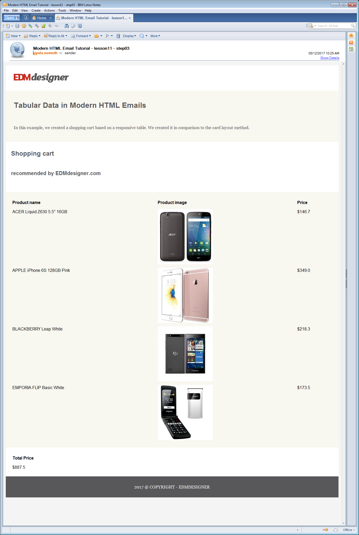
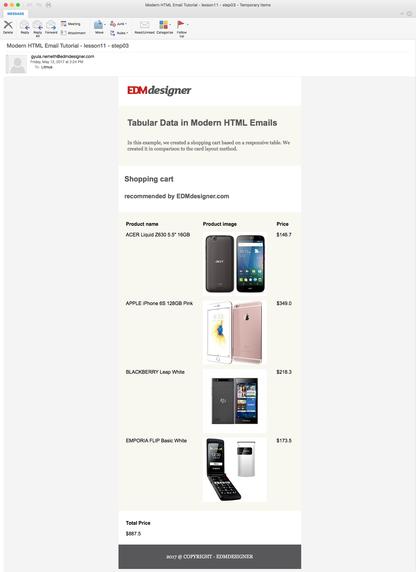
In this section, we will create shopping cart email templates. First we compose one with the responsive table method, next we reproduce it with the card layout method. This real life example is appropriate to compare the two method and enables you to choose the one that better suits your use case.
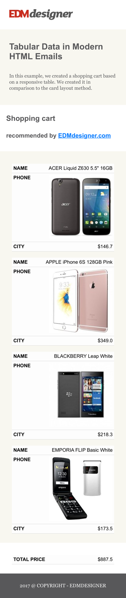
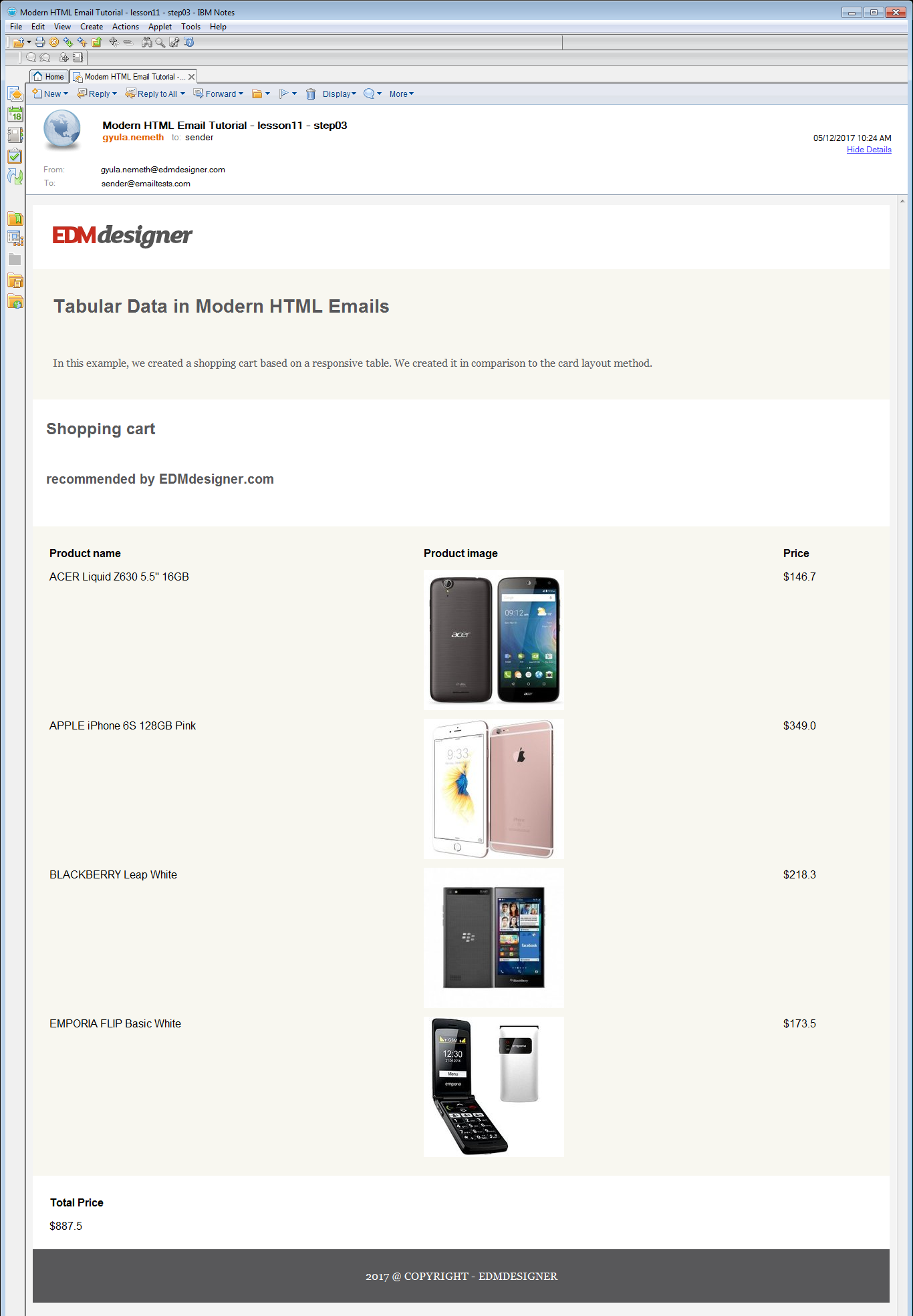
Shopping Cart Example with Responsive Table
There are few modifications we need to make to have a fair-looking shopping cart example with a responsive table. We don't add custom styles for the webmail and desktop clients; mobile is the main focus. We are aiming for the following:
Here is a list where you can check off the modifications:
- update the names and labels of the table data
- add
margin-bottom: 10px !important;to thetrelement to distinguish between cell-groups formed from the original table's rows - insert a product image and define the necessary styles for it
- add a price summary, which is also set with pseudo-elements
on mobile devices.
So, the following styles complete the style tag in this step:
  ...
   .smarttable tr {
      ...
      margin-bottom: 10px !important;
   }
   .smarttable td {
      ...
      background: #fdfdfd;
   }
   .smarttable td img {
        border-bottom: 1px solid #ddd;
        display: inline-block;
        font-size: 15px;
        text-align: right;
   }
It's worth to note that the image is set to inline-block. We do this so we can align it inside the table cell. We couldn't align a block level image this easily. After this fix we can arrange it with the text-align CSS property, as we do with textual elements.
As we are discussing tips and tricks let us share another one we use throughout the tutorial. We implement the Drop Calc Method's centered container element as the main container. We insert the content in this main container generated by our new HTML email generator. It is useful to prevent our table to push the template to full-width on Outlooks. Unfortunately we can't say the same for Lotus Notes versions.
Check out the full source code of this step on GitHub.
Litmus test results
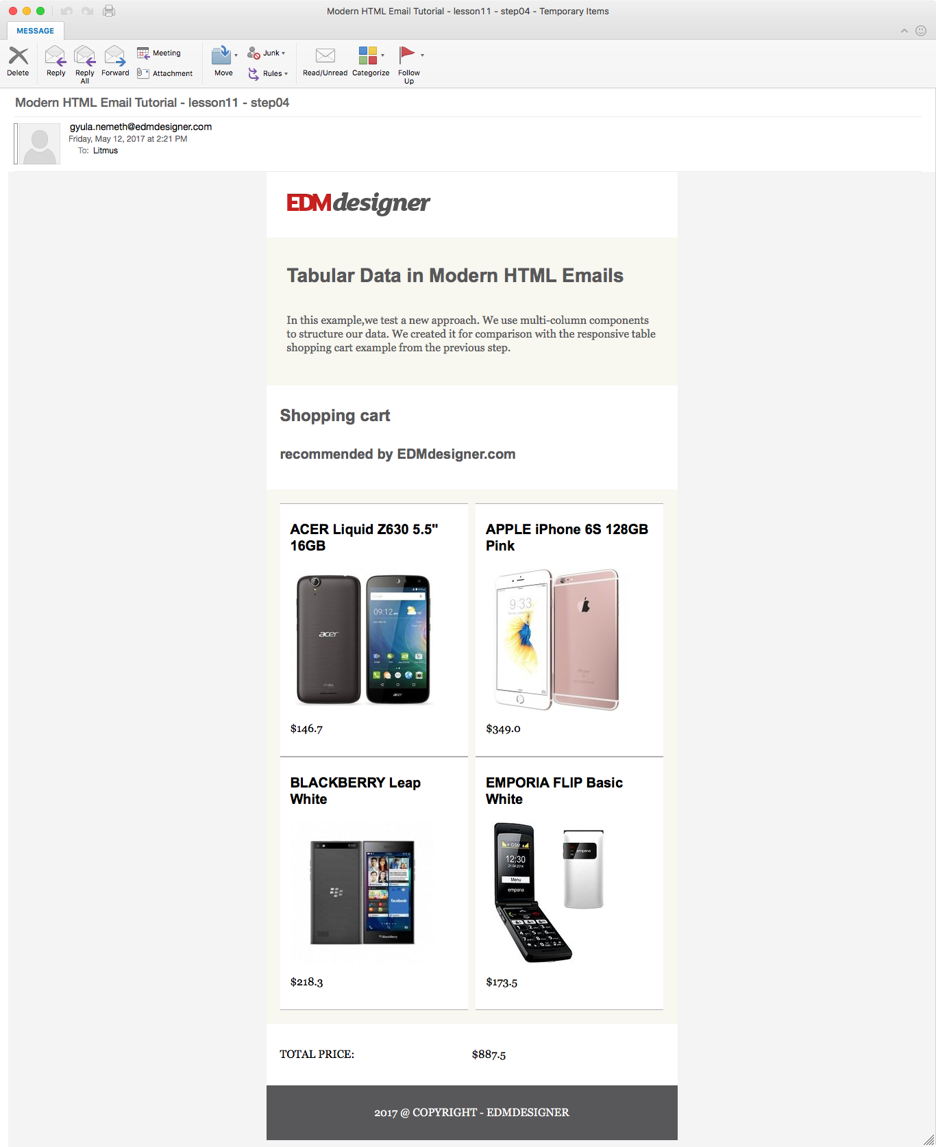
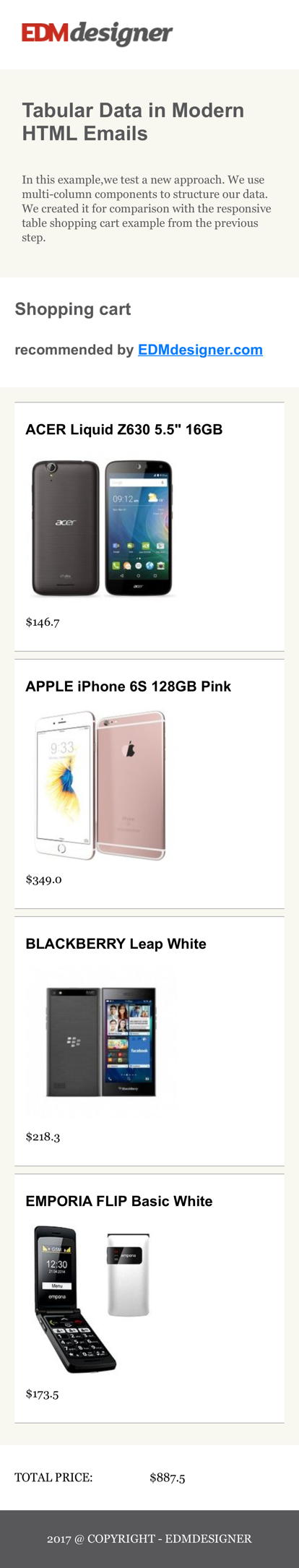
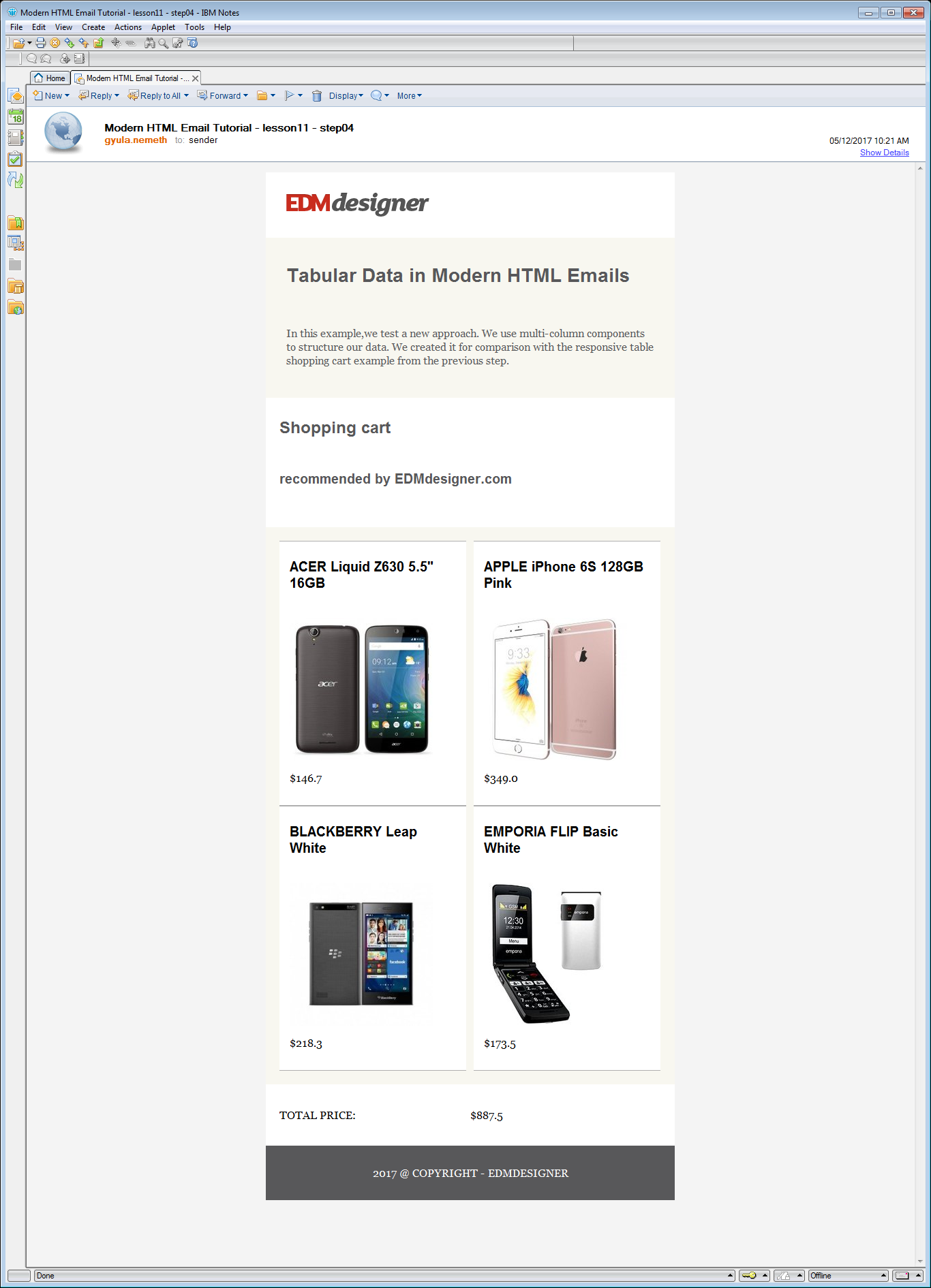
Shopping Cart Example with Card Layout Design
The card layout method structures the data into groups. These groups are formed with the use of multi-column pattern. They can be considered as cards or tiles by their design, and we re-enforce this with the CSS.
First, we need to remove all table related styles from the style tag. Then we switch the original HTML table we had to multi-column elements. A row's data from the original table is wrapped into a single card. In the example, we work with a 600px wide template. There's sufficient room for two of them in a row in webmails and desktop clients with the card layout technique.
We also insert a "ghost-column" in between the cards to add a little spacing for desktop and webmail clients. It's referred as a ghost-column, because it gets hidden on mobile devices.
To wrap up: the whole template uses two multi-column elements, each containing two data-columns and one ghost-column. You can examine this above, in the preview.
If you got confused, the source code of a multi-column element and its container may help better understanding:
...
CSS RESETS
...
<style>
.container600 {
width: 600px;
max-width: 100%;
}
@media all and (max-width: 600px) {
.container600 {
width: 100% !important;
}
}
.col49 {
width: 49%;
}
.col2 {
width: 2%;
}
.col50 {
width: 50%;
}
@media all and (max-width: 599px) {
.fluid {
width: 100% !important;
}
.reorder {
width: 100% !important;
margin: 0 auto 10px;
}
.ghost-column {
display:none;
height:0;
width:0;
overflow:hidden;
max-height:0;
max-width:0;
}
}
</style>
<!--[if gte mso 9]>
<style>
.ol {
width: 100%;
}
</style>
<![endif]-->
</head>
<body style="background-color: #f4f4f4;">
<center>
<!--[if gte mso 9]><table width="600" cellpadding="0" cellspacing="0"><tr><td>
<![endif]-->
<table class="container600" cellpadding="0" cellspacing="0" border="0" width="100%" style="width:calc(100%);max-width:calc(600px);margin: 0 auto;">
<tr>
<td width="100%" style="text-align: left;">
...
TEMPLATE MAIN CONTENT
...
<table width="100%" cellpadding="0" cellspacing="0" border="0" style="min-width:100%;">
<tr>
<td style="background-color:#F8F7F0;padding:20px;">
<!-- BEGINNING OF THE MULTI-COLUMN ELEMENT -->
<table width="100%" cellpadding="0" cellspacing="0" border="0">
<tr>
<td width="100%" valign="top" style="min-width: 100%;">
<!--[if gte mso 9]><table width="100%" cellpadding="0" cellspacing="0"><tr><![endif]-->
<!--[if gte mso 9]><td width="49%" valign="top"> <![endif]-->
<table class="ol col49 reorder" width="100%" align="left" style="width: calc(49%);" cellpadding="0" cellspacing="0" border="0">
<tr>
<td width="100%" valign="top" style="background-color:#ffffff;color:#000000;">
<table width="100%" cellpadding="0" cellspacing="0" border="0" style="border-top:1px solid #afafaf;border-bottom:1px solid #afafaf;min-width:100%;">
<tr>
<td width="100%" style="min-width:100%;padding:15px;">
<table cellpadding="0" cellspacing="0" border="0" width="100%">
<tr>
<td style="padding-top:10px;padding-bottom:20px;">
<h3 style="font-family:Arial;font-size:20px;line-height:24px;">ACER Liquid Z630 5.5" 16GB</h3>
</td>
</tr>
</table>
<img alt="" src="https://edmdesigner.github.io/modern-html-email-tutorial/lesson11/img/acer-liquid-z630-16gb-4g-black.jpg" width="210" style="display: block;" />
<table cellpadding="0" cellspacing="0" border="0" width="100%">
<tr>
<td style="padding-top:15px;padding-bottom:15px;">
<p style="font-family:Georgia, Arial, sans-serif;font-size:16px;line-height:20px;">$146.7</p>
</td>
</tr>
</table>
</td>
</tr>
</table>
</td>
</tr>
</table>
<!--[if gte mso 9]></td><![endif]-->
<!--[if gte mso 9]><td width="2%" valign="top"> <![endif]-->
<table class="ol col2 ghost-column" width="100%" align="left" style="width: calc(2%);" cellpadding="0" cellspacing="0" border="0">
<tr>
<td width="100%" valign="top" style="line-height: 20px;">
</td>
</tr>
</table>
<!--[if gte mso 9]></td><![endif]-->
<!--[if gte mso 9]><td width="49%" valign="top"> <![endif]-->
<table class="ol col49 reorder" width="100%" align="left" style="width: calc(49%);" cellpadding="0" cellspacing="0" border="0">
<tr>
<td width="100%" valign="top" style="background-color:#ffffff;color:#000000;">
<table width="100%" cellpadding="0" cellspacing="0" border="0" style="border-top:1px solid #afafaf;border-bottom:1px solid #afafaf;min-width:100%;">
<tr>
<td width="100%" style="min-width:100%;padding:15px;">
<table cellpadding="0" cellspacing="0" border="0" width="100%">
<tr>
<td style="padding-top:10px;padding-bottom:20px;">
<h3 style="font-family:Arial;font-size:20px;line-height:24px;">APPLE iPhone 6S 128GB Pink</h3>
</td>
</tr>
</table>
<img alt="" src="https://edmdesigner.github.io/modern-html-email-tutorial/lesson11/img/unas_361921.jpg" width="210" style="display: block;" />
<table cellpadding="0" cellspacing="0" border="0" width="100%">
<tr>
<td style="padding-top:15px;padding-bottom:15px;">
<p style="font-family:Georgia, Arial, sans-serif;font-size:16px;line-height:20px;">$349.0</p>
</td>
</tr>
</table>
</td>
</tr>
</table>
</td>
</tr>
</table>
<!--[if gte mso 9]></td><![endif]-->
<!--[if gte mso 9]></td></tr></table> <![endif]-->
<!-- END OF THE MULTI-COLUMN ELEMENT -->
</td>
</tr>
</table>
...
FOOTER CONTENT
...
</td>
</tr>
</table>
<!--[if gte mso 9]></td></tr></table>
<![endif]-->
</center>
</body>
</html>
Now we totally understand if you think that this is a lot of code. It is. That's why we generate our HTML from a markup document. In a future post on EDMdesigner's blog we are going to show how we do it.
The results speak for themselves.
The Litmus previews show exactly what you would experience on the web:
The only difference we should recognize is that on Android devices and Gmail App IMAP there is no spacing between the second and third card.
This happens for two reasons. The first is that there is no ghost-column defined with a line-height between the two cards. The second is that the padding-bottom from the style tag is not applied by these clients.
You can view the full source code of this step on GitHub.
Litmus test results
Comparison and Conclusion
We have seen where the two methods have their weaknesses in the previous step. Now we should compare them directly and summarize the results.
First let's compare working examples in each type of the clients:
| Desktop clients - Outlook 2016 | |
|---|---|
| Responsive Table Method | Card Layout Method |
|
|
| Webmail clients - Yahoo Mail | |
|---|---|
| Responsive Table Method | Card Layout Method |
|
|
| Mobile clients - iPhone 7S | |
|---|---|
| Responsive Table Method | Card Layout Method |
|
|
In most webmail and desktop clients either method works just fine. We'll give you some aspects to consider, but it is totally up to you to make your choice when it's not necessary to support special email clients.
The most important thing to deal with is usability and user interaction. We are partial to the card layout method, having a better, more modern feel. It's better suited for longer data strings and probably for a bigger data volume as well. It's more flexible in data representation.
There are also cons to using the card layout method. It's more sophisticated and the email weight is higher. It's maintainability is also more difficult.
Nonetheless, if you wish to support the widest client list possible, you should choose the card layout method.
In the table below you can see problematic previews for both methods:
| Android 4.4 | |
|---|---|
| Responsive Table Method | Card Layout Method |
|
|
| IBM Notes 9 | |
|---|---|
| Responsive Table Method | Card Layout Method |
|
|
| Android 6.0 - own screenshots | |
|---|---|
| Responsive Table Method | Card Layout Method |
|
|
From the comparison above it's clear that the responsive table approach has more drawbacks, and it's less stable.
Summary
This article showed two approaches to tabular representation of data. The traditional responsive data table and the card layout technique.
In the first part of the post we kept on improving a responsive table example for mobile clients. We used display: block on table cells to make full-width and stack. Then we hid the th elements and experimented with adding cell names through CSS pseudo-elements. We did it by applying data attributes. We came to the conclusion that with this approach, we lose support for Android devices.
In the second part, we introduced the card layout method. We made a thorough comparison of the the card layout method and the responsive table method with a shopping cart example. We saw that the card layout method is more stable, but has a higher complexity. The method is very robust with the use of the Drop Calc Method, and it has additional flexibility for custom styles.
If you enjoyed this tutorial post, help us notify you about the next one as well. Please subscribe to our newsletter below.