What actually makes email design inspiring?
Obviously, an awesomely shocking subject line and unconventional email copy can make your email very inspiring. There are some content creating methods that can help you with this. You should get acquainted with them before you start creating your newsletter design and drafting a copy.
First of all, you have AIDA, which stands for Attention, Interest, Desire, and Action. These are the four steps you should use to guide your audience if you want them to take any intended action.
In the case of ‘Attention’ for your emails, it basically means an eye-catching subject line encouraging people to open your email, for instance, “Surprise! (Can you guess what yours is?)” (Banana Republic).
‘Interest’ is hard to evoke, but you can help it by structuring your text in such a way that your message stands out and people immediately catch things relevant to them.
‘Desire’ is usually built by appealing to people’s needs and wants and underlining features and benefits of your product.
In the case of ‘Action’, everything is very simple: you should be very clear about an action you want people to take.
Next, there are 4P’s of Persuasion: Promise, Picture, Proof, and Push. These help you build climax and evoke an intended response from your email.
You study your audience, find out what they want and then ‘Promise’ it to them.
Then you ‘Picture’ what you promised to them by creating a mental image that corresponds with their values.
‘Proof’ is needed to justify the picture you have just created; depending on your audience it can either be data, studies, or even social proof.
And then you ‘Push’ by being specific with what kind of action you want your audience to take.
In this article, we are going to discuss the in and outs of email design. You can find some brilliant examples of email newsletters on the internet.
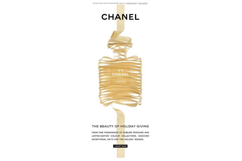
Source: Pure
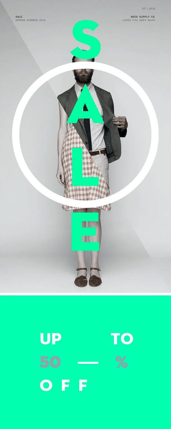
*Source: *Campaign Monitor
But is appearance enough to make an email inspiring? Are great graphic design and stunning images going to bring potential customers to you on a silver platter? Most likely not. I bet your company would not like to spend it’s precious resources on a not very successful email campaign. For instance, a campaign like this:
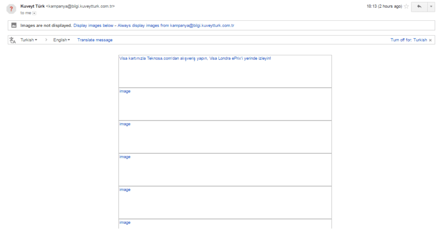 Kuveyt Turk email campaign when images are disabled.
Do you see what this company is offering you? Or what it is all about? Can you find the actual call to action button to find out more? No, no, and no.
When you switch on the images, you finally see what the problem is here. But which of your potential clients will bother to do that, even if the subject line will be persuasive enough to make them open the email they received.
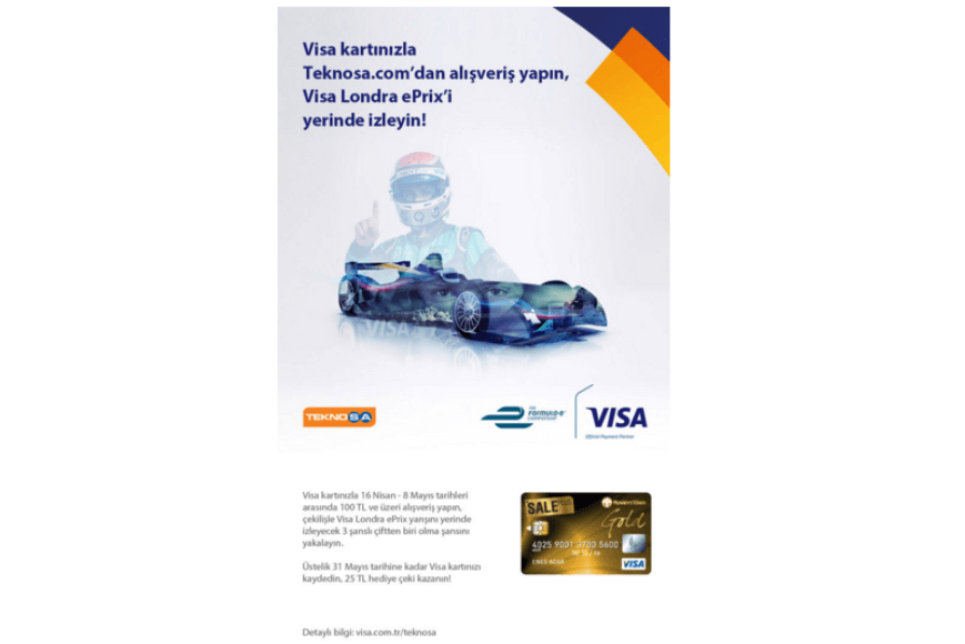
Kuveyt Turk email campaign when images are enabled.
It is not enough for your newsletter design to be beautiful in order to be effective.
Key Elements of Email Design
For everyone, it is clear that you should keep in mind user experience when developing your product. Should you do the same when you create your email design? Yeeeees.
Busy with developing a new email newsletter design for your campaign? It might be wise to recall the principles of Peter Morville’s user experience honeycomb.
Great user experience has the following qualities:
- **Useful. **Your email should be useful for its recipient and has actual purpose.
- Usable. You should consider all possible limitations of HTML.
- Desirable. Your email should give something desirable to your recipient.
- Findable. Your email should not end up in their spam folder.
- Accessible. Easy to click and working links, contrast colors, hierarchy of information, plain text version – all of these things make your email more accessible.
- Credible. Sender name of your email, subject lines, copy and links should not mislead your customers.
- Valuable. In your email you should give the recipient something valuable. It can be information, a free product, coupon, etc.
If you want your email campaign to work well, you should make your email design look beautiful, but you should also go beyond the design and consider user experience and other factors that make your newsletter effective, especially the limitations of HTML.
Layout & Format
- Make everything 600 px wide: email clients have a limited preview window and most of your audience will read your email on a mobile device.
- Optimize for mobile: again – loads of people, like 56%, read emails on their portable devices.
- Keep important things (like calls to action) to the left: people tend to scan emails rather than read them properly.
- Images on the left, text on the right: people tend to perceive images much faster than text, at the same time when they look at your email they first see the left side of it. Why don’t you put images on the left so that people first catch the mood and emotions and only then read text.
- F-shaped reading pattern: people don’t actually read, they scan and their eyes move in an F-shaped direction, so always start your emails with the most relevant information, so people capture it first.
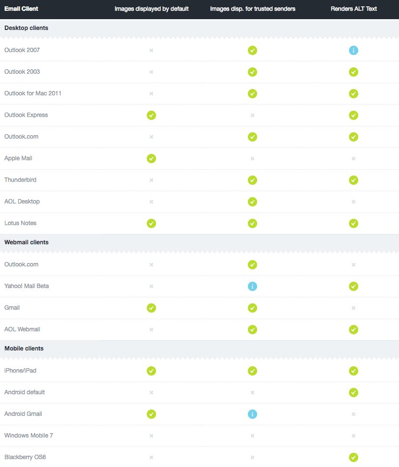
- Make email understandable even without images: many Outlook versions and some other email clients block email images by default, or some people prefer to disable images. Thus, make your descriptions persuasive enough for user to switch on images.
- Use web safe fonts, such as Arial, Verdana, and Georgia. You don’t want your message to look wicked on your customer’s screen.
- Calls to action: they should be placed as high as possible, as it is the top part of the email that actually makes a difference, so your CTA should be clear and easily findable (preferably, a button).
- Include “open in the browser” or “open original” link: just in case people would like to enjoy your email in full beauty and in the browser.
- Be consistent: your email layout should match with your website and landing page. This will make your marketing efforts appear uniform across all channels.
 **
**
*Source: *Campaign Monitor
Images
- Don’t use background images: background images are not shown on many email clients (Outlooks), so it is much better to use solid-color background, or if you are using a background image, always make sure that you have a similar color as a fallback option.
- Don’t forget about resolution: you want your images look nice, neat, and fast, so don’t make them too heavy, but at the same time don’t downgrade the quality too much. Use animation – why should you restrict yourself, when you can use GIF to carry on emotions that a static picture is unable to express.
 **
**
*Source: *Mail Bakery
*Source: *Mail Bakery
Content
- Subject Line: You can never make the first impression twice. Subject line is your way in, so summon all your creativity and try to do your best for the copy that is less than the standard Twitter message.
- Humor always works:
Groupon: “Best of Groupon: The Deals That Make Us Proud (Unlike Our Nephew, Steve)” - As well as surprise:
Barack Obama: “Hey” - And real numbers:
Neil Patel: “How I grew the KISSmetrics Blog from 0 to 350,000 readers a month” - Here are some other tips on subject lines that will make your email design effective.
- Copy: keep your copy sweet, short and appealing; you can go in all the details you want on your landing page.
- Links: add follow/subscribe links to your social media and check that all the links in your email actually work and presented in the plain text version too (especially call to action ones).
- Testimonials: add testimonials where appropriate, because people simply like social proof.
- Story: your newsletter design should tell a story, so all of the elements should be connected and have a narrative flow.
- Footer: like every good story your email needs an end – the footer can easily perform this function and contain all the small stuff you don’t want to place in your copy.
Source: Mail Bakery
Testing your email design
- Smartphone and tablet-friendly: keep in mind that according to Litmus, 56% of emails are opened on mobiles, so people are more likely to read your newsletter on their small screen mobile devices.
- Spelling: check your spelling very carefully, some people are extremely grammar sensitive.
- Testing: test your newsletter design several times before your publish.
We hope you will find our tips on email design useful and contributing to the success of your email campaigns.
