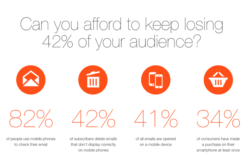
Litmus and Salesforce conducted a research together to have a look into the current trends of the market.
 image source: Litmus.com
Email opens stabilized
The first thing that we can see from the data set is that the situation is not changing so rapidly anymore – the share of mobile, desktop and webmail opens hardly changed over the course of the year. Mobile of course still dominates around 48-50 percent, with desktop currently only accounting for 22% of opens.
**The market is lagging behind but catching up: **the share of mobile-friendly websites have increased from 74% in June 2014 to 85% in June 2015.
It is no question that that Google’s mobile-friendly update have helped with the deeper adoption of responsive designs – for months now Google prefers mobile-friendly pages in search results provided for mobile users.
But emails don’t look so good…
While many B2C companies were able to create responsive (or at least mobile-aware) email designs in the last 12 months, the share of desktop-centric designs in email is still 44 percent. It is however positive that mobile-friendliness increased 155% since October 2013.
 image source: Litmus.com
Incoherent user experience
Because company emails are lagging behind websites in mobile-friendliness subscriber experiences are very disjointed. There is not only a 29% difference – 16% of mobile-friendly emails lead to desktop-centric websites, which can cause a lot of mobile users to bounce after visiting the site. More than half (52%) of B2C brands seem to lack emails and websites that are both mobile friendly.
Other research confirms that you should move quickly – according to Gartner, 74% of smartphone users are actively using their devices to check their mail, and more than two thirds of Gmail and Yahoo opens are now taking place on mobile platforms.
Litmus says that you should determine how many of your subscribers are using mobile devices to open your emails – we can be fairly confident however that it will be a great portion of them. And even if you currently have more desktop users, you can count on that changing in the next months or years. Which of course means, that **you should go for responsive emails and websites. **
It is far too late for early adoption but not for catching up! For emails you only have to find a quality responsive email editor which is easy to use and you can create cool mobile-friendly emails in no time. We realized that there are many email service providers lacking a quality responsive email editor, that’s why we offer EDMdesigner’s email editor for 100% white-label integration.
We believe in a future where anybody can create responsive web and email content without writing a single line of code! Thank you for supporting our cause with a share 😉


