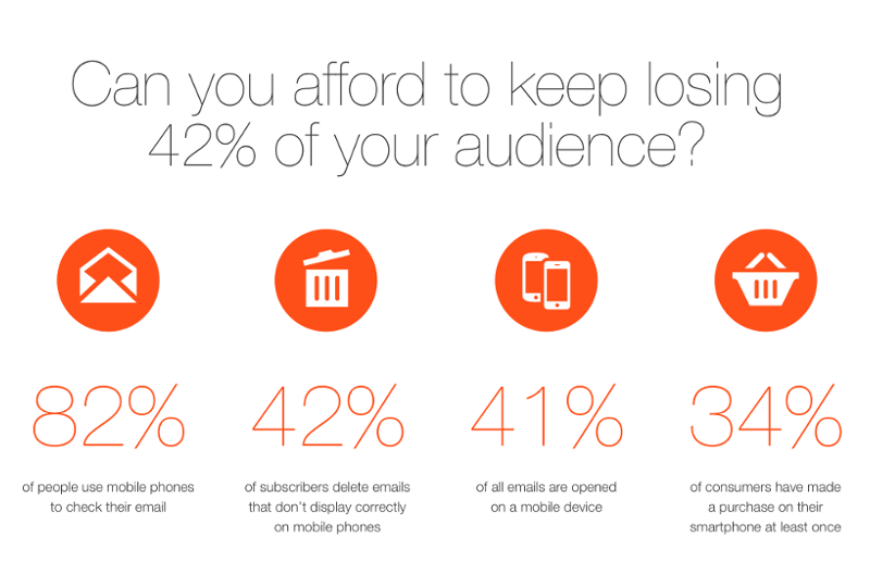
Your smartphone is always with you, connected to the web, and ready to shoot you notifications when “something” happens. You text and make calls, but you also read your mails on it, as it is faster and much simpler than going to your desktop every time.
In terms of global usage, mobile have already surpassed desktop sometime around early 2014 according to comScore. Mobiles are not only common in the general population, but also the number of companies who adopt smart devices increases rapidly. Mobility boosts productivity, and also provides great new opportunities for email marketers…
But this is all old news. It’s been more than three month since Google rolled out its so called “Mobilegeddon” update, which favors mobile-friendly sites. Since then, Bing also adopted the mentality, and all the other search engines will soon join the trend for sure.
So, when more than 80% of internet users own smartphones and use them even more than their desktops, an email marketer must answer the call of times as well.
Needless to say, emails don’t open the same way in all devices – what might look nice on a desktop will likely fall apart if opened on a mobile. Or on a tablet, a phablet and so on. And by 2015 the majority of email opens take place on mobiles, up to 53%.

What happens if you send out a mail which is not optimized? A BlueHornet study revealed that more than 80% of recipients delete it and almost a third hit unsubscribe – while if they receive a responsive mail, 63% is willing to consider making a purchase. Which is no surprise, as they don’t want to deal with badly formatted, barely readable mail.
User experience is critical for online marketing, and if we are talking about mobile, it is even more important. Someone reading his emails on the phone wants to receive a tidy message with simple and nice layout, clear navigation. Your offer and the conversion goal(s) should be obvious at a glance.
No zooming, no pinching, no hardly “clickable” links! If you want your mobile readers to you’re your emails give them **simple choices and clear directions, **and content that displays in the right way on every device they own.
Better user experience leads to greater conversion, and that experience is primarily shaped by responsiveness. Responsive mails have a 21% higher click-to-open rate (according to MarketingProfs), which is a very good reason by itself to consider switching to responsive.
We conducted our own research last year with an eCommerce website which had 1 million subscribers. As part of our cooperation we rebuilt one of their templates with EDMdesigner from scratch. It looked almost the same as the standard “desktop” email they used to send, but thanks to the HTML generator engine we used, the output was a bulletproof responsive email. We A/B tested the two versions, and the responsive email had 11,8% higher conversions!
If you are not using responsive design in emails and still consider a one-size-suits-all approach as the best, you are years behind your competitors. You are not missing out anymore – that would have been true two years ago. Today, you are willingly passing up an enormous part of your target market.
**Luckily, it’s never too late to join in. **If you start learning how to compose responsive emails and start using a responsive email editor right now with the right designs and templates, you stand a good chance to catch up and EDMdesigner is an email editor which is happy to help you with that.


