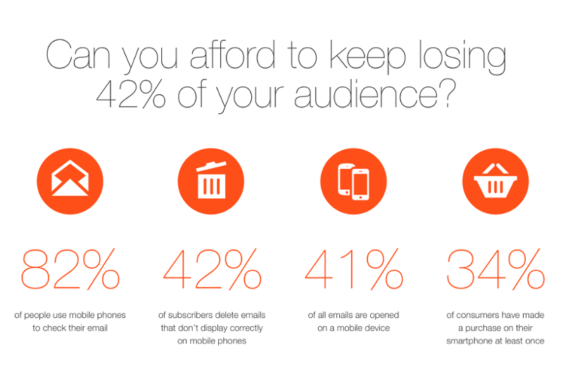
For creating responsive emails we need to use CSS3 Media Queries in a linked or embedded stylesheet. These control and transform the layout of your email on different screen sizes. This technology makes it possible to present emails on a mobile device in a user-friendly format, so that your subscribers don’t have to scroll horizontally or zoom in just to be able to read the content.
source: Freeimageslive.co.uk
Andrew Driscoll fromAspen Marketing Service** confirmed us that these causes leave responsive email’s design ***“1.75 and 2.5 times greater than a non-responsive, mobile-friendly design”***.
Pretty high number, right?
It isn’t a rocket science to conclude that people would prefer using automated app rather than spending heaps of time on coding and testing and retesting and so on… We created EDMdesigner to make your life easier and save some precious time for you by not having to code your responsive email in HTML. We’re working hard to make this experience happen and equip you and your business with an innovative tool that does the ugly coding in the background. Our editor is easy to use, the functionalities are straightforward and at the end of the day it provides you smart and sexy responsive emails. So why not have a look?
Try EDMdesigner or drop us a line, if you want us to make your emails responsive!


