Throughout this tutorial series, we have been using paddings, margins and borders a lot. We have implicitly shown you some of their — sometimes weird — behaviours, but we felt that we should convert this implicit knowledge to explicit.
In the first part of the article, you will learn how to use these properties on text and image components. I am talking about components, because it is absolutely not sure that we are going to put all of these CSS properties in the img or p element itself.
In the second part, I am going to show you a small trick that you can use to imitate margins that will disappear on mobile devices. If you have created multi-column layouts with margins, you probably know that it can be a pain.
There are still some remaining chapters of this tutorial series, which will cover some very interesting topics, for example: responsive tabular data representation, interactive emails, and a summary of a complex component system for emails.
If you don't want to hassle with the coding and you think it takes too much of your time, you can try out our new email template builder where you can design emails without coding. You can sign up and try it out for free here.
Testing Margins, Paddings and Borders
In this section we are going to go through the different ways to apply paddings, margins and borders on different elements to figure out the best and most robust way to do it.
Testing Margins, Paddings and Borders on p and img tags
First of all, we start with a simple template where we apply the mentioned properties to an img and to a p element.
This way, we can identify the problematic email clients, and we can figure out how to solve those issues. You can check out the relevant lines from the source below:
...

<img alt="IMG with padding, margin and border" src="https://edmdesigner.github.io//modern-html-email-tutorial/lesson10/img/edmlogo120.jpg" width="120" height="90" style="display: block; width:auto; height:auto; padding: 10px;background:#cdcdcd; border: 2px dashed #a0a0a0;margin: 20px;" />

...

<p  style="padding: 10px;background:#cdcdcd; border: 2px dashed #a0a0a0;margin: 20px;font-size: 16px;line-height: 20px;">P with padding, margin and border, while contains only text</p>

...
If you check out the Litmus test, you won't be surprised. Once again, our biggest problem is Word-based Outlooks.
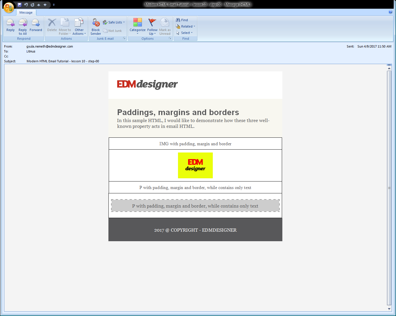
Every property that we tried to apply on the img element is lost (padding, margin and border). The margin-left and margin-right values are also modified on the p tag.
Besides our major enemies (Word-based Outlooks), paddings on img tags are also not applied on Lotus 8.
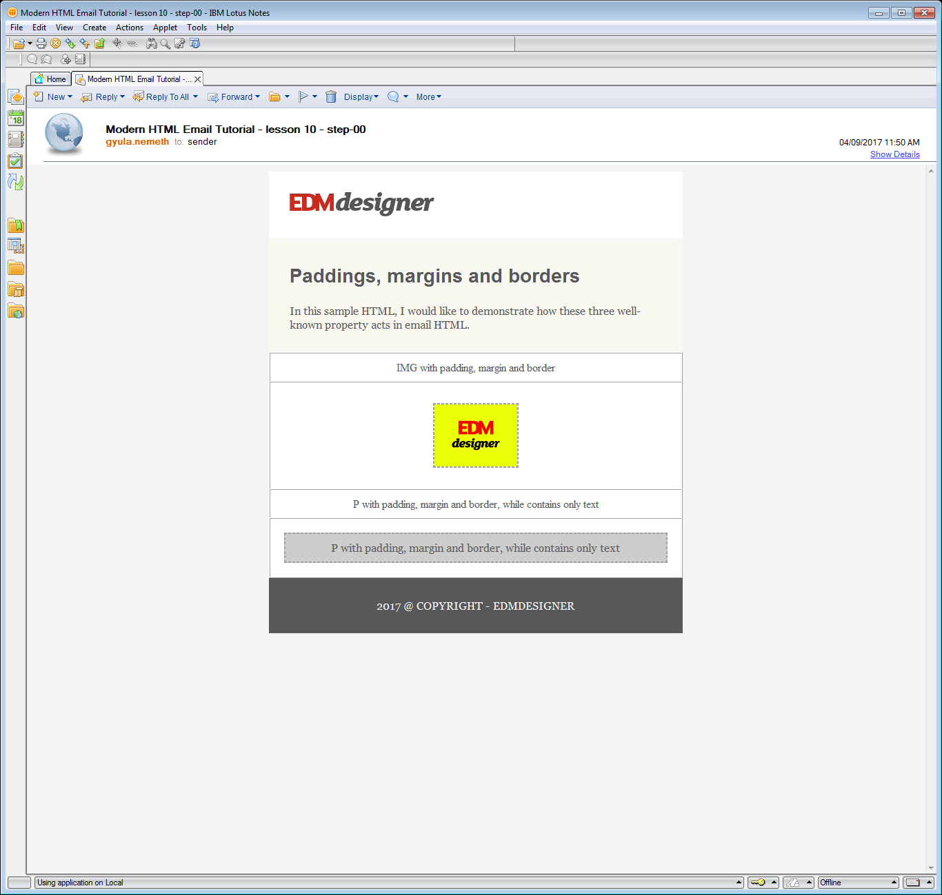
Check out the full source code of this step on GitHub.
Testing Margins, Paddings and Borders on div warppers
As you could see in the previous section, some CSS properties were lost when we applied them to img and p tags. If you had been following this tutorial series, you might have figured out that we have to wrap these elements in another element.
Let's try to wrap them in a div element to check if there are any differences.
...

<div style="padding: 10px;background:#cdcdcd; border: 2px dashed #a0a0a0;margin: 20px;display:inline-block;">
    <img alt="DIV holds all the padding, margin, border properties, and contains the responsive IMG" src="https://edmdesigner.github.io//modern-html-email-tutorial/lesson10/img/edmlogo120.jpg" width="120" height="90" style="display: block; width:auto; height:auto; "/>
</div>

...

<div style="padding: 10px;background:#cdcdcd; border: 2px dashed #a0a0a0;margin: 20px;font-size: 16px;line-height: 20px;">DIV with all the padding, margin, border properties, and contains only text</div>

...
In the screenshot below, you can see that it indeed matters what kind of element we apply the CSS properties on.
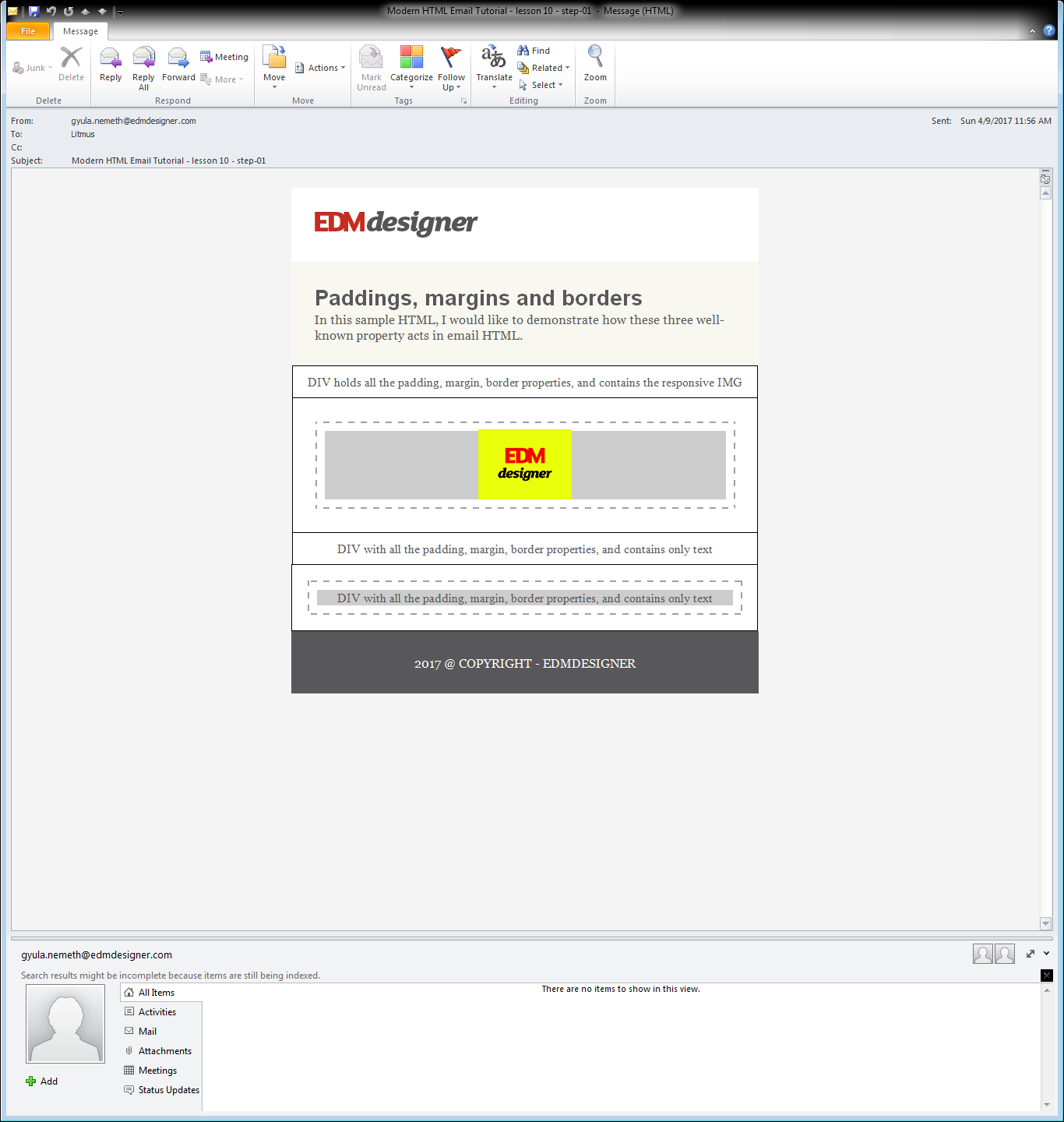
As you can see, the margin-left and margin-right issue on p elements is solved. You can also see that all of the properties are applied on divs, so the image component's issue is almost solved. The only problem that remained related to the img element is that display: inline-block; was not applied, so that element remains 100% wide.
Check out the full source code of this step on GitHub.
Testing Margins, Paddings and Borders on table wrappers
You probably have guessed already that we should use tables as wrappers. Also, it's very important to use paddings on tds only, because that is the only tag-css-property combination that works on every single email client.
It means that if you want to apply margins, then you have to use another wrapper table.
The final structure is that you have a "margin-table" in which there is a "padding-table" and inside that there is your original content. You can apply the borders on the "padding-table"; you do not need a separate table for that.
...

<table width="100%" cellpadding="0" cellspacing="0" style="min-width:100%;">
	<tr>
		<td style="color:#58585A;padding:20px;" align="center">
			<table cellpadding="0" cellspacing="0" style="padding:0;background:#cdcdcd; border: 2px dashed #a0a0a0;margin: 0;">
				<tr>
					<td style="padding: 10px;">
						<img alt="TableWrapper with padding reset and border, while contains only text. Margin value changed to padding, and moved to parent TD;" src="https://edmdesigner.github.io//modern-html-email-tutorial/lesson10/img/edmlogo120.jpg" width="120" height="90" style="display: block; width:auto; height:auto; "/>
					</td>
				</tr>
			</table>
		</td>
	</tr>
</table>

...

<table width="100%" cellpadding="0" cellspacing="0" style="min-width:100%;">
	<tr>
		<td style="color:#58585A;padding:20px;" align="center">
			<table cellpadding="0" cellspacing="0" style="padding:0;background:#cdcdcd; border: 2px dashed #a0a0a0;margin: 0;">
				<tr>
					<td style="padding: 10px;font-size: 16px;line-height: 20px;">TableWrapper with padding reset and border properties, while TD has the padding 10px; The margin 20px moved from the wrapper Table to the parent TD, and changed to padding:20px;</td>
				</tr>
			</table>
		</td>
	</tr>
</table>

...
As you can see from the Litmus tests, this method is very, very robust. All of the email clients render our example very well.
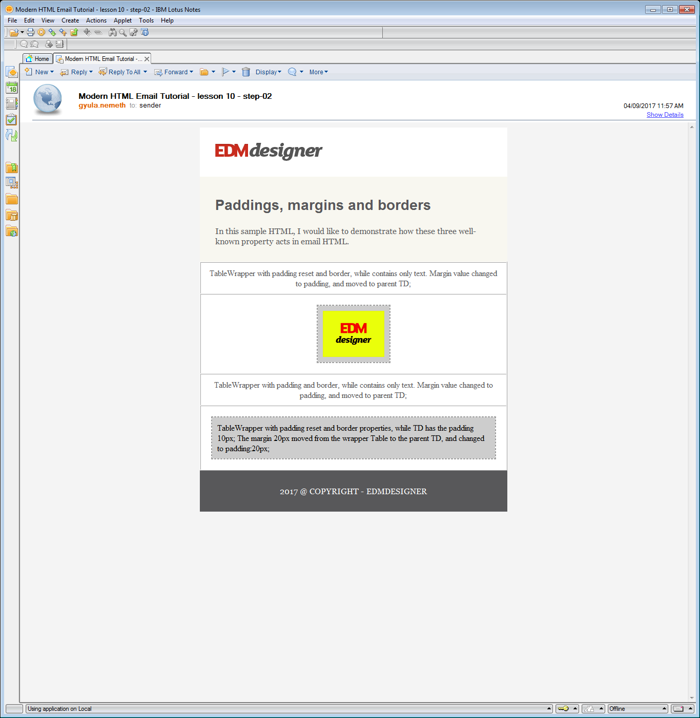
Check out the full source code of this step on GitHub.
Conclusion and Sidenotes
As you could see from the tests, using table wrappers is the most well-supported solution, but again: If you do not need to support all of the email clients, then you might not need these many tables. More light-weight the email is, more likely that you won't have problems with spam filters.
In our examples we only checked p from the text-like elements. If you would like to read a more comprehensive article about text elements, please read our article about typography. In that article, you can read about a very interesting limit. Borders can be only 8 pixels wide on Word-based Outlooks. I am wondering why would someone build a limit like that into a rendering engine...
My final thought about wrapper tables is that you can use custom graphics in the wrapper tables' cells. That was the way to create very fancy borders in the 90's and the early 2000's. I can still observe this technique in some HTML emails which alway makes me nostalgic.
Margins on Small Screens
If you want to create multiple columns with margins in between them, you will face an issue which is a little bit tricky to solve on some mobile devices. We have created an example to demonstrate this issue. Please check out the mobile preview in the example below:
As you can see, there is margin-right on the left column and margin-right on the left column. If you reorder it on small screens then you have to use media queries to make those margins disappear.
Now, the problem is that there are some mobile email clients that do not support media queries. It feels like an impossible task to solve, but there is a neat trick which will help you in these cases.
You can use empty columns instead of margins. It means that everything will be stacked on small screens, even the empty columns.
If you combine this idea with the Drop Calc method, then you will be able to create multi-column layouts with margins that work on almost all of the email clients.
I won't go into the details here. I think you will be able to figure it out if by yourself. The only thing you need to keep in mind is if you use the Drop Calc method, the placeholder columns will have to have dimensions. It means that you have to add line-height to the placeholder cell and a as content.
<!--[if gte mso 9]><td width="5%" valign="top"><![endif]-->
<table class="ol col5" width="100%" align="left" cellpadding="0" cellspacing="0" border="0" style="width: calc(5%);">
<tr>
<td width="100%" valign="top" style="line-height:20px;">
</td>
</tr>
</table>
<!--[if gte mso 9]></td><![endif]-->
The line height will define the vertical spacing between the cells on small screens, while the width of the cell will be the horizontal spacing between the cells on desktop.
Check out the full source code of this step on GitHub.
Summary
By finishing this tutorial post you have learned the ins and outs of spacings and borders in modern HTML emails.
We have shown you how to wrap your content into "padding-tables" and "margin-tables" to achieve an uniform look on every email client.
In the second part of this short chapter, you could learn a neat little technique with which you can create multi-column layouts with spacings in between the columns, which will disappear on mobile devices.

