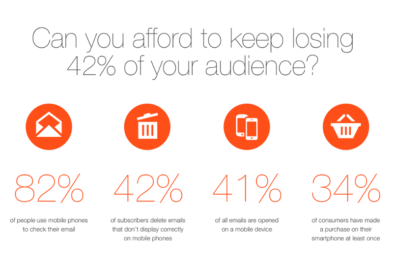
It’s really disappointing for us, and for many other players in the email marketing industry, that Gmail, the biggest webmail provider, still doesn’t support media queries.
Why are CSS media queries so important?
Briefly: responsive email design lies on media queries. Without them, it is not possible to adjust the original desktop design to different screen sizes. They are used for influencing width (min-width, max-width) and changing layout (float, display attributes). But the inconvenient truth is that not all email clients support CSS media queries. 🙁

 image source: Litmus.com
FAQ – Why isn’t this email responsive/sexy in my Gmail Mobile App?
Simply because Gmail does not support CSS Media Queries, so responsive email techniques simply do not work in any Gmail Mobile App. What can we do about it?
- Design and prepare mobile first email templates only
- Stick to one column
- Use big text, large buttons
- Compromise (worse desktop experience vs. better user experience on mobile)
Fortunately we are not the only ones fighting for a better world (in email). Email-standards.org is out there to help us to spread the word all over the web, and make email design a less tiresome issue for all of us. Thank you for that!
Please spread the word, and if you know anyone, who’s involved in the development of Gmail please just forward this post to them!


