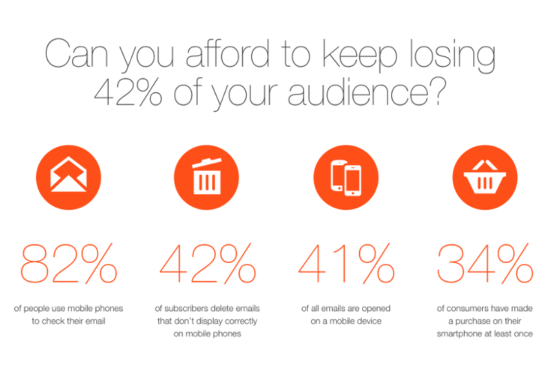
Litmus says that 80% of recipients will delete an email right away if they don’t like the way it looks on their mobile. This fact is already strong enough to prove that responsive or mobile friendly email design is a must! But if your email is responsive it does not mean that it looks good! It may look better than a non-responsive one, but if you want to use your email editor to create masterpieces of marketing mail, you have to know the likes of your audience. Edisonda conducted a thorough research on the subject, and they found that the most crucial factors influencing the effectiveness of your emails are the length of your paragraphs, placement of text, image content, logo and CTA placement.
Most important information should come first
You must fight for the attention of your readers with every word, image and CTA. If your message is not interesting, relevant and/or attractive enough, you will lose many of them in a glance. As you can see on the heatmap below, if you place the introductory text above an image, readers will notice it more.
 image source: Slideshare.net
Also, size matters. Not surprisingly bigger text will draw more attention. “The smaller the font of the text, the smaller the attention span on this specific area of interest”, says the research.
Use your responsive email editor to distinguish important text
We also know that long paragraphs are distracting to the viewer. It is one of the most basic elements of content marketing: you should use shorter text blocks (paragraphs), because your reader will get tired. **They want to feel that they are moving on. Heatmaps once again reinforced this theory: CTAs of shorter mails were noticed by 77% of the study’s respondents, but CTAs placed after longer paragraphs by only 53%. That is a huge difference.
 image source: Slideshare.net
Key takeaway – Divide your text into more paragraphs. It may make the whole email a bit longer, but those paragraphs will be much easier to consume.
Align text to the left!
It may be tempting to play around with text alignment in your emails, but it seems still the good, old left-align rules ‘em all. Heatmaps showed that left aligned text helped 47% of respondents to notice the given element, while with center aligned text only 26% recognized that there’s something for them to read.
 image source: Slideshare.net
All of these seem to be very small changes but they have enormous impacts. When opening your responsive email editor, keep in mind that you should give your recipients the email they will like – not the one that you or your designer likes!


