In the last few months I have been following the previous posts of the Modern HTML Email Tutorial series and I have learnt quite a lot already. I have seen why is best to think in components and how layout design works made up of them. I have observed the basics of email coding and taken in the brand new "Drop Calc Method" technique. I chose to deepen my knowledge with the help of those posts written by Gyula Németh - Co-founder & CTO @ EDMdesigner.com. With the expertise gained, I feel confident about sharing my findings on content images.
If you want eye-catching, promotional email campaigns, images are fundamental. Images let email marketers communicate their message in an entertaining, personal way, and gives them the benefit of an engaged community of prospective clients. By reading this tutorial, you will learn how to code content images that will show up in every email client and will be rendered correctly.
This article aims to cast light on the quirks and mysteries an email coder encounter when developing Email HTML with images in 2017. In the article we will:
- extend our component library,
- learn how to handle image blocking, and
- examine GIF and Base64 encoded image support.
A short disclaimer, though: an upcoming post will feature background images, we only cover content images for now.
I will follow the clear structure of the previous articles and we will build on the basis laid down by them. I hope that you will enjoy trying out some of the mentioned techniques and you can use the introduced new image component for your own projects. On this assumption, let's get started!
Building the Content Image Component
First we are going to go over the best practices to achieve the perfect display. The idea is to try to understand in depth, why each property is necessary for images in our code. We want to build a robust example based on our experiences. We will end up with a quality, reusable code block as our image component. You can add it to your component library to emphasize maintainability. This section will include serious testing on the different HTML and CSS properties, covering most of Julie Ng's suggestions in her blog post.
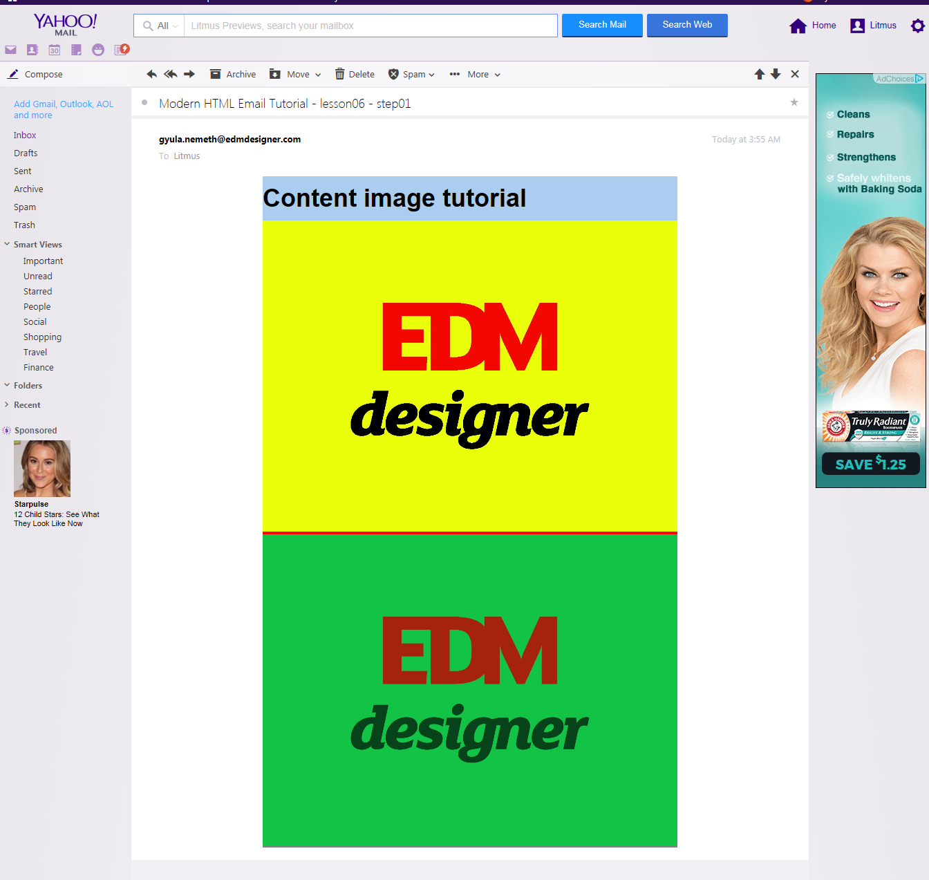
For the purposes of this post, I created a project, showing the EDMdesigner logo below a <h1> element. They are each placed inside a section component, which are put in the wrapper component template of the Drop Calc Method. This results in a set of nested tables. I colored the section components, so we can see if the image does not fit properly. I used a 1600x1200 pixels, high-resolution, JPG format image, which file type is often considered the default for emails. This setup will be the basis of our tests for this tutorial and we are going to modify it, according to the properties in test.
You can view the project's initial source code on Github
At each step the README.md file on Github summarizes the changes and how they are supported, based on the visual tests of the two major email testing services: Litmus and Email on Acid.
Using Image With Only Its Src Attribute
First I did not specify any dimension, as I was curious about, if the container can force sizing on my image. I ran a Litmus test, and got a pretty discouraging result. Web, desktop and tablet clients did not prevent the image to stretch, only some mobile clients were able to adjust size to the parent container. The few exceptions were Gmail App IMAP(Android), Android 5.1 and 6, and iPhone with iOS7 and iOS10+. They work great, because they apply well the style="width: 100%" property, used on various parts of our table.
This is our first result in Web based Gmail on Firefox:

You can check out the full source code of this step on Github.
Litmus test results
Width as Percentage Value
Following the basic test with only the source attribute given, I wanted to check how percentage value is supported across clients. I updated the example with an additional logo, so assessing style- and attribute-width parallel became possible. The two picture's source looks like this:
<img alt="Awesome yellow EDMdesigner logo" width="100%" src="https://edmdesigner.github.io/modern-html-email-tutorial/lesson06/img/logo2yellow.jpg"/>
<img alt="Awesome green EDMdesigner logo" style="width: 100%;" src="https://edmdesigner.github.io/modern-html-email-tutorial/lesson06/img/logo2green.jpg"/>
Examining the test results it is clear that percentage support is widespread for mobile and web clients. Almost all display correctly. Here is Yahoo! Mail as a nice example:
Even modern desktop clients, like Thunderbird, or different versions of Apple Mail and Outlook 2011, 2016 adapts to percentage width. For them it does not matter, if it is given as an attribute or a style. Other versions of Outlook and Lotus Notes still have the content at its full resolution. We can conclude that there is poor support for percentage width for older desktop clients.
You can check out the full source code of this step on Github.
Litmus test results
Width as Pixel Value
Besides percentage dimension, it is necessary to know how clients handle pixel widths. The previews are controversial here. We see that pixel values score better, as they are sized appropriate on all clients (but Android 4.4) if we look at the first logo with the yellow background. On the other hand, the green-background logo does not do what we have asked, in the case of Word-based Outlooks (2007, 2010, 2013) and Windows 10 Mail. The red background becomes visible, because the table cell, that contains the images, is enlarged by the green logo where the inline style was not applied.
You can check out the full source code of this step on Github.
Litmus test results
Width Applied in Classes
To have a full picture on measurement support, we must try to implement width from embedded styles. We have the same setting here, only widths are applied via classes:
<html>
<head>
...

<style>
      .pixelSize {
        width: 600px;
      }

      .percentSize {
        width: 100%;
      }

...
</style>
...
</head>
<body>

...

 <table width="100%" cellpadding="0" cellspacing="0" border="0" style="min-width:100%;">
              <tr>
                <td width="100%" style="min-width:100%;background-color:red;">
                    <img alt="Awesome yellow EDMdesigner logo" class="pixelSize" src="https://edmdesigner.github.io/modern-html-email-tutorial/lesson06/img/logo2yellow.jpg"/>
                </td>
              </tr>
            </table>
            <table width="100%" cellpadding="0" cellspacing="0" border="0" style="min-width:100%;">
              <tr>
                <td width="100%" style="min-width:100%;background-color:grey;">
                    <img alt="Awesome green EDMdesigner logo" class="percentSize" src="https://edmdesigner.github.io/modern-html-email-tutorial/lesson06/img/logo2green.jpg"/>
                </td>
              </tr>
            </table>

...
</body>
</html>
You can view this step's previews on Litmus
We can identify interesting characteristics when comparing this step's outcome with the previous one.
- Outlook 2000, 2002, 2003, Lotus Notes and IBM Notes only apply pixel based classes, and they do not apply percentage based ones,
- Word-based Outlooks (2007, 2010, 2013) and Windows 10 Mail does not apply the width property in classes at all,
- Older Androids, Mail.ru and Terra Mail do not support the style tag.
It is safe to say, that if your need to provide HTML for the before mentioned clients, classes are not safe to use.
You can check out the full source code of this step on Github.
Litmus test results
Applying the Lessons Learnt
Reviewing the experiments we had so far, it is easy to spot, that attributes on the img tag outperform inline styles. It is based on the fact, that in the 2nd and 3rd experiment (where we set pixel values and a mixture in classes) attributes allowed sizing where style did not effect the corresponding image. Another takeaway is to set pixel measures, because they were recognized by even old outlooks. With these experiences I updated my example's source, only giving width as an attribute. I reduced the example to only feature one logo again, as it is sufficient for our learning purposes.
In the results there were mobile clients not showing correctly, which was surprising for me after the good results of the "pixel-width test" (step-02). So we see, that the sizing is correct, when there is another image below with inline style applied. This means that for mobile clients, it is necessary to use width in inline style. I tried to apply it through a media query, so only mobile clients are affected. It worked, which gave me a good smile.
You may have noticed in the previously attached images and in the preview summary, that on many clients there is an underlying red line for the logo. It is the background-color property defined on the parent container. Because images by default behave as inline-block elements, the height is not applied correctly. We can fix it with adding display: block; to the img tag. I also included this improvement for this step.
You can view this step's previews on Litmus
Our code now looks like this:
<!DOCTYPE html>
<html>
  <head>
    <meta charset="utf-8">
    <meta name="viewport" content="width=device-width, initial-scale=1.0">
    <title>One column layout</title>
    <style>
      html,
      body,
      table,
      tbody,
      tr,
      td,
      div,
      p,
      ul,
      ol,
      li,
      h1,
      h2,
      h3,
      h4,
      h5,
      h6 {
        margin: 0;
        padding: 0;
      }

      body {
        margin: 0;
        padding: 0;
        font-size: 0;
        line-height: 0;
        -ms-text-size-adjust: 100%;
        -webkit-text-size-adjust: 100%;
      }

      table {
        border-spacing: 0;
        mso-table-lspace: 0pt;
        mso-table-rspace: 0pt;
      }

      table td {
        border-collapse: collapse;
      }

      .ExternalClass {
        width: 100%;
      }

      .ExternalClass,
      .ExternalClass p,
      .ExternalClass span,
      .ExternalClass font,
      .ExternalClass td,
      .ExternalClass div {
        line-height: 100%;
      }
      /* Outermost container in Outlook.com */

      .ReadMsgBody {
        width: 100%;
      }

      img {
        -ms-interpolation-mode: bicubic;
      }
    </style>
    <style>
      .container600 {
        width: 600px;
        max-width: 100%;
      }

      @media all and (max-width: 600px) {
        .container600 {
          width: 100% !important;
        }
      }

      @media all and (max-width: 599px) {
        img {
          width: 100% !important;
        }
        .reorder {
          width: 100% !important;
        }
      }
    </style>

    <!--[if gte mso 9]>
        <style>
            .ol {
              width: 100%;
            }
        </style>
    <![endif]-->
  </head>
  <body>
    <center>

      <!--[if gte mso 9]><table width="600" cellpadding="0" cellspacing="0"><tr><td><![endif]-->
      <table class="container600" cellpadding="0" cellspacing="0" border="0" width="100%" style="width:calc(100%);max-width:calc(600px);margin: 0 auto;">
        <tr>
          <td width="100%" style="text-align: left;">
            <table width="100%" cellpadding="0" cellspacing="0" border="0" style="min-width:100%;">
              <tr>
                <td width="100%" style="min-width:100%;background-color:#abcdef;">
                  <h1 style="font-family:Arial;font-size:36px;line-height:44px;padding-top:10px;padding-bottom:10px">Content image tutorial</h1>
                </td>
              </tr>
            </table>
            <table width="100%" cellpadding="0" cellspacing="0" border="0" style="min-width:100%;">
              <tr>
                <td width="100%" style="min-width:100%;background-color:red;">
                    <img alt="Awesome yellow EDMdesigner logo" width="600" style="display: block;" src="https://edmdesigner.github.io/modern-html-email-tutorial/lesson06/img/logo2yellow.jpg"/>
                </td>
              </tr>
            </table>
          </td>
        </tr>
      </table>

      <!--[if gte mso 9]></td></tr></table>
                    <![endif]-->
    </center>
  </body>
</html>
You can check out the full source code of this step on Github.
Litmus test results
Dimensioned DIV to Support Web Outlooks
Despite adopting display: block; the red line for Outlook.com and Outlook 365 often stays in place. This issue was also recognized by Geoff Phillips, and though I could not succeed with the first fix, wrapping the content in a div made the problem disappear. Geoff suggests to set the div height. First I used height="auto", which was not enough, then I also added width="600". Using both was able to remove the red line in my tests. Though I use 600px for simplicity of the example, it is also possible to overcome this limitation in your email. Our image component evolved into this template:
<div width="600" height="auto">
    <img alt="###ALT###" width="600" style="display: block;" src="###SRC###"/>
</div>
One side note on the testing process: it was really puzzling that some tests passed before this fix, whereas the issue turned up in other ones, while the code was not changed, at all.
You can check out the full source code of this step on Github.
Litmus test results
Trying out Smaller Image Size
There is one last thing I want to try. So far the image size was exceeding the viewport size on smaller mobile devices, so everything worked just fine. I modified the example to show the logo 300px wide. To have a nice setup I used two of them, placed inside the multi-column component, described in a previous tutorial of this series. If I use the image at a width less than the viewport-width, this is what I get for Gmail App IMAP (Android):
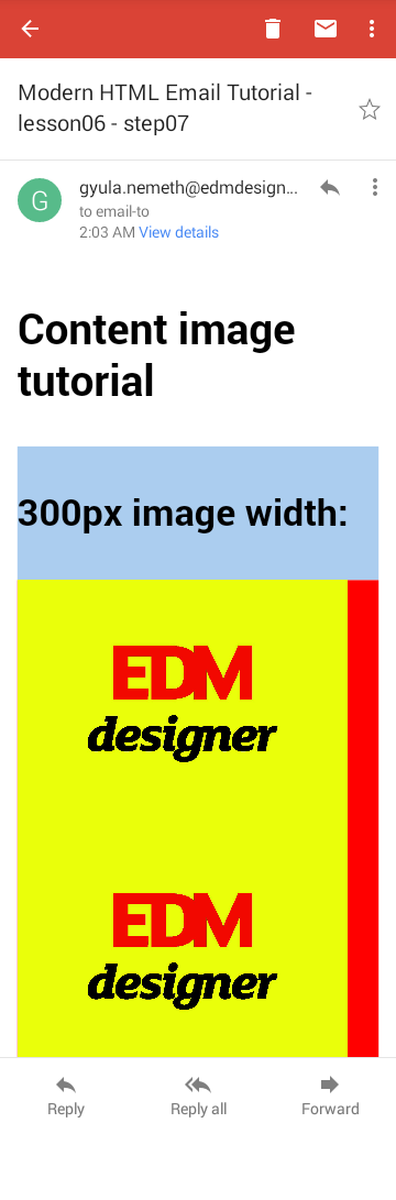
To fix this view, first I ran a test. I had two separate container table, to have a sterile environment. I placed a multi-column component in each, with two logos, sized at 300px. For the first image-group, I set style="width: 100%;" for the second style="max-width: 50%;. By this setup, I could confirm that on Android versions width adapted to the viewport width, which is the intended behavior. On the image-group below it is visible, that max-width serves only as the highest limit, and it is applied correctly to 50%.
Here you can see the result on Android 5.0 from the test:

On the other hand, on Lotus Notes versions, IBM Notes 9, and Outlook 2000, 2002, 2003 width is applied to show the image at its original width. Besides that, max-width is based on the parent container's width. Therefore it is applied as 150px in our case, as the max-width property was set to 50%.
This preview shows, how the step looks in Outlook 2003:

You can check out the full source code of this step on Github.
Litmus test results
Image Component End Solution
After the experiences I had with width and max-width, I tried to apply them both. I simplified the example to a single multi-column component and a pair of images. The results have achieved, what I was looking for. Android versions use width: 100% to go full width on the viewport, while the older Outlooks, and Lotus Notes clients apply max-width: 100% as a top limit to display the image, sized to its parent container.
The end solution for the component looks like this:
<div width="###WIDTH###" height="auto">
    <img alt="###ALT###" width="###IMAGE-WIDTH###" style="display: block; width: 100%; max-width: 100%;" src="###SRC###"/>
</div>
Android based views,

Outlooks,

and Lotus Notes versions were improved:

At the end of this section, I am really quite proud of how our images look. There are only four clients that I am not satisfied with yet, but could not cover in this section:
- Android apps have a glaring sub-pixel border, which persist even with
border="0"on, - in Windows 10 Mail, a known issue appeared. As per our investigation, the width of the image is set to
599px, so a vertical line shows, - Lotus Notes 7 does not show images,
- Outlook 2013 (120 DPI) resizes the image, which is not a comfortable feeling for me.
You can check out the full source code of this step on Github.
Litmus test results
Handling Disabled Images
In this section we are going to discuss possible ways to get our message delivered even when images are disabled. This can happen if the end-users decide on disabling images in their email clients, or when the clients have image blocking set as a default behavior.
Alt Text
The first, and foremost advised practice is to add alt text to your images. This text is shown when the image blocking is on. Additionally, you can style ALT text.
For this example, I removed the image source. For the moment, this is helpful operation as we can examine ALT text for many clients even without disabling images.
Examining the result previews we can conclude, that besides Windows 10 Mail, Mailbox (iOS), Windows Mobile phones, Mail.ru, Comcast and some less frequently used clients, ALT text is supported for web and desktop use. Support is broadly available on mobile clients. Looking at styled ALT text results we see almost exactly the same broad list of clients. There's only Outlooks (except Outlook 2011 on Mac) and AOL Mail (Internet explorer), that would support ALT text, but not styled ALT text.
If you wish to understand ALT text in greater details, Justine Jordan - VP of Marketing @ Litmus - has covered client support with the help of great overview tables, as well as the CSS font properties available for styled ALT text. The only note I can add to her article based on my test is, that Outlook 2003 (Win7) and 2016 (OSX10.10), webmail AOL Mail (Internet Explorer) and Comcasts can already support ALT text styling.
You can check out the full source code of this step on Github.
Litmus test results
Base64 Encoded Images
Email clients can block images, but you may ask what happens when you provide your content as code. That's what Base64 encoding is for.
Base64 is a group of similar binary-to-text encoding schemes that represent binary data in an ASCII string format by translating it into a radix-64 representation. The term Base64 originates from a specific MIME content transfer encoding. Each Base64 digit represents exactly 6 bits of data. source: Wikipedia
The idea is, to have no external links for the pictures, because it is often considered untrusted by clients and they do not make the download. It's logical to expect, that the content remains visible using Base64 encoding, even when image blocking is turned on.
The code in this step looks like this:
<div width="600" height="auto">
    <img alt="" "src="data:image/png;base64,iVBOASwCAYAAACj ###VERY LONG SNIPPET### blzx1NDgAAAABJRU5ErkJggg==" width="600" style="display: block;" />
</div>
After running the tests I was very surprised. Base64 images have far less support, than I expected. On desktop, only the different versions of Apple Mail are stable. For other clients Litmus and Email on Acid tests often shows opposite results. The support for mobile clients is good, but we could also do that with externally linked images, which has less overhead. Base64 encoding adds to the overall email weight, which results worse user experience on hand-held devices.
On the web, AOL Mail and Yahoo! Mail can be served reliably, other web clients does not support Base64 well.
AOL Mail renders the image even with image blocking ON:

On local webmails the content usually shows up, but it often can't be confirmed by the test, if with image blocking on it remains available or not. So the scene has bettered a bit (referring to Yahoo and AOL) since Campaign Monitor's survey, but it is not as promising as expected. I also ran a spam test, only Outlook.com failed for in Business to Customer category.
In conclusion, even though it seemed like a good option, it has little support, and has bad affect on email weight. Generally not advised to use.
You can check out the full source code of this step on Github.
Litmus test results
Fallback Techniques
There are two more fallback methods worth knowing about that can lower the effects of image blocking: background coloring the image container, and using pixel-art either with CSS or HTML. These have the benefit, that your email structure does not get broken. With pixel-art you are still able to promote your message with a visual aid. You can read more on background images from Justine Jordan, or get lost in pixel-art. You may enjoy some inspiration, from Email Monks as well.
Testing GIF File Format
As outlined before, having engagement from your subscribers is vital to a campaign's success. GIF animation is a superb way to achieve it, when used wisely. It is an old technology dating back to 1987, so its support is far above average.
Best Practices
Most articles warns you to use animation with modesty, and consider the weight it adds to your email in kilobytes. I'm not going to go over general best practices, I am only interested in testing the animation support in clients. If you are wishing to read further on what to consider in a campaign, check out Kim Stiglitz's - Director of Content Marketing @ Campaign Monitor - article, or Jason Rodriguez's - Product Manager @ Litmus - post on Litmus blog.
I began the test by creating a GIF file, composed from two images which had different coloring, but otherwise were identical. As a coder I use Linux and tools made for it, thus I fired up GIMP and with the "layering technique" and a few seconds of work, I had a nice GIF. It was set to just repeat once, and stop on the second frame. This made the animation easy to test. If we see the second image, the animation have happened, if the first is shown, then the client only displays the first frame. The grey logo reflects the first image, the yellow denotes the end-frame.
The Test Results
By the first look it is obvious that besides Lotus Notes 7 and Mail.ru, every client is able to process and show GIF images. It's also simple to determine the clients, that do not support the animation. Here we only find different desktop versions of Outlook (2007, 2010, 2013), Windows 10 Mail, legacy Gmail clients and Outlook.com on Explorer. By confirming my results with Email on Acid test framework I can also add Office 2016, when it is not running on Mac.
You can check out the full source code of this step on Github.
Litmus test results
So to sum up, GIF is a safe file type for including animation, and we can even count on the motion to happen.
Summary
The aim of this post was to develop the image component of our component library. For this purpose, we examined the behavior of attributes, styles, and classes. We tested width with pixel and percent values in each case. The component we produced can be used anywhere you want to display images.
Based on the visual tests we ran, we proved that the image component renders well on almost all email clients. Feel free to use it in your own projects.
We also looked at ALT text as a fallback technique and Base64 encoding as a limited alternative for external images.
We covered GIF animation with a simple test, which proved great support for this two decade old format. We have seen that it can be used with almost no restriction.
There are still some features that can be improved in our component, but overall it serves its purpose well. If some part of the article was not clear or you see any flaws in the methods I used, please leave a comment in the comment section below.
If you enjoyed this, you might also enjoy the next chapter, where we are going to investigate bulletproof Call-to-Action buttons. Join us next time as well!


