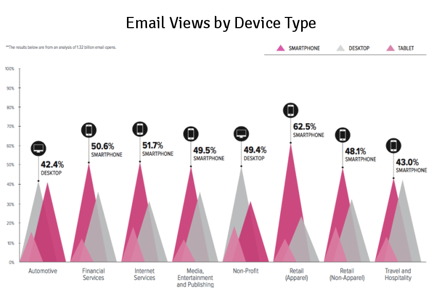
Responsive email design is not an innovation by now – it is a must. The number of mobile users has surpassed desktop users sometime in 2014 (in the US), and today there are around a dozen countries where the majority of people will view your website and email on their phones.

Optimize your messages
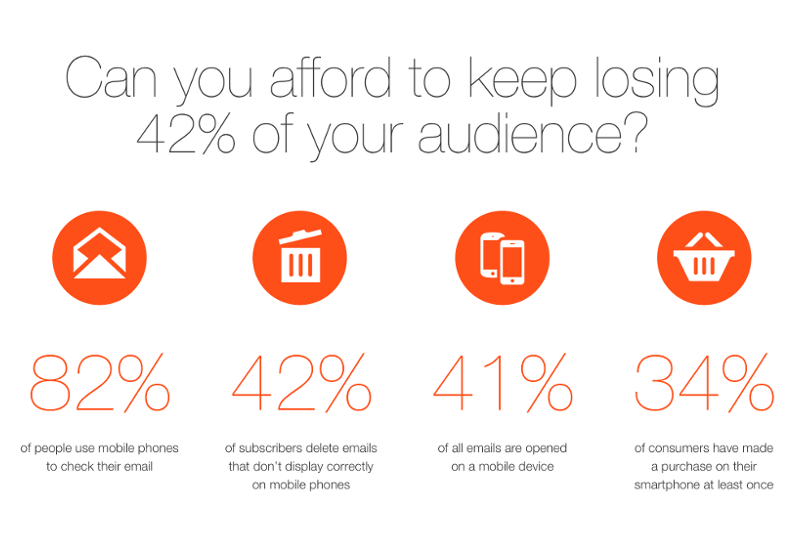
Did you know that 75% of people who receive an email that isn’t optimized for mobile will just delete it right away?
There is a saying, “the best design is no design”. It briefly means that the best design is invisible and intuitive. The same is true for responsive emails too.
If you include nothing but the copy in your email it will most certainly display perfectly on every device – provided you use the correct typeface. But there are few who want their email to look like plaint text and nothing more. We have to add that in some cases plain text email works better than the visually compelling versions – especially in B2B sales.
But generally speaking visual elements are great at many things. They help people recognize your brand, you can direct their attention, gain their sympathy. But if your emails fall apart like a house of cards when opened on mobile, tablet, phablet or other devices than the only thing you will get from your recipients is frustration.
EDMdesigner’s email builder helps you to create professional emails
That is why we made it our mission to help you create responsive email templates without any headaches. It’s really challenging to code a responsive email HTML from scratch, especially if you are not an expert – but an online HTML email designer can help you to produce error-free responsive email templates.
But be careful. There are big differences in email code quality among the so called responsive email editors. We are the only ones who proudly publish our responsive email compatibility list online. It’s a result of thousands of hours development and not only the pre-built email templates are responsive in EDMdesigner, but each and every template will be which you build with the tool, even from scratch.
8 tips to use in your responsive email editor
- Large enough elements – On smart devices people navigate with their fingers. Create buttons and other navigation elements that are easily tappable / clickable, with a minimum size of 44 x 44 px.
- Use white space – It will allow users to skim through the content and find what is important for them.
- Use a single column – Don’t overcomplicate your email, make it easy to consume so that your subscribers can just scroll down to read it.
- Use CTA above the fold – Most of your recipients won’t read through your message, but will click your CTA anyway – if you provide one at the proper place.
- Remember that your email is an extension of your brand – Use the same basics in your email design that you use on your website(s) so people will recognize you.
- Don’t overcrowd with visual elements – If you want make it more visual, play with typography and contrasting colors to emphasize your main message.
- Forget about stock photos – Stock photos are boring and are used by too many (email) marketers. Stand out from the crowd by using quality images instead of the unnatural stock photos.
- **Direct their attention to your CTA **– Include a photo of a person, who stares at your CTA button. Readers will instinctively look where the actual person looks on the picture.
Sorry, but this is not the full list of tips, that we can come up with. But if you don’t want to miss any of our future updates, please subscribe to our newsletter in the footer. We try our best to bring you valuable email design related content every week!


