Important Update - 2017 January
The original version of this article was posted in 2014. For a detailed article about the limitations of HTML email width and size, visit our new email marketing blog on Chamaileon.io.
Original article from 2014
We were involved in various responsive email pilots with partners, and we always faced this question:
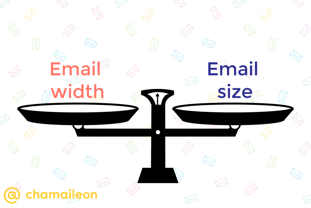
“Why should we fit our email template into 600px?
Screen resolutions are much bigger nowadays, aren’t they?”
Everything in the online / tech world is developing. New devices, email clients, email service providers, etc. appear day by day. But one thing doesn’t really change. Email.
Email is still a bit like we were in the 90s.
Many things were superb those years (for example: MTV, Nirvana, SMS), but the internet was only in an embryonic development stage and email was born in this era.
“Electronic mail, most commonly referred to as email or e-mail since ca. 1993, is a method of exchanging digital messages from an author to one or more recipients.” – Wikipedia
The optimal email width is a very old issue, I can say. The ideal email width has been recommended at between 550 px and 600 px for many years.

Why 600 px?
- Screen resolutions were too small back in the 90s (in 1024 x 768, 600/650 px is still the maximum which could fit in the screen for example in Yahoo or Aol Mail)
- Many email clients have a preview window which has a limited size – 600 px is a safe size to go for (Outlook, Thunderbird, Apple mail)
- You cannot be certain that your email displays in full size
- 50-75 characters per line is the optimal line length for readability (Source: Baymard.com)
- People view emails on mobile (one column, 600 px width, large font sizes = mobile first thinking is still the safest way of optimizing for mobile, but has cutbacks)
Overcoming the 600px Limitation
Over the years most email marketers got used to the 600 px width limitation, but there were always rebels, who refuse to accept any limitation.
We don't like limitations either, so decided to join the rebels and write an article about workarounds for creating 600+ px wide responsive email templates.
If you are an email developer you should definitely check it out.