1. Neglect your subject line
The first impression people have about your email is always it’s subject line. They will decide if it makes sense for them to open your email or not. If you are boring, repetitive, irrelevant they will never open your email. Most successful email marketers invest significant hours of work into crafting the perfect subject line and regularly A/B (split) test their subject lines before sending a campaign to the whole list.
Ideally you should do the same every time, but with small lists A/B testing may bring irrelevant results. In this case you should at least test email subject lines with friends, colleagues or at search for your subject line in Google. Who knows, there may be some useful content out there or you can get tips how others addressed the same issue.
2. Forget about the preheader text
The second most important factor that users take into account before opening your email is the preheader text, but still 53% of email marketers forget about it! The rule of thumb here is to make it catchy and relevant to your subject line! To learn more please check out our recent article about preheader text.
3. Send your email from no-reply@ or info@
We are all people. We love to be in touch with people so we like to feel that there’s somebody listening to us on the other side. Email is a two way communication, even if we hardly reply to the email newsletters we receive. The opportunity should be there. Preferably send your email from a real person’s email address or at least a dedicated email address like newsletter@.
4. Write irrelevant content
After you made them open your email, you should keep their attention alive and direct it towards your conversion goal, but don’t try to sell at all costs. Direct selling is usually not the approach, except for if you made it clear from the really beginning – even before they subscribed to your list – that you are going to sell in every newsletter.
5. Use inconsistent design
Your brand is not just your name and logo, but everything around it. From a visual perspective you should have your own colors, style and the same “face” on all communication channels. You have to be recognizable all the time, so don’t use too many different email designs or if you do so, always make sure that each and every email you send has the same impression and your brands shines through it.
The guys at Litmus are real pros in email design, and they craft always really beautiful newsletters and always use the freshest email design tricks. They don’t stick to the same designs all the time ,but they are still easily recognizable. Maybe this article about the 50 best email designs may help you to develop your own style.
6. Write in different style
It really matters what you write and how you write it. It’s easy if there’s only one person responsible for all of your content marketing, but if there are more people there should be at least one person responsible for checking all content before publishing anything. People easily get used to things, so don’t confuse them with writing in different style.
7. Tons of spelling and grammatical mistakes
I’m quite sure that this one happened to many of us, especially because many online tools we use to craft our email content don’t really help us with spelling and grammar. Always show your email content to as many colleagues as possible before sending it to the whole list. If your business is a one man show at least leave your email alone for a couple of hours (night) and read it through several times before the blast.
8. Miss the call-to-action!
Hopefully you always include a CTA in your messages, but it may happen that it doesn’t stand out enough from your email design. For example a small text link is not a good CTA especially on mobile. So always use easily clickable buttons as your call to actions which stand out visually from your email template.
9. Leave out social media from your emails
It requires a little effort on your side to include a couple more icons in your email. Always make sure that your subscribers have the chance to easily share your content or at least become fan of your product/service on another channel. If your email content is really relevant, they may even forward it to a friend… but to be honest I received 100k+ emails in my life, and have never forwarded a promotion to anybody. Hopefully it’s only me, and there are people out there who do forward messages to friends sometimes.
10. No unsubscribe link
Fortunately modern ESPs all add the unsubscribe link to your email automatically, but if you’re using something older you may need to add a string like %%unsubscribe%% to your message to make the link appear for your readers. Simply never forget about it, since you may be fined for violating SPAM regulations.
11. Don’t bother with responsive/mobile friendly email design
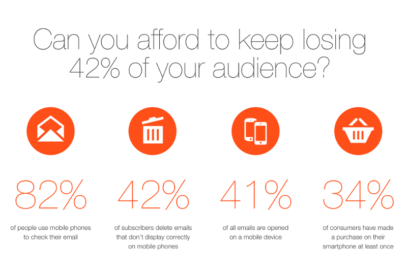
At last bot not least, you should always make sure that your email design is enjoyable on mobile as well. In modern environments already the majority of people read email on their mobile devices so don’t annoy them with hardly readable emails. Unfortunately still 80% of people have negative feelings about email, so there’s room for improvement for most email marketers!
Did we miss anything important from this list? Feel free to add your tips in the comments section!


