An outdated principle
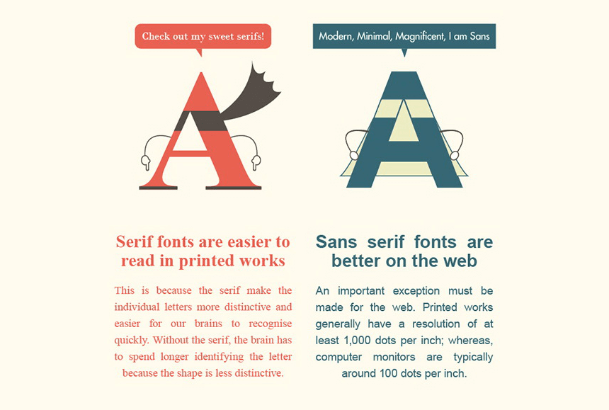
Most email marketers use the simple, web safe fonts in email builders like Helvetica, or Arial. These are typefaces that, along with Calibri, display well on lower resolution screens since they are sans serif.
They are traditionally preferred not only because they are defaults of different platforms, but also because in the past corporate offices had lower resolution monitors (and smartphones of course had a lower resolution screens too), so they** were easier to read than the serif** typefaces.
 The old principle, is only a myth today.
Image Source: Urbanfonts.com
But this is no longer the case. Today high resolution is cheaper to acquire, phones have better displays and we should not resort to using sans serif typefaces only.
Helvetica and Arial are harder to read because there is too little space between letters and mirror forms like “b” and “d” are truly only mirrored. Reading a sans serif post is, according to experts, harder for the mind, consequently slower.
A better experience
In the case of serif fonts the additional serifs give each letter a unique appearance. Groups of letters are more easily recognized, which is an important thing as we do not read individual letters but groups of them at a time.
This may sound like a small different but if you use a font where every letter has its own character, it will provide a better reading experience for people looking at your texts.
Of course, you want your recipients to have a great reading experience, even subconsciously about your emails – they will be more likely to read through your emails, if the fonts are reader friendly.
Nowadays you still need to use web safe fonts if you want your mail to display the “same” way in various environments, so you have to choose more wisely.
Georgia for example is a much better choice than the standard sans serif typefaces, as its individual letters are more distinguishable.
If you insist on using a sans serif typeface, than Verdana may be your best bet. It has more spacing between letters thus its more easy to read.
So next time you open up your email builder to create new email templates for your next campaign, think about using a serif font. Try it out, test it, ask a control group if it was easier to read, if they had a better visual experience overall.
Of course if you stick with the new font, design your webpages accordingly, as your marketing email and landing pages should always be aligned in terms of design.
It is time for change
As the web itself has progressed greatly in recent years it may be time for the different email platforms to follow up on that and expand the list of supported typefaces. There aren’t many fonts that are universally supported and that is a problem all email marketers must face.
At EDMdesigner we are thinking about adding the support for more fonts – like Google Fonts, or custom fonts that you could upload through the editor. Please tell us your needs when it comes to custom fonts (in comments or via email to info@) – and we will do our best to meet your needs with the next version of our responsive email editor!