The Solution
To draw the final conclusion we have to tackle one more issue. This issue relates to how we approach our HTML email campaigns.
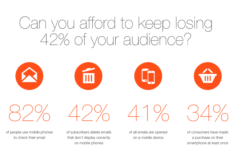
The above mentioned problems derive from the fact that we design our newsletters mainly for desktop clients and resolutions, and we want to transform these into mobile-friendly versions only in a later stage. If we are keen on delivering readable emails to all of our clients, the safest way to go is to use a mobile-first mindset, which is very popular nowadays for websites. However, those emails that require fully customized HTML codes can get very complicated if we want to optimize them for mobile devices as well, therefore the risk of making a mistake is much higher. The old and safe table or image only approach is not enough any more. Rather it looks like the ancient saying might hold some truth even for the 21st century, so we should keep it in mind that: “Less is more”.
There is NO full-stack solution, which would be perfect on all email clients!
Case A
If we don’t have to deal with “ancient” softwares like MS Outlook or Lotus Notes, only modern webmails and mobiles, or our market has significantly more Gmail users than legacy fans, than the solution is Mobile First Emails!
In this case, design and build a mobile-first version, for ~300px width. One column, fluid design, with HTML5 doctype. It will work on all mobile clients including Gmail apps, and Windows phones too.
Define CSS media queries for all regular screen sizes, but do not forget that old-school MS Outlooks, Lotus Notes, and Gmail will ignore these media queries!
Case B
If you need to cover legacy clients but mobile is also important. Design and build old fashioned table-based HTML emails, and then use a secondary cover with media queries to be mobile friendly. Forget Gmail apps, and the fact, that your email will always be readable on small screens. But generally this is still the most compatible way to cover as many clients, as possible.
A few email coding tips
- Always declare doctype! If you want to use mobile-friendly media-queries, than you need to apply HTML5 Doctype!
- Declare inline style on all elements!
- Use CSS media queries in the above mentioned <STYLE>
- Always use TABLE to wrap an item, if you need padding, margin or border. Apply these styles to the TD element. It should look like this:

- Never use margin. Use padding, and another wrapper table instead.
- Always set HTML attributes (width and height) with exact pixels on <IMG> tags.
- Use Classnames, and target stylings with htmlTag[class=”classname”] to avoid overrides from webclients like Outlook.com or YahooMail. (there is an old legend, that android native email doesn’t support classnames, but in our tests from 2.3 to 4.2+ it works.)
- Do not minify your HTML email into an one line HTML, because there are different limitations in each email clients, so sometimes it will break your code.
Useful Resources – Targeting and Segmentation
- Why List Segmentation Matters in Email Marketing by HubSpot
- Effects of List Segmentation on Email Marketing Stats by Mailchimp
- Identify Your Target Audience by Aweber
- Focus Your Email Marketing With Targeted Lists by Bosweb Systems
- Measuring The Success of Your Email Marketing Campaigns – Using Opens by Device Reporting by Pure360
Useful Resources – Testing
- Your Complete Guide to Measuring Email Marketing Success by HubSpot
- A/B Split Testing Email Marketing by Fulcrumtech
- A/B Testing Your Email Campaigns by Campaignmonitor
- A/B Testing – How Do You Know That Your Results Are Statistically Valid by ExactTarget
Key takeaways
- Keep an eye on international (like Emailclientmarketshare.com) and local stats
- Study your own list – Measure what email clients and devices do your subscribers use
- Choose your strategy and HTML email site build approach on the basis of your findings (Mobile or Desktop First)
- A/B test and measure everything!
I hope we could help you to understand how responsive emails work, and how you can make your email campaigns even more successful.
Have a question or anything missing? Just post a comment, we would be happy to hear your opinion!


