Fixed email design
A fixed email design allows you to design your email for a fixed screen size. The email’s components have a fix width or percentage which you need to determine when creating your email. You can completely control your layout and design beautiful emails with this approach however your email won’t be reacting to your reader’s device thus providing lower user experience as such. You might end up losing business because of the fixed email design’s unresponsive nature. So what else is out there?
Fluid email design
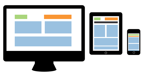
The fluid email design can be seen as the predecessor of the responsive email design. Web designers praised the future of fluid email design way before the responsive email design was born. This approach understands the variety of screen sizes such as monitor, tablet or smartphone and increases the user experience compare to the fixed design. It does it by linking only a percentage to the email components allowing them to align to the display’s resolution. Thanks to that the text adjusts as soon as the browser’s size is changed. But is this approach enough to display emails correctly in thousands of different gadgets that we use today to read emails?
 source: Mailbeez
Responsive vs. scalable email design
Yesmail Interactive published a pretty neat infographic on the differences between the two approaches. The scalable layout resizes your email in order to fit the screen making the email still readable and clickable on any devices that is being read on. The scalable layout requires only one layout that is compatible across all devices. It looks like this.
On the other hand the responsive layout basically adapts to device’s screen by using a CSS media query. It allows the email to adjust the content’s size (including text, images and the entire layout) and tweak the content by for example changing or disabling images based on the device that is being rendered on. The responsive design is definitely the future of mobile email however not all devices there yet to support this technology. To satisfy each and every reader, a good solution might be what Yesmail Interactive suggests: a hybrid layout that uses both scalable and responsive design depending on the device that the message being read on.
We can definitely help you to get part of the job done. Have a look and try EDMdesigner or drop us a line, if you want us to make your emails responsive!


