1. Use images wisely
When creating a responsive email template, you should be as moderate with images as you can. Especially background images, since they are not supported in most Outlook versions. Visual elements may take up a lot of space, and the smaller screen you get to display your message on the less space you should devote to graphics – except if you are like Apple, who can sell with a single image and one tag line.
Load time is often also an issue. If you use too many images your email will load slower – and mobile users are always on the go, they always hurry and will abandon any site or email that takes too much time to load.
To avoid this you should decrease image size to 600px maximum and also reduce quality to 80%.
2. Use straightforward copy if you can
When targeting mobile users you have to take into account that they are impatient, as we already mentioned. They are more likely to only skim through longer content, they won’t read huge blocks of text (most people don’t do it on the web either).
So be more concise, tell them the most important information and guide them to your offer. Do all your best to convince them, but also be short.
3. Use larger fonts
Pay attention to how mobile users use their phones. Research suggests that the average distance we hold our phones from our eyes is around 34 centimeters (32 cm for websites, 36 for text messages).
Screens are getting larger continuously, but your texts (at least titles) still have to be visible from greater distances. The reading experience must be convenient as well, so use at least 16px fonts or larger, for example Apple recommends 17-22px.
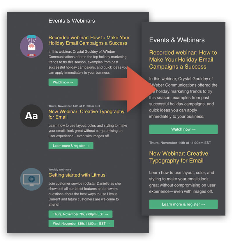 Image source: Litmus.com
4. Link only to responsive websites
Be consistent: if your email is responsive, recipients will automatically assume that your website is responsive too. If you take them to a page which doesn’t display properly on mobile, a large portion of them will be disappointed and will leave instantly.
5. CTA: pay attention to the thumb zone
Three out of four smartphone users will use their right thumb to click on links or buttons displayed on the screen.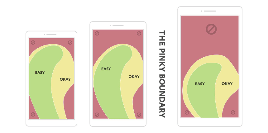
Image source: Alistapart.com
That means that you not only should use large enough buttons which can be clicked without much aiming, but you should also position it so it will be easier to reach.
Before you start designing a new responsive email template, take a deep breath and think** about how people use their phones in real life**, what are their expectations and what do they like.
If you can meet their expectations in terms of email design, sales copy and even your offering matches their needs… you will rule. That’s the ultimate goal of every email marketing right?