In this article you will find out:
- Why you should use images in your email design
- What factors you should keep in mind before you start using images in your email design
- Some quick and dirty conversion optimization of images in your email
Why Should You Use Images in Your Email Design?
Image is worth a thousand words.
First of all, it is so important because the human brain processes images much faster than text.
Secondly, we live in a word of visual culture, and the great shift from text culture to image culture has already happened. Visual content makes up 93% of human communication.
Thirdly, images convey emotions and many people buy for emotional reasons. Suitable and relevant images will encourage your readers and customers to feel what you want them to feel, and leverage emotions.
Thus to send an email without an image, would be both a branding and conversion mistake.
What Do You Need to Consider Before You Add an Image to Your Email Design
In general, you email should meet the following two criteria:
- It should look good and neat
- It should engage your subscribers and convert them
Converting, thus bringing real results is more important.
Electronic mail has usability limitation, thus the trick is to make your email display properly no matter what in order to drive conversions.
Images you add to your email should do a power of good to your emails rather than ruin them.
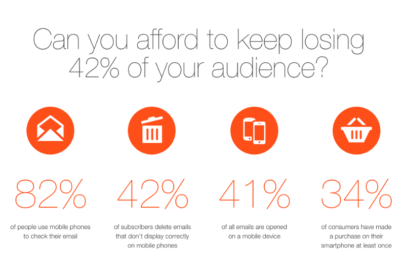
The number of people who don’t have images displayed in their emails is slowly growing, but is still very high. It stays around 40%. These people won’t see the beautiful pictures in your email unless they enable them.
You are designing your email for the whole list of your subscribers. For that reason your email template should work for everyone regardless of their ability to see images by default.
There are two ways to add an image to your email: embed it or add as an URL. With the rise of drag and drop email designers, embedded images are almost in the past. However, it is worthwhile to remind that they can lead to some serious implications for your email design usability. Thus a lot of your subscribers will simply not be able to see the image, if it is embedded in email. Besides that, embedded images may let your email end up in spam folder, because this method is favored by spammers and people sending malware or fishing software (this is actually the reason why the main email clients have images disabled by default).
Source: Litmus
Moreover, if you pay per email weight, embedded images increase email’s size and even can make it too big to be sent by email provider.
Thus there are four things that you should keep in mind:
- Email design has its limitations
- Slightly less than 50% of all email users will see your email with images disabled
- Conversion and usability are more important than good looks
- Do not use embedded messages, because they make you look like spam
How to Use Images in Your Email Design ?
- Don’t make your email one big image, because a lot of people (see above) will simply not understand what it is all about. It is more than enough if images occupy 30% of email space and the rest is simple text. But in case you feel the urge to make your email extra beautiful and place images all over it, use a HTML table to combine several images together in such a way that they create a meaningful message even if the images are disabled.
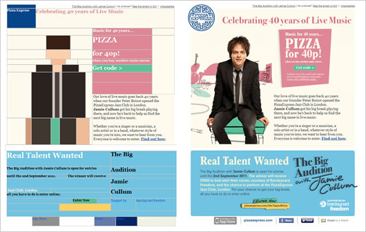 Source: Campaign Monitor
 - **Always use Alt and Title Text that appear as a text **within your image URL that appears when the image is disabled. It is very important for your conversion, because Alt text still conveys the intended message even if your subscribers do not see the picture.
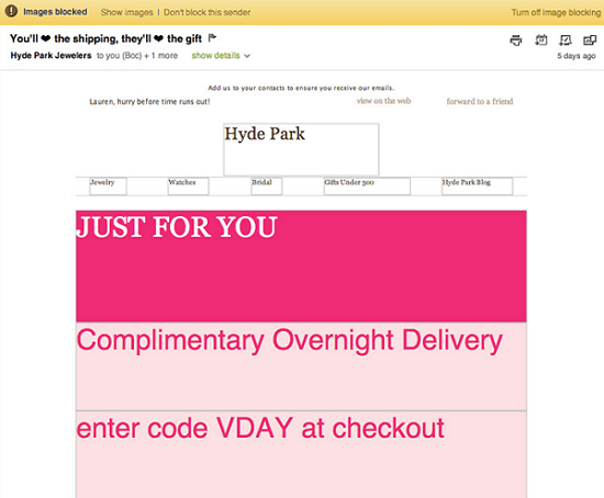
- **Don’t hide call to action buttons or important information inside the image. **Always put them as HTML text or buttons. Otherwise if your subscribers like your message, they simply won’t know where to click.
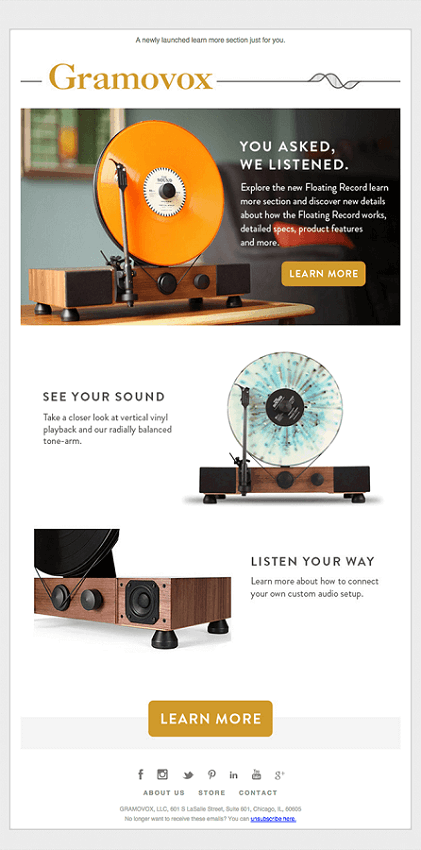
- **Consider placing a hero image in the top two inches **(5.06 cm) of your email. Two inches is a standard preview height. Typical email preview is horizontally aligned, so an attractive image with appealing call to action in the above-the-fold area will definitely force your subscribers to explore your email further.
 Source: Really Good Emails
 - Don’t make images too big both in terms of size and weight. Your images should be well-formatted and well-compressed. It is recommended to make your images 600 pixels wide to avoid any issues with their display both on desktop and mobile. By the way, on modern mobile devices, for instance on Retina displays, email images may seem blurry and pixilated. So it is good practices to run the image through an optimization tool before your upload them to your server.
- Include “view in browser” button in case your users do not trust images in emails or want to enjoy the full beauty of your email.
Some Quick and Dirty Conversion Optimization Tips for Using Images in Your Email Templates
- Use images of people. One study showed that websites with images of people score higher than websites with other pictures. This can be fully applied to email design.
- Direct subscribers attention to your call to action using images. Use images as hints pointing to important parts of your email design. You see at the example below the shampoo tube gets more attention when the woman looks at it.*
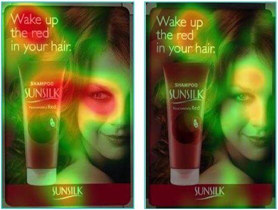 *Source: Invesp
 - Place an image and the most important information above the fold area. People don’t thoroughly read emails, they scan them. If you were persuasive enough to encourage your subscriber to open the email, the most effective way to retain their interest and make them continue reading is to place all important things above the fold.
- Consider placing an image in the left part of your email. People first pay attention to the left side of the screen and image conveys information much faster than words because people process images 60,000 times faster than text. By placing an image in the left side you will already create a certain mood and address some points that will then be confirmed by the copy on the right side.
- **Emphasize a call to action button **by making it visible to the audience.
- Remove all unnecessary design elements and allow for enough space. Declutter your email template and keep enough spacing between the elements, especially because it is a big trend in webdesign nowadays.
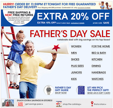
*Cluttered email design. Source: *Econsultancy
And if you have any doubts regarding the effect of including images in your email on conversion rates, you can always test different versions.
Key points of this article:
- Email design implies certain limitations and you should keep them in mind when designing your email template.
- It is much better to use URLs to images rather than embedded images.
- You should not abuse images and always consider blocked image view while you are creating your email template.
- Clear, decluttered email design with images above the fold leading users to well-defined call to action buttons (don’t forget about HTML text with URLs under them) can increase conversion rates of your email campaign.